
CSS3 vertical multicolor 3D menu
In our new tutorial we’ll create new stylish vertical multicolor and crossbrowser CSS3 menu with 3D animation (I use css3 transition, perspective and transform properties) and pure css3 color switcher. This is UL-LI-based menu.
Here are samples and downloadable package:
Live Demo
download in package
Ok, download the example files and lets start coding !
Step 1. HTML
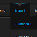
As usual, we start with the HTML. Here is the html code of our menu. As usual – this is again UL-LI based navigation menu. The most interesting thing will be CSS styles of course.
index.html
<div class="container">
<span id="clr1"></span>
<span id="clr2"></span>
<span id="clr3"></span>
<span id="clr4"></span>
<span id="clr5"></span>
<span id="clr6"></span>
<div class="colorScheme">
<a href="#clr1" class="clr1"></a>
<a href="#clr2" class="clr2"></a>
<a href="#clr3" class="clr3"></a>
<a href="#clr4" class="clr4"></a>
<a href="#clr5" class="clr5"></a>
<a href="#clr6" class="clr6"></a>
</div>
<ul id="nav">
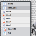
<li><a href="http://script-tutorials.com/">Home</a></li>
<li><a href="#">Menu 1</a>
<ul class="subs">
<li><a href="#">Submenu 1</a></li>
<li><a href="#">Submenu 2</a></li>
<li><a href="#">Submenu 3</a></li>
<li><a href="#">Submenu 4</a></li>
<li><a href="#">Submenu 5</a></li>
</ul>
</li>
<li><a href="#">Menu 2</a>
<ul class="subs">
<li><a href="#">Submenu 2-1</a></li>
<li><a href="#">Submenu 2-2</a></li>
<li><a href="#">Submenu 2-3</a></li>
<li><a href="#">Submenu 2-4</a></li>
<li><a href="#">Submenu 2-5</a></li>
<li><a href="#">Submenu 2-6</a></li>
<li><a href="#">Submenu 2-7</a></li>
<li><a href="#">Submenu 2-8</a></li>
</ul>
</li>
<li><a href="#">Menu 3</a>
<ul class="subs">
<li><a href="#">Submenu 3-1</a></li>
<li><a href="#">Submenu 3-2</a></li>
<li><a href="#">Submenu 3-3</a></li>
<li><a href="#">Submenu 3-4</a></li>
<li><a href="#">Submenu 3-5</a></li>
</ul>
</li>
<li><a href="#">Menu 4</a></li>
<li><a href="#">Menu 5</a></li>
<li><a href="#">Menu 6</a></li>
<li><a href="http://script-tutorials.com/css3-vertical-multicolor-3d-menu/">Back</a></li>
</ul>
</div>
Step 2. CSS
Here are the CSS styles of our vertical menu. Maybe you’ve noticed – that in our html we have two CSS files: layout.css and menu.css. The first one (layout.css) contains the styles of our demo page. We don’t publish these styles in the article, but if you need – you can find these styles in our package.
css/menu.css
#nav,#nav ul {
    background-color: #8899AA;
    list-style: none outside none;
    margin: 0;
    padding: 0;
}
#nav {
    display: block;
    padding: 5px;
    position: relative;
    width: 112px;

    -moz-perspective: 200px;
    -ms-perspective: 200px;
    -webkit-perspective: 200px;
    -o-perspective: 200px;
    perspective: 200px;
}
#nav ul {
    left: -9999px;
    opacity:0;
    overflow: hidden;
    padding: 5px;
    position: absolute;
    top: -9999px;

    -moz-transform: rotateY(70deg);
    -ms-transform: rotateY(70deg);
    -o-transform: rotateY(70deg);
    -webkit-transform: rotateY(70deg);
    transform: rotateY(70deg);

    -moz-transform-origin: 0 0;
    -ms-transform-origin: 0 0;
    -o-transform-origin: 0 0;
    -webkit-transform-origin: 0 0;
    transform-origin: 0 0;

    -moz-transition: -moz-transform 0.3s linear, opacity 0.3s linear;
    -ms-transition: -ms-transform 0.3s linear, opacity 0.3s linear;
    -o-transition: -o-transform 0.3s linear, opacity 0.3s linear;
    -webkit-transition: -webkit-transform 0.3s linear, opacity 0.3s linear;
    transition: transform 0.3s linear, opacity 0.3s linear;
}
#nav li {
    background-color: #FFFFFF;
    position: relative;
}
#nav > li {
    -moz-transform-style: preserve-3d;
    -ms-transform-style: preserve-3d;
    -o-transform-style: preserve-3d;
    -webkit-transform-style: preserve-3d;
    transform-style: preserve-3d;
}
#nav li a {
    background-color: #AABBCC;
    border-color: #DDDDDD #555555 #555555 #DDDDDD;
    border-style: solid;
    border-width: 1px;
    color: #000000;
    display: block;
    font-size: 15px;
    padding: 8px 10px 8px 5px;
    text-decoration: none;
    width:95px;

    -moz-transition: all 0.2s linear;
    -ms-transition: all 0.2s linear;
    -o-transition: all 0.2s linear;
    -webkit-transition: all 0.2s linear;
    transition: all 0.2s linear;
}
#nav li:hover > a {
    background-color: #8899AA;
    border-color: #8899AA;
    color: #FFFFFF;
}
#nav li:hover ul.subs {
    left: 114px;
    opacity:1;
    top: 0;

    -moz-transition-delay: 0.3s;
    -ms-transition-delay: 0.3s;
    -o-transition-delay: 0.3s;
    -webkit-transition-delay: 0.3s;
    transition-delay: 0.3s;

    -moz-transform: rotateY(0deg);
    -ms-transform: rotateY(0deg);
    -o-transform: rotateY(0deg);
    -webkit-transform: rotateY(0deg);
    transform: rotateY(0deg);
}
#nav ul li {
    width: 100%;
}

/* colors */
.colorScheme {
    list-style: none outside none;
    overflow: hidden;
    width: 120px;
}
.colorScheme a {
    cursor: pointer;
    float: left;
    height: 30px;
    margin: 0 5px 5px;
    width: 30px;
}
.colorScheme .clr1 {
    background-color: #8899AA;
}
.colorScheme .clr2 {
    background-color: #aa889e;
}
.colorScheme .clr3 {
    background-color: #8f88aa;
}
.colorScheme .clr4 {
    background-color: #88aaaa;
}
.colorScheme .clr5 {
    background-color: #88aa8a;
}
.colorScheme .clr6 {
    background-color: #aaa188;
}

#clr1:target ~ #nav, #clr1:target ~ #nav ul {
    background-color: #8899AA;
}
#clr2:target ~ #nav, #clr2:target ~ #nav ul {
    background-color: #aa889e;
}
#clr3:target ~ #nav, #clr3:target ~ #nav ul {
    background-color: #8f88aa;
}
#clr4:target ~ #nav, #clr4:target ~ #nav ul {
    background-color: #88aaaa;
}
#clr5:target ~ #nav, #clr5:target ~ #nav ul {
    background-color: #88aa8a;
}
#clr6:target ~ #nav, #clr6:target ~ #nav ul {
    background-color: #aaa188;
}

#clr1:target ~ #nav li:hover > a {
    background-color: #8899AA;
    border-color: #8899AA;
}
#clr2:target ~ #nav li:hover > a {
    background-color: #aa889e;
    border-color: #aa889e;
}
#clr3:target ~ #nav li:hover > a {
    background-color: #8f88aa;
    border-color: #8f88aa;
}
#clr4:target ~ #nav li:hover > a {
    background-color: #88aaaa;
    border-color: #88aaaa;
}
#clr5:target ~ #nav li:hover > a {
    background-color: #88aa8a;
    border-color: #88aa8a;
}
#clr6:target ~ #nav li:hover > a {
    background-color: #aaa188;
    border-color: #aaa188;
}
Live Demo
download in package
Conclusion
Hope you enjoyed with new 3D menu, don’t forget to tell thanks and leave a comment  Good luck!
Related Articles
CSS3 multicolor menu
Pure CSS3 LavaLamp Menu
Creating an Accordian like CSS3 Onclick Vertical Navigation

Hi from Sweden,
Very nice vertical menu indeed. Is it difficult to add more subsub and subsubsub menus? How do you do that?
Best Regards,
Mats
Hello Mars,
Actually no, this is not very difficult. All you need is to expand HTML structure (to add more levels here), and then, maybe you will need to modify styles (to work with more deep levels)
Please elaborate on Mats question. Also, how difficult is it to make this open left instead of right?
Hello Hozey,
This is not so difficult in fact, first, you need to put our #nav to the right corner (you can add float:right property here), after, you should change styles for
#nav li:hover > ul.subs, try to change left 112 to left -122