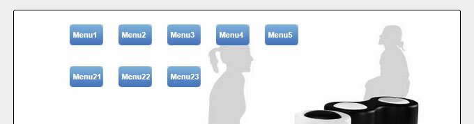
• HTML/CSS
  • jQuery
  • PHP
  • JS
  • AJAX
  • MySQL
  • Res
  • XSLT
  • Contact Us
  • HTML/CSS
    • Game Development →
      • HTML5 Game Development - Lesson 1
      • HTML5 Game Development - Lesson 2
      • HTML5 Game Development - Lesson 3
      • HTML5 Game Development - Lesson 4
      • HTML5 Game Development - Lesson 5
      • HTML5 Game Development - Lesson 6
      • HTML5 Game Development - Lesson 7
    • Menus →
      • CSS3 multilevel menu with transition and animation
      • Marble Style CSS3 Navigation Menu
      • Toggle CSS3 Bottom Navigation Bar
      • Accordian like CSS3 Onclick Vertical Navigation
      • Multilevel CSS3 Metal Navigation with icons
      • Click-action CSS3 Dropdown Menu with jQuery
      • Click action Multi-level CSS3 Dropdown Menu
      • CSS3 Animated Menu
      • CSS3/jQuery crossbrowser Drop-down menu with tabs
      • CSS3 Drop sliding list Menu #6
      • CSS3 Slideout Menu #5
      • CSS3 Dropdown Menu #4
      • CSS3 Dropdown Menu #3
      • CSS3 Dropdown Menu #2
      • Cool CSS3 Dropdown Menu
    • Templates →
      • Robo Splash Page Layout
      • 'Mono' HTML5 CSS3 Single Page Layout
      • HTML5/CSS3 single page layout - Art theme
      • Attractive HTML CSS Anime Theme Website Layout
      • HTML CSS website layout #4 - Gray theme
      • Dark and clean HTML CSS website layout
      • HTML5&CSS3 single page layout - Rock portal
      • E-Store HTML5 CSS3 Single Page Layout
      • Under Water Themed HTML5 & CSS3 single page Layout
      • HTML5 & CSS3 Single Page Web Layout
    • HTML5 tutorials →
      • HTML5 Canvas Slideshow
      • HTML5 canvas - Custom brush #2 (Bubble brush)
      • HTML5 canvas - Custom brush (BezierCurveBrush)
      • HTML5 Face Builder
      • Pure HTML5 file upload
      • HTML5 image crop tool
      • HTML5 animation - patterns with loops
      • HTML5 3D circle text with shadows
      • HTML5 canvas pixelate effect
      • Animated Moving Clouds using HTML5
      • Animated Fireplace in HTML5
      • 3D Animated Box HTML5 WebGL Photo Slideshow
      • Your Own Paint Program
      • Image Zoomer in HTML5 Canvas
      • Photo Array in WebGL
      • HTML5 Canvas Image Color Picker
      • HTML5 Image Effects App - Adding Horizontal Flip
      • Keyboard Sensitive 3D Twisted Images in WebGl
      • Animated 3D WebGL Demonstration
      • HTML5 Image Effects App - Adding Noise and Invert
      • HTML5 Canvas Image Effects App - Adding Blur
      • Attractive Presentation with HTML5
      • HTML5 Canvas App for Online Image Enhancements
      • Water Ripple effect using HTML5 canvas
      • Animated 3D canvas object in HTML5
    • CSS3 tutorials →
      • CSS3 Image Hover Effects
      • CSS3 Modal Popups
      • Isometric interactive interior guide
      • Analog Clock with Pure CSS3
      • CSS3 Optical Illusions
      • CSS3 Animated Photo Slider
      • CSS3 Christmas Tree with Snow
      • How to Create a Pure CSS3 Slideshow
      • CSS3 Drop Caps
      • Pure CSS3 Slider
      • Fantastic Animated Buttons using CSS3
      • How to Create a Pure CSS3 Animated Photo Gallery
      • Toggle CSS3 Bottom Navigation Bar
      • How to Generate Runtime Multi-columns with CSS3
      • Multiple backgrounds and Animation with CSS3
  • jQuery
    • Photo album with jQuery Fotorama
    • Photo album with jQuery Chop Slider
    • Cool Background Image Sliding effect with jQuery
    • jQuery Templates - Usage Practice
    • Photo Album with Galleriffic jQuery plugin
    • Fantastic Photo Album with TN3
    • Ajaxy Photo Gallery (jQuery) with Custom Images Sets
    • Rotating Slider with Easing Effects in jQuery
    • Animated jQuery Progressbar Plugin
    • Nice CSS3 Lightbox Gallery
    • Photo Album with Highslide
    • Using Flux Slider jQuery plugin
    • Ajaxy Chained Selects
    • Modern jQuery Pagination for Content
    • Your own jQuery Slider Plugin
    • Attractive Photo Gallery using SmartGallery
    • Animated Photo Gallery using jQuery (Slider Kit)
  • PHP
    • Powerful Chat System - Lesson 3
    • Powerful Chat System - Lesson 2
    • Powerful Chat System
    • Access Control with Bit Masks
    • Own XML/JSON/HTML API with PHP
    • Your Own Ajax Poll System
    • Diary style PHP Guestbook
    • Smooth Curve Graphs with PHP and GD
    • Your Own Commenting System from Scratch
    • Autocomplete with PHP, jQuery, MySQL and XML
    • Your Own 5 Stars Voting System
    • How to use Memcache with PHP
    • How to install APC on Linux
    • How to Use APC Caching with PHP
    • Watermark processing on images using PHP and GD
    • ID3 Tags Reader with PHP
    • Advance Level Login system with Logic captcha
    • Protection and Methodologies of Security Vulnerabilities
    • How to Resize images on Server Side
    • How to Protect any Site from Spam using Akismet
    • Phar - PHP archiving practice
  • JS
    • Form Validation with Javascript and PHP
    • Fullscreen Javascript Slide navigation
    • Photo Scrambler grid in javascript
    • Photo Slideshow (zoom fading) effect
    • Custom scrollbars - cross-browser solution
    • Flare Lens Effect
    • Own RSS Reader Using Google Feed API
    • Cross-browser Wave Effects
    • Cross-browser Supported Image Skew effect
  • Res
    • ← Infographic
      • The Evolution of Languages
    • ← jQuery plugin roundups
      • December 2011
      • November 2011
      • 10 fresh jQuery Tutorials
      • October 2011
      • September 2011
      • 10 fresh Ajax related jQuery plugins
      • August 2011
      • 10 Oven Fresh jQuery Plugins for UI
      • 10 Most creative jQuery plugins for tables
      • 10 Most Creative jQuery Navigation Plugins
      • 10 fresh jQuery plugins for working with forms and UI
      • 10 superb jQuery plugins for working with images
    • ← HTML5 stuff
      • HTML5 and Games
      • 10 Fresh HTML5 Tutorials
      • Fresh impressing WebGL demonstrations
      • Most impressing HTML5 with WebGL demonstrations
      • 10 Fresh & Impressive HTML5 Canvas (and WebGL) Examples
      • 10 Exceptional Examples of HTML5 Canvas and Applications
    • ← Mobile
      • How to start developing own applications for Android
      • 10 Fresh Android tutorials
      • 10 Attractive Tutorials for Developing iPhone Applications
      • 10 Attractive android tutorials for developers
      • 10 Fresh iPad Apps for Web Designers & Developers
      • 10 Fresh Android Apps for Web Designers & Developers
      • 10 Fresh iPhone Apps for Web Designers & Developers
      • Top 10 iPhone apps for working with graphics
    • 12 Unique Navigation Menu Designs For Your Inspiration
    • 15 Unique and Creative Layouts 2011
    • 12 Beautifully Creative Flash Websites of 2011
    • Fresh collection of Original Captchas
  • XSLT
    • Animated forums using XSLT and Ajaxy
    • Multilevel Menu using XSLT
    • Delicious bookmarks using XSLT transformation
    • XPath visually
    • Tags cloud using XSLT transformation
    • Youtube videos using XSLT transformation
  • Contact Us
KEEP IN TOUCH

Creating A CSS3 Animated Menu

Aug24
2011
Leave a Comment Written by admin
Creating CSS3 animated menu #8

Creating CSS3 animated menu

This is our eighth CSS3 menu. Today we will make interesting animated menu using CSS3. This menu will have 2 levels. By default – we can see single small top menu element. When we will hover our mouse over this element – first level elements will appear, when we will hover mouse over these elements – will appear submenus. So, lets start !


This is our final result (how menu will looks):

CSS3 animated menu8

Here are samples and downloadable package:

Live Demo
download in package

Ok, download our package and lets start creating this menu!


Step 1. HTML

Here are html source code of our menu.

index.html

<!DOCTYPE html PUBLIC "-//W3C//DTD XHTML 1.0 Strict//EN" "http://www.w3.org/TR/xhtml1/DTD/xhtml1-strict.dtd">
<html xmlns="http://www.w3.org/1999/xhtml" xml:lang="en">
<head>
    <link rel="stylesheet" href="css/style.css" type="text/css" media="all">
    <title>CSS3 animated menu #8 | Script tutorials</title>
</head>
<body>
<div class="example">

    <!-- defining top menu elements -->
    <ul class="navi">
        <li id="n1"><a href="#"><img src="images/btn.png" alt="" /><span>Menu1</span></a>
            <!-- defining sub menu elements -->
            <ul class="sub">
                <li class="l"><a href="#"><img src="images/btn.png" alt="" /><span>Menu11</span></a></li>
                <li class="c"><a href="#"><img src="images/btn.png" alt="" /><span>Menu12</span></a></li>
                <li class="r"><a href="#"><img src="images/btn.png" alt="" /><span>Menu13</span></a></li>
            </ul>
        </li>
        <li id="n2"><a href="#"><img src="images/btn.png" alt="" /><span>Menu2</span></a>
            <ul class="sub">
                <li class="l"><a href="#"><img src="images/btn.png" alt="" /><span>Menu21</span></a></li>
                <li class="c"><a href="#"><img src="images/btn.png" alt="" /><span>Menu22</span></a></li>
                <li class="r"><a href="#"><img src="images/btn.png" alt="" /><span>Menu23</span></a></li>
            </ul>
        </li>
        <li id="n3"><a href="#"><img src="images/btn.png" alt="" /><span>Menu3</span></a>
            <ul class="sub">
                <li class="l"><a href="#"><img src="images/btn.png" alt="" /><span>Menu31</span></a></li>
                <li class="c"><a href="#"><img src="images/btn.png" alt="" /><span>Menu31</span></a></li>
                <li class="r"><a href="#"><img src="images/btn.png" alt="" /><span>Menu31</span></a></li>
            </ul>
        </li>
        <li id="n4"><a href="#"><img src="images/btn.png" alt="" /><span>Menu4</span></a>
            <ul class="sub">
                <li class="l"><a href="#"><img src="images/btn.png" alt="" /><span>Menu41</span></a></li>
                <li class="c"><a href="#"><img src="images/btn.png" alt="" /><span>Menu41</span></a></li>
                <li class="r"><a href="#"><img src="images/btn.png" alt="" /><span>Menu41</span></a></li>
            </ul>
        </li>
        <li id="n5"><a href="http://www.script-tutorials.com/creating-css3-animated-menu/"><img src="images/btn.png" alt="" /><span>Tutorial</span></a>
        </li>
    </ul>

    <div style="clear:both"></div>
</div>
</body>
</html>

Step 2. CSS

Here are used CSS styles. First two selectors (you can skip it) belong to our demo page. All rest – menu #8 styles.

css/style.css

/* demo page styles */
body {
    background:#eee;
    margin:0;
    padding:0;
    font-family: Helvetica,Arial,sans-serif;
    font-size: 11px;
}
.example {
    position:relative;
    background:url("../images/background.jpg") no-repeat scroll center center #fff;
    width:600px;
    height:510px;
    border:1px #000 solid;
    margin:20px auto;
    padding:20px;
    border-radius:3px;
    -moz-border-radius:3px;
    -webkit-border-radius:3px;
}

/* navigation menu styles - main styles */
ul.navi {
    position:relative;
    z-index:100;
    padding:0;
    margin:0 0 0 60px;
    list-style:none;
    width:auto;
    height:30px;
}
ul.navi > li {
    width:48px;
    height:30px;
    position:absolute;
    left:0;
    top:0; 

    -moz-transition: -moz-transform 0.5s ease-in-out;
    -ms-transition: -ms-transform 0.5s ease-in-out;
    -o-transition: -o-transform 0.5s ease-in-out;
    -webkit-transition: -webkit-transform 0.5s ease-in-out;
    transition: transform 0.5s ease-in-out;
}
ul.navi a {
    display:block;
    width:48px;
    height:30px;
    position:absolute;
    left:0;
    top:0;
    line-height:30px;
    text-align:center;
    text-decoration:none;
}
ul.navi a img {
    border:0;
}
ul.navi a span {
    position:absolute;
    left:5px;
    font-size:11px;
    font-weight:bold;
    color:#fff;
}

/* top line - hover styles */
ul.navi:hover {
    height:100px;
}
ul.navi:hover li#n1 {
    -moz-transform: translatex(0px);
    -ms-transform: translatex(0px);
    -o-transform: translatex(0px);
    -webkit-transform: translatex(0px);
    transform: translatex(0px);
}
ul.navi:hover li#n2 {
    -moz-transform: translatex(70px);
    -ms-transform: translatex(70px);
    -o-transform: translatex(70px);
    -webkit-transform: translatex(70px);
    transform: translatex(70px);
}
ul.navi:hover li#n3 {
    -moz-transform: translatex(140px);
    -ms-transform: translatex(140px);
    -o-transform: translatex(140px);
    -webkit-transform: translatex(140px);
    transform: translatex(140px);
}
ul.navi:hover li#n4 {
    -moz-transform: translatex(210px);
    -ms-transform: translatex(210px);
    -o-transform: translatex(210px);
    -webkit-transform: translatex(210px);
    transform: translatex(210px);
}
ul.navi:hover li#n5 {
    -moz-transform: translatex(280px);
    -ms-transform: translatex(280px);
    -o-transform: translatex(280px);
    -webkit-transform: translatex(280px);
    transform: translatex(280px);
}

/* submenus - common styles */
ul.sub {
    padding:0;
    margin:0;
    list-style:none;
    width:48px;
    height:30px;
    position:absolute;
    left:0;
    top:0;
    z-index:-1;
    opacity:0;

    -moz-transition: opacity 0s linear 1s;
    -ms-transition: opacity 0s linear 1s;
    -o-transition: opacity 0s linear 1s;
    -webkit-transition: opacity 0s linear 1s;
    transition: opacity 0s linear 1s;
}
ul.sub li {
    width:48px;
    height:30px;
    position:absolute;
    left:0;
    top:0;
    z-index:-1;

    -moz-transition: -moz-transform 0.5s ease-in-out 0.5s;
    -ms-transition: -ms-transform 0.5s ease-in-out 0.5s;
    -o-transition: -o-transform 0.5s ease-in-out 0.5s;
    -webkit-transition: -webkit-transform 0.5s ease-in-out 0.5s;
    transition: transform 0.5s ease-in-out 0.5s;
}

/* submenus - hover styles */
ul.navi > li:hover ul {
    opacity:1;

    -moz-transition: opacity 0s linear 0.5s;
    -ms-transition: opacity 0s linear 0.5s;
    -o-transition: opacity 0s linear 0.5s;
    -webkit-transition: opacity 0s linear 0.5s;
    transition: opacity 0s linear 0.5s;
}
ul.navi li:hover ul li.l {
    -moz-transform: translatex(-70px) translatey(60px);
    -ms-transform: translatex(-70px) translatey(60px);
    -o-transform: translatex(-70px) translatey(60px);
    -webkit-transform: translatex(-70px) translatey(60px);
    transform: translatex(-70px) translatey(60px);
}
ul.navi li:hover ul li.c {
    -moz-transform: translatey(60px);
    -ms-transform: translatey(60px);
    -o-transform: translatey(60px);
    -webkit-transform: translatey(60px);
    transform: translatey(60px);
}
ul.navi li:hover ul li.r {
    -moz-transform: translatex(70px) translatey(60px);
    -ms-transform: translatex(70px) translatey(60px);
    -o-transform: translatex(70px) translatey(60px);
    -webkit-transform: translatex(70px) translatey(60px);
    transform: translatex(70px) translatey(60px);
}

Step 3. Images

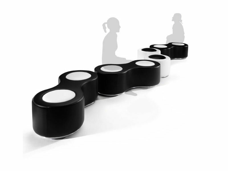
Few images – background of our demo and button icon:

    page background
    button

Live Demo
download in package

Conclusion

Today we made new nice menu (eighth), Your comments and thanks are very welcomed. Good luck!

About: admin:
I am web developer with huge experience (in web languages and even in system languages). Also I am the founder of current website (and several another). I like to write blogs about web development/design. Feel free to Follow us on Twitter: tweetmeme_screen_name='AramisGC';
If you Enjoyed our article don't forget to Share the love with your friends.
    Tweet
   
   
Written by: admin on August 24, 2011.

Related Stuff You Will Love!

  1. Creating Fantastic Animated Buttons using CSS3
    Creating Fantastic Animated Buttons using CSS3
  2. Creating a Marble Style CSS3 Navigation Menu
    Creating a Marble Style CSS3 Navigation Menu
  3. Creating CSS3 Slideout Menu #5
    Creating CSS3 Slideout Menu #5
  4. CSS3 multilevel menu with transition and animation
    CSS3 multilevel menu with transition and animation
Posted in HTML/CSS - Tagged animated, css3, menu, navigation, tutorial
SHARE THIS Twitter Facebook Delicious StumbleUpon E-mail
« Nice CSS3 Lightbox Gallery With jQuery
» HTML5 Canvas Image Effects App – Adding Blur

No Comments Yet

Leave a Reply Cancel reply

Your email address will not be published. Required fields are marked *

*

*

CAPTCHA Image
Refresh Image

*

You may use these HTML tags and attributes: <a href="" title=""> <abbr title=""> <acronym title=""> <b> <blockquote cite=""> <cite> <code> <del datetime=""> <em> <i> <q cite=""> <strike> <strong>

Popular Tutorials

  • How to create easy pagination with jQuery
  • Animated jQuery Progressbar Plugin
  • Pure HTML5 file upload
  • How to Create Animated Photo Gallery using jQuery (Slider Kit)
  • CSS3 Image Hover Effects
  • Creating a HTML5 & CSS3 Single Page Web Layout
  • How to Easily Make a PHP Chat Application
  • Autocomplete with PHP, jQuery, MySQL and XML

Tags

3d AJAX android animated animation app application applications apps canvas captcha chat system coding creating css css3 developers dropdown effect flash fresh gallery how-to html html5 image images iphone javascript jQuery layout menu navigation new photo PHP plugin plugins slideshow system tutorial tutorials webgl website xslt

Recent Tutorials

  • HTML5 Video player jQuery plugin
  • Pure CSS3 Accordion
  • HTML5 charts and graphs
  • Infographic: CSS3 Properties
  • 10 HTML5 canvas examples for Valentine’s Day
  • Powerful Chat System – Lesson 4
  • CSS3 multicolor menu
  • New HTML5&CSS3 single page layout – Fashion

Friends

  • X-Musics

Tutorials for Web Developers Copyright © 2009-2011 Script tutorials · All rights reserved