
CSS3 animated tooltips
Today I will tell you how to create simple and attractive CSS3 tooltips with using transitions and several another css3 properties. You will see all these tooltips directly in that article. You can apply custom tooltips and for text elements and for images too.
Ok, lets start !
Step 1. HTML
Lets imagine, that you have some plain text, as example:
<div class="content">The King sat naked. Like a foolish pauper on the street, he sat leaning against a cold wall, drawing in his blue, goose-bumped legs. He shivered, with his eyes closed, he listened, but everything was quiet.</div>
Now, lets wrap few words with tooltip:
<div class="content">The King sat naked. Like a <span>foolish pauper<i>foolish pauper tooltip</i></span> on the street, he sat leaning against a cold wall, drawing in his blue, goose-bumped legs. He shivered, with his eyes closed, he listened, but everything was quiet.</div>
The King sat naked. Like a foolish pauperfoolish pauper tooltip on the street, he sat leaning against a cold wall, drawing in his blue, goose-bumped legs. He shivered, with his eyes closed, he listened, but everything was quiet.
How I did it – pretty easy:
Step 2. CSS
First, lets define style for our visible tooltip element:
.content span {
    background:#eee;
    border:1px solid #444;
    cursor:pointer;
    display:inline-block;
    outline:none;
    padding:0 5px;
    position:relative;
    text-decoration:none;

    -webkit-border-radius:5px;
    -moz-border-radius:5px;
    -ms-border-radius:5px;
    -o-border-radius:5px;
    border-radius:5px;
}
And now – for its hidden (floating) area:
.content span i {
    visibility:hidden;
    border:1px solid #444;
    bottom:60px;
    left:50%;
    margin-left:-110px;
    opacity:0;
    padding:10px;
    position:absolute;
    width:200px;
    z-index:99;

    background-image:-webkit-linear-gradient(rgba(255,255,255,.6), rgba(255,255,255,.2));
    background-image:-moz-linear-gradient(rgba(255,255,255,.6), rgba(255,255,255,.2));
    background-image:-ms-linear-gradient(rgba(255,255,255,.6), rgba(255,255,255,.2));
    background-image:-o-linear-gradient(rgba(255,255,255,.6), rgba(255,255,255,.2));
    background-image:linear-gradient(rgba(255,255,255,.6), rgba(255,255,255,.2));
    background-color: #eee;

    -webkit-border-radius:5px;
    -moz-border-radius:5px;
    -ms-border-radius:5px;
    -o-border-radius:5px;
    border-radius:5px;

    -webkit-transition:all 0.3s ease-in-out;
    -moz-transition:all 0.3s ease-in-out;
    -o-transition:all 0.3s ease-in-out;
    -ms-transition:all 0.3s ease-in-out;
    transition:all 0.3s ease-in-out;
}
.content span:hover i {
    bottom:30px;
    opacity:0.95;
    visibility:visible;
}
Fine and easy, right? But that’s not all. I have prepared several more effects (and even with different colors).
This is tooltip#1Tooltip number one. Which can be in redTooltip#1 – red color, greenTooltip#1 – green color and blueTooltip#1 – blue color.
This is tooltip#2Tooltip number two. Which can be in redTooltip#2 – red color, greenTooltip#2 – green color and blueTooltip#2 – blue color.
This is tooltip#3Tooltip number three. Which can be in redTooltip#3 – red color, greenTooltip#3 – green color and blueTooltip#3 – blue color.
This is tooltip#4Tooltip number four. Which can be in redTooltip#4 – red color, greenTooltip#4 – green color and blueTooltip#4 – blue color.
This is HTML markup of all these samples:
<div class="content">
This is <span>tooltip#1<i class="v1">Tooltip number one</i></span>. Which can be in <span class="r">red<i class="v1">Tooltip#1 - red color</i></span>, <span class="g">green<i class="v1">Tooltip#1 - green color</i></span> and <span class="b">blue<i class="v1">Tooltip#1 - blue color</i></span>.
<hr />
This is <span>tooltip#2<i class="v2">Tooltip number two</i></span>. Which can be in <span class="r">red<i class="v2">Tooltip#2 - red color</i></span>, <span class="g">green<i class="v2">Tooltip#2 - green color</i></span> and <span class="b">blue<i class="v2">Tooltip#2 - blue color</i></span>.
<hr />
This is <span>tooltip#3<i class="v3">Tooltip number three</i></span>. Which can be in <span class="r">red<i class="v3">Tooltip#3 - red color</i></span>, <span class="g">green<i class="v3">Tooltip#3 - green color</i></span> and <span class="b">blue<i class="v3">Tooltip#3 - blue color</i></span>.
<hr />
This is <span>tooltip#4<i class="v4">Tooltip number four</i></span>. Which can be in <span class="r">red<i class="v4">Tooltip#4 - red color</i></span>, <span class="g">green<i class="v4">Tooltip#4 - green color</i></span> and <span class="b">blue<i class="v4">Tooltip#4 - blue color</i></span>.
<hr />
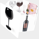
<span class="img">
<img src="http://script-tutorials.com/demos/209/images/1.jpg">
<i><img src="http://script-tutorials.com/demos/209/images/1.jpg"></i>
</span>
<span class="img g">
<img src="http://script-tutorials.com/demos/209/images/2.jpg">
<i class="v2"><img src="http://script-tutorials.com/demos/209/images/2.jpg"></i>
</span>
<span class="img r">
<img src="http://script-tutorials.com/demos/209/images/3.jpg">
<i class="v3"><img src="http://script-tutorials.com/demos/209/images/3.jpg"></i>
</span>
</div>
And – the final CSS stylesheet:
.content {
    background-color:rgba(255,255,255, 0.9);
    margin:50px auto;
    width:800px;
}
.content span {
    background:#eee;
    border:1px solid #444;
    cursor:pointer;
    display:inline-block;
    outline:none;
    padding:0 5px;
    position:relative;
    text-decoration:none;

    -webkit-border-radius:5px;
    -moz-border-radius:5px;
    -ms-border-radius:5px;
    -o-border-radius:5px;
    border-radius:5px;
}
.content span i {
    visibility:hidden;
    border:1px solid #444;
    bottom:60px;
    left:50%;
    margin-left:-110px;
    opacity:0;
    padding:10px;
    position:absolute;
    width:200px;
    z-index:99;

    background-image:-webkit-linear-gradient(rgba(255,255,255,.6), rgba(255,255,255,.2));
    background-image:-moz-linear-gradient(rgba(255,255,255,.6), rgba(255,255,255,.2));
    background-image:-ms-linear-gradient(rgba(255,255,255,.6), rgba(255,255,255,.2));
    background-image:-o-linear-gradient(rgba(255,255,255,.6), rgba(255,255,255,.2));
    background-image:linear-gradient(rgba(255,255,255,.6), rgba(255,255,255,.2));
    background-color: #eee;

    -webkit-border-radius:5px;
    -moz-border-radius:5px;
    -ms-border-radius:5px;
    -o-border-radius:5px;
    border-radius:5px;

    -webkit-transition:all 0.3s ease-in-out;
    -moz-transition:all 0.3s ease-in-out;
    -o-transition:all 0.3s ease-in-out;
    -ms-transition:all 0.3s ease-in-out;
    transition:all 0.3s ease-in-out;
}
.content span:hover i {
    bottom:30px;
    opacity:0.95;
    visibility:visible;
}
.content span:hover i.v2 {
    bottom:30px;

    -webkit-transform:scale(1.3);
    -moz-transform:scale(1.3);
    -ms-transform:scale(1.3);
    -o-transform:scale(1.3);
    transform:scale(1.3);
}
.content span:hover i.v3 {
    -webkit-transform:rotateX(360deg) scale(1.2);
    -moz-transform:rotateX(360deg) scale(1.2);
    -ms-transform:rotateX(360deg) scale(1.2);
    -o-transform:rotateX(360deg) scale(1.2);
    transform:rotateX(360deg) scale(1.2);
}
.content span i.v4 {
    height:70px;
    margin-left:-60px;
    padding-top:40px;
    text-align:center;
    width:100px;

    -webkit-border-radius: 50% 50% 50% 50%;
    -moz-border-radius: 50% 50% 50% 50%;
    -ms-border-radius: 50% 50% 50% 50%;
    -o-border-radius: 50% 50% 50% 50%;
    border-radius: 50% 50% 50% 50%;
}
.content span i:before,.content span i:after {
    border-bottom:0;
    border-left:8px solid transparent;
    border-right:8px solid transparent;
    border-top:8px solid #444;
    bottom:-8px;
    content:"";
    left:50%;
    margin-left:-8px;
    position:absolute;
    z-index:100;
}

/* custom colors */
.content span.r {
    background:#f88;
}
.content span.r i {
    background-color:#f44;
    border:1px solid #f44;
}
.content span.r i:before, .content span.r i:after {
    border-top-color:#f44;
}

.content span.g {
    background:#8f8;
}
.content span.g i {
    background-color:#4f4;
    border:1px solid #4f4;
}
.content span.g i:before, .content span.g i:after {
    border-top-color:#4f4;
}

.content span.b {
    background:#88f;
}
.content span.b i {
    background-color:#44f;
    border:1px solid #44f;
}
.content span.b i:before, .content span.b i:after {
    border-top-color:#44f;
}

/* images */
.content span img {
    height:128px;
    width:128px;
}
.content span.img i {
    height:auto;
    margin-left:-65px;
    margin-top:-10px;
    width:auto;
}
.content span.img i:before, .content span.img i:after {
    display:none;
}
.content span:hover i img {
    height:auto;
    width:auto;
}
Conclusion
I hope you enjoyed this tutorial and find it useful! Welcome back to read our new tutorials!
Related Articles
Creating Fantastic Animated Buttons using CSS3
Creating A CSS3 Animated Menu
CSS3 Animated Photo Slider

A superb tutorial.
You are taking CSS3 into newer heights.
Most importantly you are making it look so simple.
That is the beauty of your tutorials.
Thanks for this tutorial.
Quick question, I love these but can’t get it to work in IE. Any ideas?
Hi Dan,
It will work for IE, but not so smooth, because IE (even IE9) still don’t support css3 transitions.
I just copy/paste your first section of code and i don’t get that little arrow pointing down.
Hi dekip,
Possible it depends on your browser, you have to try this with FF browser as example.
Thanks a lot ! Until now, I was using a Mootools script to provide this functionnality for an event management component for Joomla but the Mootools script was no more working (old version of Mootools) and, try to keep a descendant compatibility, I was searching for something, more robust.
Many thanks mister admin !
These look amazing and I love the image to larger image tooltips. Thanks for sharing.
Congratulations ! Your site is awesome.
Excuse me, but these do NOT work on Safari.
I need an image popup script. But is has to work on Safari.
buz
Hello Buzz,
Hum, I can’t check it in safary (is it not installed at my computer), but maybe in case of safari we should add some custom vendor-styles?