
CSS3 Animated Photo Slider
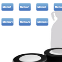
Today I have prepared new great CSS3 demonstration. This is 3D slideshow where I have used WebKit CSS 3D transforms. On the demo you will see a free-floating 3D object with photos. Hint – you have to use Chrome or Safari browser to see all these delights.
Live Demo
download result
Ok, download the example files and lets start coding !
Step 1. HTML
First, lets create the main HTML markup. As you can see – the structure is quite minimal as usual and contains only several DIV and IMG elements.
index.html
<!DOCTYPE html>
<html lang="en" >
    <head>
        <meta charset="utf-8" />
        <title>CSS3 Animated Photo Slider | Script Tutorials</title>
        <link href="css/layout.css" rel="stylesheet" type="text/css" />
        <link href="css/slider.css" rel="stylesheet" type="text/css" />
    </head>
    <body>
        <header>
            <h2>CSS3 Animated Photo Slider</h2>
            <a href="http://script-tutorials.com/css3-animated-photo-slider/" class="stuts">Back to original tutorial on <span>Script Tutorials</span></a>
        </header>

        <div class="slider">
            <div class="x_rot">
                <div class="y_rot">
                    <div id="i1">
                        <img src="images/1.jpg" />
                    </div>
                    <div id="i2">
                        <img src="images/2.jpg" />
                    </div>
                    <div id="i3">
                        <img src="images/3.jpg" />
                    </div>
                    <div id="i4">
                        <img src="images/4.jpg" />
                    </div>
                    <div id="i5">
                        <img src="images/5.jpg" />
                    </div>
                    <div id="i6">
                        <img src="images/6.jpg" />
                    </div>
                </div>
            </div>
        </div>
    </body>
</html>
Step 2. CSS
Now, there are the CSS rules that will transform our markup into a great animated photo slider. I have already commented the CSS below, so you can see the major parts of this file.
css/slider.css
/* Animations with keyframes */
@-webkit-keyframes x_rot {
    0%    { -webkit-transform: rotateX(-30deg); }
    50%   { -webkit-transform: rotateX(30deg); }
    100%  { -webkit-transform: rotateX(-30deg); }
}
@-webkit-keyframes y_rot {
    0%    { -webkit-transform: rotateY(0deg); }
    50%   { -webkit-transform: rotateY(180deg); }
    100%  { -webkit-transform: rotateY(360deg); }
}

/* main styles */
.slider {
    margin: 250px auto;

    -webkit-perspective: 1000; /* setup perspective to parent */
}
.x_rot {
    -webkit-transform-style: preserve-3d;
    -webkit-animation-name: x_rot; /* setup custom animations */
    -webkit-animation-duration: 6s;
    -webkit-animation-iteration-count: infinite;
    -webkit-animation-timing-function: ease;
}
.y_rot {
    -webkit-transform-style: preserve-3d;
    -webkit-animation-name: y_rot; /* setup custom animations */
    -webkit-animation-duration: 10s;
    -webkit-animation-iteration-count: infinite;
    -webkit-animation-timing-function: linear;
}
.y_rot div {
    color: rgba(0,0,0,0.9);
    height: 235px;
    left: 300px;
    opacity: 0.8;
    position: absolute;
    width: 235px;

    -webkit-border-radius: 15px;
    -webkit-transition: .3s;
}
.y_rot div#i1 {
    -webkit-transform: rotateY(0deg) translateZ(200px);
}
.y_rot div#i2 {
    -webkit-transform: rotateY(60deg) translateZ(200px);
}
.y_rot div#i3 {
    -webkit-transform: rotateY(120deg) translateZ(200px);
}
.y_rot div#i4 {
    -webkit-transform: rotateY(180deg) translateZ(200px);
}
.y_rot div#i5 {
    -webkit-transform: rotateY(240deg) translateZ(200px);
}
.y_rot div#i6 {
    -webkit-transform: rotateY(300deg) translateZ(200px);
}
.y_rot div img {
    height:235px;
    width:235px;

    -webkit-border-radius: 15px;
    -webkit-transition: .3s;
}

/* onhover effect */
.y_rot div#i1:hover,
.y_rot div#i2:hover,
.y_rot div#i3:hover,
.y_rot div#i4:hover,
.y_rot div#i5:hover,
.y_rot div#i6:hover {
    opacity: 1;
}
.y_rot div#i1:hover img,
.y_rot div#i2:hover img,
.y_rot div#i3:hover img,
.y_rot div#i4:hover img,
.y_rot div#i5:hover img,
.y_rot div#i6:hover  img{
    height:335px;
    width:335px;
    margin-left:-50px;
    margin-top:-50px;
}

/* pause main animation onhover */
.x_rot:hover {
    -webkit-animation-play-state: paused;
}
.y_rot:hover {
    -webkit-animation-play-state: paused;
}
Today, I omit styles of page layout (layout.css). This is not important right now. File will available in package.
Live Demo
download result
Conclusion
Today we have made another great CSS3 photo slideshow. Just one little moment, as we have used CSS3 animation with 3D Transforms – this is supported only in Chrome and Safari browsers For more information – look here. Lets hope that coming versions of FF will support this too. Happy Holidays, and, you are welcome to leave your comments here!


Awesome ! thanks