Musical drop down menu
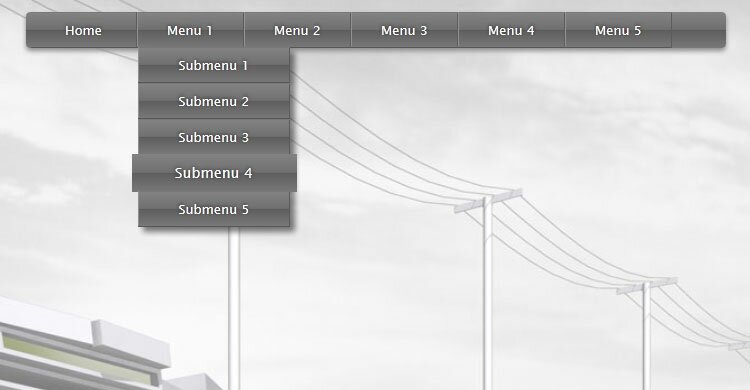
Our new tutorial tells about developing cool musical drop down menu (html5 + css3). This menu has css3 animation effects (neat hover effect to menu elements). We also used html5 Audio element in order to add music to this menu. If you are ready, lets start.
Final result
Here are samples and downloadable package:
Live Demo
download in package
Step 1. HTML
As the first, we should prepare HTML layout of our menu. Each menu element (which actually is a unordered list item) has anchor, or nested level.
<ul id="nav">
    <li><a href="#">Menu element</a>
        <ul>
            <li><a href="#">Submenu element</a></li>
            .....
        </ul>
    </li>
    <li><a href="#">Menu 4</a></li>
    .....
</ul>
Step 2. CSS
Here are the CSS styles of our menu:
#nav,#nav ul {
    list-style: none outside none;
    margin: 0;
    padding: 0;
}
#nav {
    font-family: "Lucida Sans Unicode",Verdana,Arial,sans-serif;
    font-size: 13px;
    height: 36px;
    list-style: none outside none;
    margin: 40px auto;
    text-shadow: 0 -1px 3px #202020;
    width: 700px;
    /* border radius */
    -moz-border-radius: 4px;
    -webkit-border-radius: 4px;
    border-radius: 4px;
    /* box shadow */
    -moz-box-shadow: 0px 3px 3px #cecece;
    -webkit-box-shadow: 0px 3px 3px #cecece;
    box-shadow: 0 3px 4px #8b8b8b;
    /* gradient */
    background-image: -webkit-gradient(linear, left bottom, left top, color-stop(0, #787878), color-stop(0.5, #5E5E5E), color-stop(0.51, #707070), color-stop(1, #838383));
    background-image: -moz-linear-gradient(center bottom, #787878 0%, #5E5E5E 50%, #707070 51%, #838383 100%);
    background-color: #5f5f5f;
}
#nav li {
    border-bottom: 1px solid #575757;
    border-left: 1px solid #929292;
    border-right: 1px solid #5d5d5d;
    border-top: 1px solid #797979;
    display: block;
    float: left;
    height: 34px;
    position: relative;
    width: 105px;
}
#nav > li:first-child {
    border-left: 0 none;
    margin-left: 5px;
}
#nav ul {
    left: -9999px;
    position: absolute;
    top: -9999px;
    z-index: 2;
}
#nav ul li {
    background: none repeat scroll 0 0 #838383;
    box-shadow: 5px 5px 5px rgba(0, 0, 0, 0.5);
    width: 100%;
}
#nav li a {
    color: #FFFFFF;
    display: block;
    line-height: 34px;
    outline: medium none;
    text-align: center;
    text-decoration: none;
    /* gradient */
    background-image: -webkit-gradient(linear, left bottom, left top, color-stop(0, #787878), color-stop(0.5, #5E5E5E), color-stop(0.51, #707070), color-stop(1, #838383));
    background-image: -moz-linear-gradient(center bottom, #787878 0%, #5E5E5E 50%, #707070 51%, #838383 100%);
    background-color: #5f5f5f;
}
/* keyframes #animation */
@-webkit-keyframes animation {
    0% {
        -webkit-transform: scale(1);
    }
    30% {
        -webkit-transform: scale(1.2);
    }
    100% {
        -webkit-transform: scale(1.1);
    }
}
@-moz-keyframes animation {
    0% {
        -moz-transform: scale(1);
    }
    30% {
        -moz-transform: scale(1.2);
    }
    100% {
        -moz-transform: scale(1.1);
    }
}
#nav li > a:hover {
    /* CSS3 animation */
    -webkit-animation-name: animation;
    -webkit-animation-duration: 0.3s;
    -webkit-animation-timing-function: linear;
    -webkit-animation-iteration-count: 1;
    -webkit-animation-direction: normal;
    -webkit-animation-delay: 0;
    -webkit-animation-play-state: running;
    -webkit-animation-fill-mode: forwards;
    -moz-animation-name: animation;
    -moz-animation-duration: 0.3s;
    -moz-animation-timing-function: linear;
    -moz-animation-iteration-count: 1;
    -moz-animation-direction: normal;
    -moz-animation-delay: 0;
    -moz-animation-play-state: running;
    -moz-animation-fill-mode: forwards;
}
#nav li:hover ul {
    left: 0;
    top: 34px;
    width: 150px;
}
When we hover over a list item, we will animate (scale) it once to emulate beat effect.
Step 3. HTML5 JavaScript
Now, it is time to add music here. In the beginning, we should prepare a new empty array (to keep our Audio objects), and then, when the page is ready, initialize the music:
// variables
var aLoops = []; // sound loops
// initialization
addEvent(window, 'load', function (event) {
    // load music files
    aLoops[0] = new Audio('media/background.ogg');
    aLoops[0].volume = 0.3;
    aLoops[1] = new Audio('media/button.ogg');
    aLoops[1].volume = 1.0;
    aLoops[2] = new Audio('media/button_click.ogg');
    aLoops[2].volume = 1.0;
    aLoops[0].addEventListener('ended', function() { // loop background sound
        this.currentTime = 0;
        this.play();
    }, false);
    aLoops[0].play();
});
And then, we should add the handlers to different events: mouseover, mouseout and click:
// all the buttons
var aBtns = document.querySelectorAll('#nav li');
// onmouseover event handler
addEvent(aBtns, 'mouseover', function (event) {
    aLoops[1].currentTime = 0;
    aLoops[1].play(); // play click sound
});
// onmouseout event handler
addEvent(aBtns, 'mouseout', function (event) {
    aLoops[1].currentTime = 0;
    aLoops[1].pause(); // play click sound
});
// onclick event handler
addEvent(aBtns, 'click', function (event) {
    aLoops[2].currentTime = 0;
    aLoops[2].play(); // play click sound
});
And voila, we have finalized it.
Live Demo
Conclusion
Hope that you’ve enjoyed with our new menu. Good luck!



Great, clean, and very necessary job. Especially considering the recent trend of increasing availability of web pages for people with disabilities.
Thanks to people like you, the internet – surfing becomes easier and more enjoyable.
Thank you!
Why you named it “Musical”? I don’t think it plays any music right?
Hi Sally, Why? It plays, try to select different menu options, or click on them
Hi there,
Very usefull but not working for IE, Opera and some others like Avant.
Regards,
Andy
This menu is optimized for Mozilla (-moz styles) and all webkit-based browsers (like Chrome, Safari). I didn’t include a lot of vendor prefixes for a lot of browsers – you always can add it by self. As example, you can use prefix -o to make it for Opera, in case of IE, you can use -ms prefix.
Awesome……
Is this free too use even for comercial purposes or are these menus for personal use only?
Hello Someone,
You may not use it in commercial purposes, please refer to https://www.script-tutorials.com/terms-of-use/
As it is told, this is free only for personal usage. Other circumstances must be discussed separately.
Great job done Andrew!
It looks really nice, I love the fading effect, but is there a way to fix that empty corner in the right side of the bar?
I tried to change width in many divs and uls but it won’t work perfectly…
Thanks :D
Hi Tita,
You need to adjust width of the ‘#nav’ element, that’s it.
???????????? ??????! ?????????? ?????????? ??? ??????? ??? ??? ?? ???? ????????
?????? ????? ??????????? ?? ???????????????? ???????!
?????? ?????,
????????? ? z-index ????, ??????? ???????????? z-index ? ????????? ????? ????????, ? ????????? ??? ???? ???? ??????? ??????