Whirling CSS3 dropdown menu
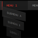
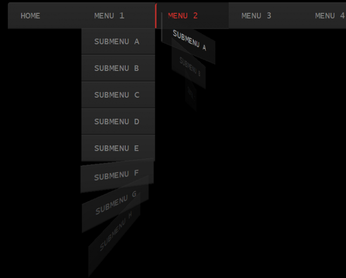
CSS3 menu. Various dropdown menus can be easily created with CSS3 with the help of selectors. Just connect your imagination – and you will create a truly new and unique design. In today’s lesson, we will create a new CSS3 drop-down menu with new effect: when you hover on the upper menu items, the submenu items appear whirling. Just follow this tutorial to see the step by step process of building this menu.
Live Demo
Step 1. HTML
First of all we will need to create the HTML structure for our CSS menu. Like most of other dropdown menus, this is UL-LI drop-down menu. Here is the HTML markup of this menu:
index.html
<ul class="menu">
    <li><a href="#">Home</a></li>
    <li><a href="#s1">Menu 1</a>
        <ul class="submenu">
            <li><a href="#">Submenu a</a></li>
            <li><a href="#">Submenu b</a></li>
            <li><a href="#">Submenu c</a></li>
            <li><a href="#">Submenu d</a></li>
            <li><a href="#">Submenu e</a></li>
            <li><a href="#">Submenu f</a></li>
            <li><a href="#">Submenu g</a></li>
            <li><a href="#">Submenu h</a></li>
        </ul>
    </li>
    <li class="active"><a href="#s2">Menu 2</a>
        <ul class="submenu">
            <li><a href="#">Submenu a</a></li>
            <li><a href="#">Submenu b</a></li>
            <li><a href="#">Submenu c</a></li>
            <li><a href="#">Submenu d</a></li>
            <li><a href="#">Submenu e</a></li>
            <li><a href="#">Submenu f</a></li>
            <li><a href="#">Submenu g</a></li>
            <li><a href="#">Submenu h</a></li>
        </ul>
    </li>
    <li><a href="#">Menu 3</a>
        <ul class="submenu">
            <li><a href="#">Submenu a</a></li>
            <li><a href="#">Submenu b</a></li>
            <li><a href="#">Submenu c</a></li>
            <li><a href="#">Submenu d</a></li>
            <li><a href="#">Submenu e</a></li>
            <li><a href="#">Submenu f</a></li>
            <li><a href="#">Submenu g</a></li>
            <li><a href="#">Submenu h</a></li>
        </ul>
    </li>
    <li><a href="#">Menu 4</a></li>
    <li><a href="https://www.script-tutorials.com/whirling-dropdown-menu/">Back to tutorial</a></li>
</ul>
Step 2. CSS
Let’s start the CSS by preparing the basic rules:
css/main.css
.menu, .menu ul {
    list-style: none;
    padding: 0;
    margin: 0;
}
.menu {
    height: 58px;
}
.menu li {
    background: -moz-linear-gradient(#292929, #252525);
    background: -ms-linear-gradient(#292929, #252525);
    background: -webkit-gradient(linear, left top, left bottom, color-stop(0%, #292929), color-stop(100%, #252525));
    background: -webkit-linear-gradient(#292929, #252525);
    background: -o-linear-gradient(#292929, #252525);
    filter: progid:DXImageTransform.Microsoft.gradient(startColorstr='#292929', endColorstr='#252525');
    -ms-filter: "progid:DXImageTransform.Microsoft.gradient(startColorstr='#292929', endColorstr='#252525')";
    background: linear-gradient(#292929, #252525);
    border-bottom: 2px solid #181818;
    border-top: 2px solid #303030;
    min-width: 160px;
}
.menu > li {
    display: block;
    float: left;
    position: relative;
}
.menu > li:first-child {
    border-radius: 5px 0 0;
}
.menu a {
    border-left: 3px solid rgba(0, 0, 0, 0);
    color: #808080;
    display: block;
    font-family: 'Lucida Console';
    font-size: 18px;
    line-height: 54px;
    padding: 0 25px;
    text-decoration: none;
    text-transform: uppercase;
}
When we hover on individual menu items, we will highlight them:
.menu li:hover {
    background-color: #1c1c1c;
    background: -moz-linear-gradient(#1c1c1c, #1b1b1b);
    background: -ms-linear-gradient(#1c1c1c, #1b1b1b);
    background: -webkit-gradient(linear, left top, left bottom, color-stop(0%, #1c1c1c), color-stop(100%, #1b1b1b));
    background: -webkit-linear-gradient(#1c1c1c, #1b1b1b);
    background: -o-linear-gradient(#1c1c1c, #1b1b1b);
    filter: progid:DXImageTransform.Microsoft.gradient(startColorstr='#1c1c1c', endColorstr='#1b1b1b');
    -ms-filter: "progid:DXImageTransform.Microsoft.gradient(startColorstr='#1c1c1c', endColorstr='#1b1b1b')";
    background: linear-gradient(#1c1c1c, #1b1b1b);
    border-bottom: 2px solid #222222;
    border-top: 2px solid #1B1B1B;
}
.menu li:hover > a {
    border-radius: 5px 0 0 0;
    border-left: 3px solid #C4302B;
    color: #C4302B;
}
The submenu is hidden by default, and it’s elements are rotated by 90 degrees. When we hover on the top-level menu items, the submenu appears with its children.
/* submenu styles */
.submenu {
    left: 0;
    max-height: 0;
    position: absolute;
    top: 100%;
    z-index: 0;
    -webkit-perspective: 400px;
    -moz-perspective: 400px;
    -ms-perspective: 400px;
    -o-perspective: 400px;
    perspective: 400px;
}
.submenu li {
    opacity: 0;
    -webkit-transform: rotateY(90deg);
    -moz-transform: rotateY(90deg);
    -ms-transform: rotateY(90deg);
    -o-transform: rotateY(90deg);
    transform: rotateY(90deg);
    -webkit-transition: opacity .4s, -webkit-transform .5s;
    -moz-transition: opacity .4s, -moz-transform .5s;
    -ms-transition: opacity .4s, -ms-transform .5s;
    -o-transition: opacity .4s, -o-transform .5s;
    transition: opacity .4s, transform .5s;
}
.menu .submenu li:hover a {
    border-left: 3px solid #454545;
    border-radius: 0;
    color: #ffffff;
}
.menu > li:hover .submenu, .menu > li:focus .submenu {
    max-height: 2000px;
    z-index: 10;
}
.menu > li:hover .submenu li, .menu > li:focus .submenu li {
    opacity: 1;
    -webkit-transform: none;
    -moz-transform: none;
    -ms-transform: none;
    -o-transform: none;
    transform: none;
}
Finally, to add uniqueness – let’s add a delay for each sub-menu item, thus they will appear at different times:
/* CSS3 delays for transition effects */
.menu li:hover .submenu li:nth-child(1) {
    -webkit-transition-delay: 0s;
    -moz-transition-delay: 0s;
    -ms-transition-delay: 0s;
    -o-transition-delay: 0s;
    transition-delay: 0s;
}
.menu li:hover .submenu li:nth-child(2) {
    -webkit-transition-delay: 50ms;
    -moz-transition-delay: 50ms;
    -ms-transition-delay: 50ms;
    -o-transition-delay: 50ms;
    transition-delay: 50ms;
}
.menu li:hover .submenu li:nth-child(3) {
    -webkit-transition-delay: 100ms;
    -moz-transition-delay: 100ms;
    -ms-transition-delay: 100ms;
    -o-transition-delay: 100ms;
    transition-delay: 100ms;
}
.menu li:hover .submenu li:nth-child(4) {
    -webkit-transition-delay: 150ms;
    -moz-transition-delay: 150ms;
    -ms-transition-delay: 150ms;
    -o-transition-delay: 150ms;
    transition-delay: 150ms;
}
.menu li:hover .submenu li:nth-child(5) {
    -webkit-transition-delay: 200ms;
    -moz-transition-delay: 200ms;
    -ms-transition-delay: 200ms;
    -o-transition-delay: 200ms;
    transition-delay: 200ms;
}
.menu li:hover .submenu li:nth-child(6) {
    -webkit-transition-delay: 250ms;
    -moz-transition-delay: 250ms;
    -ms-transition-delay: 250ms;
    -o-transition-delay: 250ms;
    transition-delay: 250ms;
}
.menu li:hover .submenu li:nth-child(7) {
    -webkit-transition-delay: 300ms;
    -moz-transition-delay: 300ms;
    -ms-transition-delay: 300ms;
    -o-transition-delay: 300ms;
    transition-delay: 300ms;
}
.menu li:hover .submenu li:nth-child(8) {
    -webkit-transition-delay: 350ms;
    -moz-transition-delay: 350ms;
    -ms-transition-delay: 350ms;
    -o-transition-delay: 350ms;
    transition-delay: 350ms;
}
.submenu li:nth-child(1) {
    -webkit-transition-delay: 350ms;
    -moz-transition-delay: 350ms;
    -ms-transition-delay: 350ms;
    -o-transition-delay: 350ms;
    transition-delay: 350ms;
}
.submenu li:nth-child(2) {
    -webkit-transition-delay: 300ms;
    -moz-transition-delay: 300ms;
    -ms-transition-delay: 300ms;
    -o-transition-delay: 300ms;
    transition-delay: 300ms;
}
.submenu li:nth-child(3) {
    -webkit-transition-delay: 250ms;
    -moz-transition-delay: 250ms;
    -ms-transition-delay: 250ms;
    -o-transition-delay: 250ms;
    transition-delay: 250ms;
}
.submenu li:nth-child(4) {
    -webkit-transition-delay: 200ms;
    -moz-transition-delay: 200ms;
    -ms-transition-delay: 200ms;
    -o-transition-delay: 200ms;
    transition-delay: 200ms;
}
.submenu li:nth-child(5) {
    -webkit-transition-delay: 150ms;
    -moz-transition-delay: 150ms;
    -ms-transition-delay: 150ms;
    -o-transition-delay: 150ms;
    transition-delay: 150ms;
}
.submenu li:nth-child(6) {
    -webkit-transition-delay: 100ms;
    -moz-transition-delay: 100ms;
    -ms-transition-delay: 100ms;
    -o-transition-delay: 100ms;
    transition-delay: 100ms;
}
.submenu li:nth-child(7) {
    -webkit-transition-delay: 50ms;
    -moz-transition-delay: 50ms;
    -ms-transition-delay: 50ms;
    -o-transition-delay: 50ms;
    transition-delay: 50ms;
}
.submenu li:nth-child(8) {
    -webkit-transition-delay: 0s;
    -moz-transition-delay: 0s;
    -ms-transition-delay: 0s;
    -o-transition-delay: 0s;
    transition-delay: 0s;
}
Live Demo
[sociallocker]
download in package
[/sociallocker]
Conclusion
We have just made another one CSS3 dropdown menu from scratch. Thanks for your patient attention, and if you really like what we done today – share it with all your friends in your social networks using the form below.


Good Programming Knowledge
hey i am on your site first time and your tutorials are great and your efforts are also very much great……i do not know about these languages even ABC of these….so i want your help can you please tell me how to add this whirling dropdown menu in blogspot with details as much as you can or a video tutorial will be very helpful.recently i have added a dropdown menu through a tutorial but that menu does not look good so if you tell me not only about this but also about others like flying css3 navigation menu or pure lavalamp etc which are also great ones……..i will be very very thankful to you for your time to give me detail.thanks
Hi shoaib,
The easiest way for you is to copy the menu’s HTML code and paste it at your website (as HTML) for your menu. And after you will need to provide the menu with CSS styles. However, .. in case if you know nothing about HTML or CSS, I think that you will have some difficulties with any HTML/CSS work. In this case you will need or to learn it, or to hire someone to help you.
LIKE :)
Thanks!
Wow what a cool menu effect! How does this hold up in IE9 and Chrome? Just curious. Slick design.
Hi Nate,
It works great in Chrome, and normal in IE9 (without 3D effect)
Hey Andrew,
Nice menu, thanks for the time and effort for showing it. I do have a question. When you hover the menu, you get the dropdown menu. But i found a bug. If you hover the center of any of the submenu’s, the dropdown menu also appears. That is not what you want to happen. Hover on any of the submenu’s and move your cursor slowly from left to right to see what i mean. So my question is: How do you fix that?
Hi Ben,
Try to comment the following style:
.menu > li:hover .submenu, .menu > li:focus .submenu {
max-height: 2000px;
z-index: 10;
}
It might help
Hey Andrey,
A very late reply, my bad. I tried your code but that didn’t work. And I finally realised that when you use rotateY() that your .submenu li becomes hoverable, even when it isn’t visible.
Because you use rotateY(90deg) the bug almost doesn’t seem to be there. but if you change it to rotateY(1deg) you can see what I mean.
Hi Ben,
Yes, if you don’t rotate it enough (like you say – 1deg) – it will be touchable, but, by default it is rotated on 90 degrees. So we can not hover it in this degree.
Hey Andrey,
i got the same issue here.. is there any solution for it ?
Hi Chris,
Try to move ‘min-width: 160px;’ property from ‘.menu li’ to ‘.menu > li’ (just move it a bit down)
Great…
Btw could you give me more css for Child of Submenu..?
Result:
Menu
– Sub menu A
– Sub menu B – Sub Menu B1
– Sub Menu B2
– Sub Menu C
thanks
Hi Kastam,
I didn’t prepare special styles for the 3rd level, because this menu was supposed to have only 2 levels.
But you can try the following:
1. add ‘position: relative’ for .submenu li
2. add .submenu .submenu { display: none; left: 100%; top: 0; }
3. add .submenu li:hover .submenu { display: block }
This is the easiest solution to achieve the 3rd level
Hi congratulations on your menu this great love, only one could ask for help form the dropdown menu into two columns for example if I have a free menu templates and category I have 10 joomla template blogger-templates etc. .. when viewing hover leaving 5 side and 5 on the other as this would help us to have enough subcategories blog and would look not too long.
Also that submenus are visualizacen, agregarselas I tried and I succeeded but I no longer work the 3d effect definitely I can not, I give you could help me. By the way I hope America understands me speak Spanish. thank you.
Hi Esthela,
There are two ways how you can split the submenu into two columns:
a – you can use two separated parent objects (e.g. Divs) that have float:left.
b – you can make your subelements 50% width, and float:left
Quick question, how would I add another level to the submenu? For instance, i work for a school district, under our “School Board” main menu item, we have an option that is “agenda”, from the agenda submenu it slides out another menu to pick the month’s agenda you wish to view. Is there a way of doing this?
Hi Dusty,
Please check my answer to Kastam, I already explained him how it can be done
Good day! Very interesting menu, but sazhaleniyu written in HTML? Mozhnoli somehow rewritten for PHP? Prompt please. I have a site on Prestshop 1,5,6, x.
I tried to change the menu file css, appearance has changed, and focusing effects are not applied. can you have a description for PHP sites?
Hi Vadim,
Some of your words are not translatable. What is the difficult to turn html into php? Without a doubt, you easily can use ordinary strings in PHP
Nicely done. I’m new to CSS and I’ve been trying to play with the CSS code to learn how you accomplished the various looks, colors, etc. On a site I’m am trying to create there is quite a few sub menus. Some of the submenu names are long which causes the words to wrap on to multiple lines. Is there a way to make the submenus not wrap and extend to the right as needed to keep all the text on one line. Thanks
Hi Frank,
If you use long labels for the menu elements – you will need to expand the width of the menu elements.
RE: Expanding the menu elements, so the long labels won’t overlap?
How do we do this?
Hi Brian,
By default, it should automatically expand menu elements depending on internal text in menu elements.
Hey Andrew Brother,
Whirling CSS3 dropdown menu is a CooooL menu 3D Effect really amazing,
brother help me I want to Add Sub-Sub Menu in this Whirling CSS3 Menu so please tell what I Do.
Hi Alam,
You are third who asks about this opportunity. Fortunately for you, I already answered about it for Kastam, just follow my answer.
Thank you for this wonderful code
But I want a little help Do you edit or add code in the css file
until I can make a sub menu within a sub menu within a sub menu, and so on
(nested sub menu )
Hi Andrew Sir,
Nice 3d Menu Effect in light weight.
Sir Help me i want to add Sub-Sub menu in “Whirling CSS3 dropdown menu”
so Andrew Sir tell me what i Do?
plz reply me
Thanks for this code, it was really nice to work with, I have one issue though, when I make this drop down menu and I don’t have a page filled to the brim with content then I have a scroll bar, yet when I hover over a drop down menu with 6 submenu’s, my scroll bar dissapears and my screen sort of ‘jumps’ and everything moves a few pixels, which is annoying, this again only happens when there is not alot of content on my site.
Thanks for the help in advance.
Ps: I can send you my entire code if needed through a medium of your choice.
Hi Vincent,
This is probably because of other styles of your page. Try to inspect all related styles.
Hi, nice menu. I want to insert this menu in my html5 site, but I can’t. Can you help me, please?
I tried different codes, but I can’t.
Thanks!
Hi Radi,
How exactly can I help you? Do you want to offer this work for me?
Hi Andrew
How can I center this menu on the page?
I tried some tricks I found on the web but it will not move.
Thanks Andrey!
Works great.
I have another question.
I notice that long menu titles are forced to use more lines. I couldn’t find anything in the code that governs this. Finally I used instead of the normal space to overcome this.
Send me your URL, I will try to check it
You can try see the same thing in your demo.
If I change one of the submenus to something like “Submenu moremore” it will use two lines. The text “Submenu moremore moremore” will use three lines.
But if I do the html trick with the & nbsp ; instead of normal space it works on one line.
Hi Max,
I suppose that you need to play with styles of ‘.menu a’ element – there is one property: ‘white-space’, try to put ‘normal’ and then ‘nowrap’. So you will see how it works
Hi Max, in order to center the menu you may use the following additional styles for the main menu element (.menu) : display: table and margin: 0 auto
You can also consider this: text-align: center
Hi Andrey,
Thank you for this great tutorial and the amazing effect. I’ve managed to implement half of it – the part where the menu goes down but the fade out is not working for me and the menu just disappears. Will it be to much to ask you to take a quick look and tell me where did I go wrong?
Thank you in advance,
Guy.
Hi Guy,
Make sure that you applied all css styles for the menu, especially with transition effects.
Good looking menu.
I found a bug when being displayed in IE 11 and some mobile browsers.
It happens in:
.menu > li:first-child {
border-radius: 5px 0 0 0;
}
For some reason the border-radius adds a vertical white line in IE 11. Even though I do like the rounded corner I like the menu being compatible in IE 11 and mobile browsers more…
You can delete this part in your CSS or set the 5px to 0 to get around this issue as I haven’t found any good resolution to resolving it.
I only found 1 more small issue. I had the menu tested by 20 random people and have confirmed that 1 in 20 people including me see a white menu instead of the dark blackish menu. I had the same issue when using my default browser on my Samsung Illusion phone.
I’m not sure why I get this problem. maybe because the browser can’t render the gradients properly.
Anyways this probably isn’t the best solution, but you can add a background-color to the .menu li and the menu will no longer be white.
.menu li {
background-color:#272727;
}
Hi Derek,
I have just checked the menu in IE11, and I didn’t notice any problems with styles (the border radius works well).
Hi!
Please help, I try use this in php but not working :( What I must change in scripts? And where? Some add in css file or php site?
Hi Abraxas,
You need to give more details about your difficulties. This is not a problem to use it in PHP or any other web language.