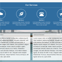
Bootstrap one-page template with Parallax effect
Bootstrap tutorial / parallax scrolling tutorial. It is no secret that the bootstrap is used on many websites now. This allows to save time and create excellent results in a short period of time. In particular it concerns the markup and styles. Last time, when we wrote about the bootstrap, we received many positive comments, so I decided to prepare another lesson on using this framework today. In order to make it more interesting, we’ll create the demonstration with one of the interesting effects – Parallax. We will see the use of different backgrounds when scrolling the page. In order to understand what we intend to do – please have a look at the demo.
Live Demo
Step 1. HTML
For a start – prepare a skeleton markup:
index.html
<!DOCTYPE html>
<html lang="en" >
<head>
  <meta charset="utf-8" />
  <meta name="author" content="Script Tutorials" />
  <title>Bootstrap one-page template with Parallax effect | Script Tutorials</title>
  <meta name="viewport" content="width=device-width, initial-scale=1.0, maximum-scale=1.0, user-scalable=no">

  <!-- attach CSS styles -->
  <link href="css/bootstrap.min.css" rel="stylesheet">
  <link href="css/style.css" rel="stylesheet" />
</head>
<body>

  <!--  BODY PAGE CONTENT -->

  <!-- attach JavaScripts -->
  <script src="js/jquery-1.10.2.js"></script>
  <script src="js/bootstrap.min.js"></script>
  <script src="//maps.google.com/maps/api/js?sensor=true"></script>
  <script src="js/main.js"></script>
</body>
</html>
This is the minimal markup which allows us to use the responsive nature of the Bootstrap. Now we can begin with adding new elements to the page.
Top navigation menu
This is the fixed navigation bar. Here is the markup:
<!-- navigation panel -->
<nav class="navbar navbar-default navbar-fixed-top" role="navigation">
  <div class="container-fluid">
    <!-- Brand and toggle get grouped for better mobile display -->
    <div class="navbar-header">
      <button type="button" class="navbar-toggle" data-toggle="collapse" data-target="#navbar-collapse-main">
        <span class="sr-only">Toggle navigation</span>
        <span class="icon-bar"></span>
        <span class="icon-bar"></span>
        <span class="icon-bar"></span>
      </button>
      <a class="navbar-brand" href="#">Your Brand Name</a>
    </div>

    <div class="collapse navbar-collapse" id="navbar-collapse-main">
      <ul class="nav navbar-nav navbar-right">
        <li><a href="#home">Home</a></li>
        <li><a href="#about">About</a></li>
        <li><a href="#services">Services</a></li>
        <li><a href="#information">Information</a></li>
        <li><a href="#google_map">Contact</a></li>
        <li><a href="http://script-tutorials.com/bootstrap-one-page-template-with-parallax-effect/">Back to tutorial</a></li>
      </ul>
    </div><!-- /.navbar-collapse -->
  </div><!-- /.container-fluid -->
</nav>
Basically, this is UL-LI-based menu (as usual). There are links to different sections of the page
Section 1 – Home
The first section is full-sized greeting page:
<!-- first section - Home -->
<div id="home" class="home">
  <div class="text-vcenter">
    <h1>Hello World</h1>
    <h3>This is bootstrap-based layout</h3>
    <a href="#about" class="btn btn-default btn-lg">Continue</a>
  </div>
</div>
<!-- /first section -->
The greeting text is aligned vertically by center.
Section 2 – About
There are two columns, the image is in the first columnm and centered text is in the right column:
<!-- second section - About -->
<div id="about" class="pad-section">
  <div class="container">
    <div class="row">
      <div class="col-sm-6">
        <img src="images/logo.png" alt="" />
      </div>
      <div class="col-sm-6 text-center">
        <h2>Lorem ipsum dolor sit amet, consectetur adipiscing elit. Donec in sem cras amet.</h2>
        <p class="lead">Lorem ipsum dolor sit amet, consectetur adipiscing elit. Sed interdum metus et ligula venenatis, at rhoncus nisi molestie. Pellentesque porttitor elit suscipit massa laoreet metus.</p>
      </div>
    </div>
  </div>
</div>
<!-- /second section -->
Section 3 – Services
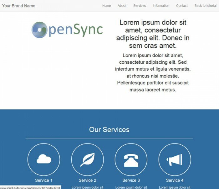
This blue section consists of four elements with glyph icons provided by the bootstrap:
<!-- third section - Services -->
<div id="services" class="pad-section">
  <div class="container">
    <h2 class="text-center">Our Services</h2> <hr />
    <div class="row text-center">
      <div class="col-sm-3 col-xs-6">
        <i class="glyphicon glyphicon-cloud"> </i>
        <h4>Service 1</h4>
        <p>Lorem ipsum dolor sit amet, consectetur adipiscing elit. Donec in sem cras amet. Donec in sem cras amet.</p>
      </div>
      <div class="col-sm-3 col-xs-6">
        <i class="glyphicon glyphicon-leaf"> </i>
        <h4>Service 2</h4>
        <p>Lorem ipsum dolor sit amet, consectetur adipiscing elit. Donec in sem cras amet. Donec in sem cras amet.</p>
      </div>
      <div class="col-sm-3 col-xs-6">
        <i class="glyphicon glyphicon-phone-alt"> </i>
        <h4>Service 3</h4>
        <p>Lorem ipsum dolor sit amet, consectetur adipiscing elit. Donec in sem cras amet. Donec in sem cras amet.</p>
      </div>
      <div class="col-sm-3 col-xs-6">
        <i class="glyphicon glyphicon-bullhorn"> </i>
        <h4>Service 4</h4>
        <p>Lorem ipsum dolor sit amet, consectetur adipiscing elit. Donec in sem cras amet. Donec in sem cras amet.</p>
      </div>
    </div>
  </div>
</div>
<!-- /third section -->
Section 4 – Information
This is the second wide section with full-size background, plus, there are two additional blocks (panels):
<!-- fourth section - Information -->
<div id="information" class="pad-section">
<div class="container">
<div class="row">
<div class="col-sm-6">
<div class="panel panel-default">
<div class="panel-heading">
<h2 class="panel-title">Additional information</h2>
</div>
<div class="panel-body lead">
Lorem ipsum dolor sit amet, consectetur adipiscing elit. Sed hendrerit adipiscing blandit. Aliquam placerat, velit a fermentum fermentum, mi felis vehicula justo, a dapibus quam augue non massa. Duis euismod, augue et tempus consequat, lorem mauris porttitor quam, consequat ultricies mauris mi a metus. Phasellus congue, leo sed ultricies tristique, nunc libero tempor ligula, at varius mi nibh in nisi. Aliquam erat volutpat. Maecenas rhoncus, neque facilisis rhoncus tempus, elit ligula varius dui, quis amet.
</div>
</div>
</div>
</div>
</div>
</div>
<!-- /fourth section -->
Section 5 – Contacts and Footer
In fact, there are three elements – the narrow blue service line (to put some extra information), the google map, where you can put your company address (as a pin on the map):
<!-- fifth section -->
<div id="services" class="pad-section">
<div class="container">
<div class="row">
<div class="col-sm-12 text-center">
<h3>Parallax scrolling effect is in action</h3>
<h4>The next is the address on Google maps</h4>
</div>
</div>
</div>
</div>
<!-- /fifth section -->
<!-- google map -->
<div id="google_map"></div>
<!-- /google map -->
<!-- footer -->
<footer>
<hr />
<div class="container">
<p class="text-right">Copyright © Your Company 2014</p>
</div>
</footer>
<!-- /footer -->
Step 2. CSS
You may have noticed that most elements already received all necessary styles at once. However, we still have to define styles for all new non-standard elements:
css/style.css
/* general styles */
html, body {
  height: 100%;
  width: 100%;
}

/* padded section */
.pad-section {
  padding: 50px 0;
}
.pad-section img {
  width: 100%;
}

/* vertical-centered text */
.text-vcenter {
  display: table-cell;
  text-align: center;
  vertical-align: middle;
}
.text-vcenter h1 {
  font-size: 4.5em;
  font-weight: 700;
  margin: 0;
  padding: 0;
}

/* additional sections */
#home {
  background: url(../images/home.jpg) no-repeat center center fixed;
  display: table;
  height: 100%;
  position: relative;
  width: 100%;
  -webkit-background-size: cover;
  -moz-background-size: cover;
  -o-background-size: cover;
  background-size: cover;
}

#about {
}

#services {
  background-color: #306d9f;
  color: #ffffff;
}
#services .glyphicon {
  border: 2px solid #FFFFFF;
  border-radius: 50%;
  display: inline-block;
  font-size: 60px;
  height: 140px;
  line-height: 140px;
  text-align: center;
  vertical-align: middle;
  width: 140px;
}

#information {
  background: url(../images/estate.jpg) no-repeat center center fixed;
  display: table;
  height: 800px;
  position: relative;
  width: 100%;
  -webkit-background-size: cover;
  -moz-background-size: cover;
  -o-background-size: cover;
  background-size: cover;
}
#information .panel {
  opacity: 0.85;
}

#google_map {
  height: 500px;
}

footer {
  padding: 20px 0;
}
footer .glyphicon {
  color: #333333;
  font-size: 60px;
}
footer .glyphicon:hover {
  color: #306d9f;
}
Step 3. JavaScript
In the end, there is the google map, in order to initialize it (with a predefined address) we have to add the following code:
js/main.js
$(document).ready(function (){

  // create a LatLng object containing the coordinate for the center of the map
  var latlng = new google.maps.LatLng(-33.86455, 151.209);

  // prepare the map properties
  var options = {
    zoom: 15,
    center: latlng,
    mapTypeId: google.maps.MapTypeId.ROADMAP,
    navigationControl: true,
    mapTypeControl: false,
    scrollwheel: false,
    disableDoubleClickZoom: true
  };

  // initialize the map object
  var map = new google.maps.Map(document.getElementById('google_map'), options);

  // add Marker
  var marker1 = new google.maps.Marker({
    position: latlng, map: map
  });

  // add listener for a click on the pin
  google.maps.event.addListener(marker1, 'click', function() {
    infowindow.open(map, marker1);
  });

  // add information window
  var infowindow = new google.maps.InfoWindow({
    content:  '<div class="info"><strong>This is my company</strong><br><br>My company address is here<br> 32846 Sydney</div>'
  });
});
Live Demo
Conclusion
That is all for now, we just finished the layout of our page. I hope that you like the result. Another advantage is the fact that this template is responsive by default, and it means that it looks good at all possible devices (including mobile phones).





Great post, thanks!
How to enable smooth transitions between the page sections?
Hi Adolfo,
You can use css3 transition to achieve this effect
Could you post a code example for smooth transitions with css3?
Hi Jay,
What smooth transition idea did you have? To scroll down smoothly when you click on menu elements?
may be this help
https://github.com/git-neelesh/bootstrap-nav-smoothscroll
Thanks for your contribution
Helo i what i should to change in style css so i want first create Section 4 – information and then Section 3 – Services
Hello,
You don’t need to change CSS, you only need to move (whole) sections in HTML
I am trying this because I need to make a similar website for a client but it seems to take a long time to load. What could possibly cause this to happen? I am using Dreamweaver CS5 for this. I do love the effect and thanks for sharing it.
Hi Tommie,
Instead of Dreamweaver, I recommend that you use Notepad++. However this is off-topic. How much is your ‘long time’ to load? less them 1 sec? You may try not to load google maps.
Hi great tutorial I was wondering if this can be applied to WordPress?
Hi Dlabz,
Yes, of course it can be applied for WP (as well as for any other engine)
I tweeted but still can’t figure out how to unlock and DL the source. :-(
Hi Jim, right after you retweet, or g+/fb, the page should be refreshed and you should see the unlocked download button, try again – it should work properly
Brilliant post.
i am planning on crating something like that. but i encountered some few problems
I am using the cover template on bootstrap.
my header and footer are not fixed to there positions.
I want my header to be fixed and the footer should remain at the bottom.
here is my source code
Phoenix E-solution
<!– Bootstrap core CSS –>
<!– Brand and toggle get grouped for better mobile display –>
Toggle navigation
Cover
<a href="#" rel="nofollow">Home</a>
<a href="#" rel="nofollow">Features</a>
<a href="#" rel="nofollow">Contact</a>
Cover your page.
Cover is a one-page template for building simple and beautiful home pages. Download, edit the text, and add your own fullscreen background photo to make it your own.
<a href="#" rel="nofollow">Learn more</a>
Cover your page.
Cover is a one-page template for building simple and beautiful home pages. Download, edit the text, and add your own fullscreen background photo to make it your own.
<a href="#" rel="nofollow">Learn more</a>
<!– Bootstrap core JavaScript
================================================== –>
<!– Placed at the end of the document so the pages load faster –>
Css styles for sticky footer.
}
html, body {
height: 100%;
}
.wrapper {
min-height: 100%;
height: auto !important;
height: 100%;
margin: 0 auto -155px; /* the bottom margin is the negative value of the footer’s height */
}
.footer, .push {
height: 155px; /* .push must be the same height as .footer */
}
Please help me with it.
Thanks
Hi Akintunde,
I usually don’t override styles when I use bootstrap (I do it really rarely). I think that it would be easier if I can investigate it at my computer. PM me your website link.
Nice tutorial.
I have it working, and with a nice jquery scroll transition.
One thing I notice is that when using a mobile browser, the dropdown menu does not close after navigating to an anchor, so it still occupies most of the screen.
How do I edit this behaviour ?
Hello Craig, yes, you are right, for the mobile browsers, the in-page navigation links will work in this way, until we use additional javascript code to force closing the navbar
Closing the dropdown menu in mobile browsers.
Navigating to anchors on the same page leaves the menu open, which occupies a lot of the screen
Here is a simple fix to close the menu
$(‘.nav a’).on(‘click’, function(){
if ($(document).width() <= 767){
$(".navbar-toggle").click();
}
});
Thanks for the provided code.
Hello,
The parallax effect does not work in mobile, as you say. Instead, the image is static, and scrolls with the browser. In iOS, there is even more issue, where the background image is not rendered at mobile resolution.
Hi Paul, it should work on the mobile devices. Here could be some delay, because of fixed background, but anyway it works.
I’m seeing the same issues Paul is actually. The content scales fine, but the background images being static and scroll with the content. Do you have a fix for this?
Hi Amy, refer to my answer to Taryn
Thank you so much Andrey for this simple and awesome tutorial.
hey this is a great tutorial i followed your code word for word but google maps still never shows up like it does in the demo option that you provided i don’t know why
Hi Alex, make sure that you connected the google maps api (check it in the bottom of the html code)
Great Tutorial really helped me out.
Superb post.
I am struggling with swapping out the Home section (Section 1 – Home) with a responsive vertical and central image.
Doing this:
Gives me the vertical and central aspect but it does not resize!
Any help much appreciated.
Hello GK,
With regards to the image, try to set it’s class to ‘img-responsive’ to make it responsive.
How do you make the nav bar collapse after you click a link?
To make it auto-collapsed, add the following properties to the menu elements:
data-toggle=”collapse” data-target=”.navbar-collapse.in” class=”collapsed”
Great tutorial, many thanks! I see to be having a similar problem to Paul in that I’ve followed your CSS for the background images and added in an extra set of rules to center the image. When viewed on a smaller screen size (iPhone or similar) the background image doesn’t resize and is very pixellated. Here is the CSS:
#home {
background-image: url(../img/hyena-pan-background.jpg);
display: table;
height: 100%;
position: relative;
width: 100%;
-webkit-background-size: cover;
-moz-background-size: cover;
-o-background-size: cover;
background-size: cover;
background-attachment: fixed;
background-repeat: no-repeat;
background-position: center center;
}
Any idea as to what is causing this?
Thanks, after some research with Taryn, I found that ‘background-attachment: fixed’ is not supported on iPhones, however it is supported on other mobile phones (including tablets). It can be ‘fixed’ with ‘background-attachment: scroll’ instead of the ‘fixed’ value.