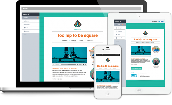
As we know, websites widely use email for mass mailing of news and other messages. This is one of the main means of delivering information. The letter itself plays a big role – many things depend on it: from the initial understanding the importance of website and even trust level of website. Today we look at the process of creating markup for the letter.
The process of creating HTML/CSS email templates starts with working on a XHTML doctype that will look like:
<!DOCTYPE html PUBLIC "-//W3C//DTD XHTML 1.0 Transitional//EN" "http://www.w3.org/TR/xhtml1/DTD/xhtml1-transitional.dtd">
<html xmlns="http://www.w3.org/1999/xhtml">
    <head>
        <meta http-equiv="Content-Type" content="text/html; charset=utf-8" />
        <style type="text/css">
        body {margin: 0; padding: 0; min-width: 100%!important;}
        .content {width: 100%; max-width: 600px;}
        </style>
        <title>basic html Email</title>
    </head>
    <body bgcolor="#eef0e8">
        <table width="100%" bgcolor="#eef0e8" border="0" cellpadding="0" cellspacing="0">
            <tr>
                <td>
                    <table class=" content" align="center" cellpadding="0" cellspacing="0" border="0">
                        <tr>
                            <td>
                                Header example
                            </td>
                        </tr>
                    </table>
                </td>
            </tr>
        </table>
    </body>
</html>
It is a basic page with the header, doctype and container table with a background color applied to the body. The class on content defines the main content table.
Creating the header
It is time to add the first row of our table as header. For the same, add the below given style to the row that we have already created.
<td class="header" bgcolor="#bed691">
Header example
</td>
Now it is the time to add CSS and then padding for the header will go like:
.header {padding: 30px 25px 18px;}
Including the first responsive row
It is time to add the first responsive row. We will be creating two tables by using align HTML property.
Left Column
Here, we are going to replace the ‘Header example’ label with the following markup:
<table width="70" align="left" border="0" cellpadding="0" cellspacing="0">
    <tr>
        <td height="70" style="padding: 0 20px 20px 0;">
            <img src="images/icon.png" width="70" height="70" border="0" alt="" / >
        </td>
    </tr>
</table>
The padding to the bottom text will work to provide vertical breathing room when the two columns will be viewed on mobile.
Right column
By aligning a table to the left, we will now be creating the right column. Our ideal table length will be 445px wide, which will provide 25px extra space to spare on right hand side. This alignment is important so that your HTML email template could easily be viewed over email clients such as outlook.
On the right hand table, similar approach will be used that includes developing a class and then adding a class along with conditioner wrapper code. Additionally, we will make the table responsive so that it could appear 100% wide on mobile.
<!--[if (gte mso 9)|(IE)]>
<table width="430" align="left" cellpadding="0" cellspacing="0" border="0">
    <tr>
        <td>
        <![endif]-->
            <table class="column" align="left" border="0" cellpadding="0" cellspacing="0" style="width: 100%; max-width: 430px;">style="width: 100%; max-width: 430px;">
                <tr>
                    <td height="70">
                    </td>
                </tr>
            </table>
        <!--[if (gte mso 9)|(IE)]>
        </td>
    </tr>
</table>
<![endif]-->
Inside the cell, we will add styled heading, as:
<table width="100%" border="0" cellspacing="0" cellpadding="0">
    <tr>
        <td class="subhead" style="padding: 0 0 0 3px;">
            Lorem ipsum dolor
        </td>
    </tr>
    <tr>
        <td class="h1" style="padding: 5px 0 0 0;">
            Lorem ipsum dolor sit amet, consectetur
        </td>
    </tr>
</table>
With this last table, the header is now completed and addition of responsive element ensures that the template will easily scale on the mobile device too.
Designing single column text row
It just requires adding a new row to the content table to add single column text row. We need to add an innerpadding class to these rows. A class of borderbottom will also be added to include a border to each row, such as:
<tr>
    <td class="innerpadding borderbottom">
        <table width="100%" border="0" cellspacing="0" cellpadding="0">
            <tr>
                <td class="h2">
                    Lorem ipsum dolor sit amet, consectetur
                </td>
            </tr>
            <tr>
                <td class="bodycopy">
                    Lorem ipsum dolor sit amet, consectetur adipiscing elit. In tempus adipiscing felis, sit amet blandit ipsum volutpat sed. Morbi porttitor, eget accumsan dictum, nisi libero ultricies ipsum, in posuere mauris neque at erat.
                </td>
            </tr>
        </table>
    </td>
</tr>
CSS for this section will be embedded as:
.innerpadding {padding: 30px;}
.borderbottom {border-bottom: 1px solid #f9f1ef;}
.h2 {padding: 0 0 15px 0; font-size: 24px; line-height: 26px; font-weight: bold;}
.bodycopy {font-size: 16px; line-height: 22px;}
Working on double column article
Here we will be working on creating a responsive row as we worked on the header. This table will have different dimension, so as to include larger images.
<tr>
  <td class="innerpadding borderbottom">
    <table width="115" align="left" border="0" cellpadding="0" cellspacing="0">
      <tr>
        <td height="115" style="padding: 0 20px 20px 0;">
          <img src="images/article1.png" width="115" height="115" border="0" alt="" />
        </td>
      </tr>
    </table>
    <!--[if (gte mso 9)|(IE)]>
      <table width="380" align="left" cellpadding="0" cellspacing="0" border="0">
        <tr>
          <td>
    <![endif]-->
    <table class="col380" align="left" border="0" cellpadding="0" cellspacing="0" style="width: 100%; max-width: 380px;">
      <tr>
        <td>
          <table width="100%" border="0" cellspacing="0" cellpadding="0">
            <tr>
              <td class="bodycopy">
                Lorem ixapsum dolor sit amet, cxaonsectetur adipiscing elit. In tempus adipiscing felis, sit amet blandit ipsum volutpat sed. Morbi porttitor, eget accumsan dictum, nisi libero ultricies ipsum, in posuere mauris neque at erat.
              </td>
            </tr>
            <tr>
              <td style="padding: 20px 0 0 0;">
                <table class="buttonwrapper" bgcolor="#dc4937" border="0" cellspacing="0" cellpadding="0">
                  <tr>
                    <td class="button" height="45">
                      <a href="#">Claim yours!</a>
                    </td>
                  </tr>
                </table>
              </td>
            </tr>
          </table>
        </td>
      </tr>
    </table>
    <!--[if (gte mso 9)|(IE)]>
          </td>
        </tr>
    </table>
    <![endif]-->
  </td>
</tr>
CSS style for this button will appear as:
.button {text-align: center; font-size: 18px; font-family: sans-serif; font-weight: bold; padding: 0 30px 0 30px;}
.button a {color: #ffffff; text-decoration: none;}
Developing single column image
In order to create single column image, we only require to set image that is 100% (width) of the email. Set the height automatically using CSS.
<tr>
    <td class="innerpadding borderbottom">
        <img src="images/image.png" width="100%" border="0" alt="" />
    </td>
</tr>
And for CSS, use
img {height: auto;}
Working on final text row
Now, it is time to add row of text without border on bottom, like:
<tr>
    <td class="innerpadding borderbottom">
    Loxrem ipsczum dolor sit amet, consczectetur adipiscing elit. In tempus adipiscing felis, sit amet blandit ipsum volutpat sed. Morbi porttitor, eget accumsan dictum, nisi libero ultricies ipsum, in posuere mauris neque at erat.
    </td>
</tr>
Working on the footer
In order to create footer, it is important to add a new table row inside. We will also be adding another table for social media icons.
<tr>
<td class="footer" bgcolor="#44525f">
<table width="100%" border="0" cellspacing="0" cellpadding="0">
<tr>
<td align="center" class="footercopy">
&reg; Someone, somewhere 2013<br/>
<a href="#"><font color="#ffffff">Unsubscribe</font></a> from this newsletter instantly
</td>
</tr>
<tr>
<td align="center" style="padding: 20px 0 0 0;">
<table border="0" cellspacing="0" cellpadding="0">
<tr>
<td width="37" style="text-align: center; padding: 0 10px 0 10px;">
<a href="http://www.facebook.com/">
<img src="images/facebook.png" width="37" height="37" alt="Facebook" border="0" />
</a>
</td>
<td width="37" style="text-align: center; padding: 0 10px 0 10px;">
<a href="http://www.twitter.com/">
<img src="images/twitter.png" width="37" height="37" alt="Twitter" border="0" />
</a>
</td>
</tr>
</table>
</td>
</tr>
</table>
</td>
</tr>
The required CSS style will come up as:
.footer {padding: 20px 30px 15px 30px;}
.footercopy {font-family: sans-serif; font-size: 14px; color: #ffffff;}
.footercopy a {color: #ffffff; text-decoration: underline;}
Optimizing for mobile
Instead of using plain text, it is suggested to use whole button links. Tapping a whole link is much easier than pressing a tiny link with your finger. For this link to work well on diverse email clients, the coding will go as:
@media only screen and (max-width: 550px), screen and (max-device-width: 550px) {
body .buttonwrapper {background-color: transparent!important;}
body .button a {background-color: #dc4937; padding: 15px 15px 13px!important; display: block!important;}
The final procedure
As the entire coding has been done, it is now time to ensure the validity of the codes by using W3C validator. Checking the codes is an important step to ensure the tags have been developed flawlessly.
Conclusion
After you are done with the procedure that has been discussed above, you can successfully create HTML email templates. In case, you are not able to perform the coding successfully, professional help is easily available to a number of service providers. A little research in this direction can help you to hire exceptional service providers.


