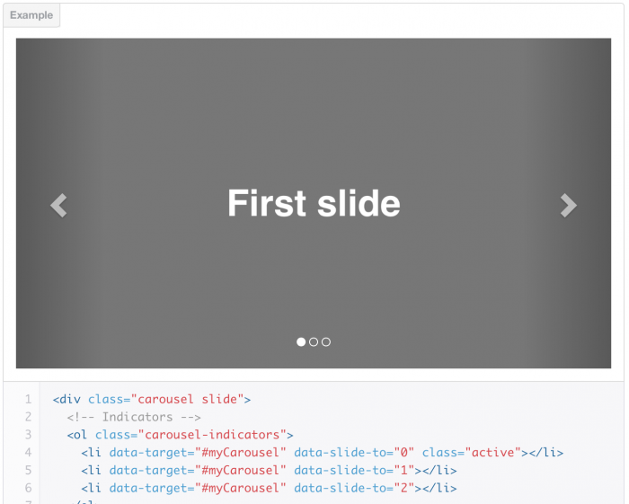
Bootstrap slider. Twitter Bootstrap 3 is one of the best CSS frameworks to develop and design content management systems. With Bootstrap you can easily create blogs or pages of the portfolio using a system of grids Twitter Bootstrap (grid layout). At the heart of many CMS systems we usually have a base component “Slider” (Carousel), basically – it auto-sequential display of images, but it can be whatever you like: it can display the latest completed projects, reviews of your customers, description of special offers, links to news or latest articles from your blog. In this article, we will explore how to create a slider using Twitter Bootstrap 3 Carousel component.
Introduction to component Twitter Bootstrap 3 Carousel
The layout for the carousel component is as follows:
<div id="carousel-example-generic" class="carousel slide" data-ride="carousel">
  <!-- Indicators -->
  <ol class="carousel-indicators">
    <li data-target="#carousel-example-generic" data-slide-to="0" class="active"></li>
    <li data-target="#carousel-example-generic" data-slide-to="1"></li>
    <li data-target="#carousel-example-generic" data-slide-to="2"></li>
  </ol>
  <!-- Slider content (slider wrap)-->
  <div class="carousel-inner">
    <div class="item active">
      <img src="..." alt="...">
      <div class="carousel-caption">
        ...
      </div>
    </div>
    ...
  </div>
  <!-- Controls -->
  <a class="left carousel-control" href="#carousel-example-generic" data-slide="prev">
    <span class="glyphicon glyphicon-chevron-left"></span>
  </a>
  <a class="right carousel-control" href="#carousel-example-generic" data-slide="next">
    <span class="glyphicon glyphicon-chevron-right"></span>
  </a>
</div>
From the code above, we can see that slider Bootstrap 3 is divided into several parts:
- Indicators
- Slider content
- Controls
To set the div element as a slider, we add a class names: carousel and slide. Class carousel creates the effect of a “carousel”, ie change slides in a circle. Class slide adds a sliding animation from right or left side. Indicators – are small circles at the bottom-center of the slider, they determine the current position of the slide and the number of slides. Indicators are defined with an ordered list.
<ol class="carousel-indicators">
  <li data-target="#carousel-example-generic" data-slide-to="0" class="active"></li>
  <li data-target="#carousel-example-generic" data-slide-to="1"></li>
  <li data-target="#carousel-example-generic" data-slide-to="2"></li>
</ol>
An ordered list has a class carousel-indicators, which makes the child elements as small circles. Each li element should have attribute data-target with id of the parent container. It also needs to have the attribute data-slide-to with a unique integer value to increase the order (position) and the value should begin with “0”. The slide content is an essential part of the slider. In this space we will put our content for the slider. Slider content is determined by using class carousel-inner. This div element can have an unlimited number of nested div. The first element should be active by default, so add the class active.
<div class="carousel-inner">
  <div class="item active">
    <img src="..." alt="...">
    <div class="carousel-caption">
      ...
    </div>
  </div>
  ...
</div>
Each element with a class item has two subsections: image and carousel-caption. The image is used as the background for a slide. Element with carousel-caption is positioned above the image, and is used as a title for the slide. Inside the carousel-caption, we can put <h3> </ h3> or <p> </ p> element, or even both. Control is the right and left arrows are used to change the slide manually.
<!-- Controls -->
  <a class="left carousel-control" href="#carousel-example-generic" data-slide="prev">
    <span class="glyphicon glyphicon-chevron-left"></span>
  </a>
  <a class="right carousel-control" href="#carousel-example-generic" data-slide="next">
    <span class="glyphicon glyphicon-chevron-right"></span>
  </a>
</div>
There should be two elements: one for each direction. The first element will have a span element with classes glyphicon glyphicon-chevron-left, which are the left arrow icon, and the second element will have classes glyphicon glyphicon-chevron-right, that are the right arrow. In Bootstrap, in order to display icons, we can use fonts instead of images.
That’s it! You have successfully created the slider for your website. Plus, you have not written a single line of JavaScript code yet, bootstrap.js did everything for you.
Carousel options
For additional adjustment of the slider you can add multiple data-* attributes to the parent carousel container.
- ‘data-interval’ is used to specify the time interval between slides. It takes a digit value, and the number should be in milliseconds.
- ‘data-pause’ is used to determine when the pause event will be invoked. For example, when this is equal to “hover”, the sliding will stops when the mouse is on the slider.
- ‘data-wrap’ is a boolean attribute and allows you to set whether or not to re-start sliding if the end of the slide is reached.
Customizing with JQuery
If you like to use jQuery and data-* attributes, the Bootstrap allows initialization via JavaScript. To make the div carousel, you can write the following code:
$('.carousel').carousel();
Options for the carousel can be set through the parameters. For example:
$('.carousel').carousel({
  interval: 2000,
  pause: 'hover',
  wrap: true
});
You can also manually invoke events of the slider using the following code:
- .carousel(‘pause’) // pause
- .carousel(‘cycle’) // turn the slides
- .carousel(3) // display the forth slide in the slider
- .carousel(‘prev’) // show previous slide
- .carousel(‘next’) // show the next slide in the slider
The above methods can be called from any JavaScript code to manipulate the normal operation of the slider. I find the prev and next methods are very useful, and especially if I want to show my own buttons instead of the standard arrows. Especially when they are located outside the carousel layout.
Conclusion
Our article should be helpful for you to learn how to create a slider without writing thousands of lines of code in JavaScript. I believe that the Twitter Bootstrap will be an integral part of your development work. No doubt, it will increase the speed of development. The most important is that this is cross-browser solution, so you do not have to tear your hair out to make them work in older browsers.


