
Infographic: Anatomy Of A Perfect Page
Thematic collections of infographic are always interesting for people. Especially if it is somehow related to their field of activity. For today, I have prepared another collection which is devoted to the structure of a web page. Here is told, but rather shows the basic elements of almost every web page. Also, there is given all sorts of advice on how to make this page efficient and ideal. These recommendations will be useful to all web designers and developers.
Information Graphics (known as infographics) are one of the best ways to transfer some information into a reader’s mind. It can be something new, or other useful information gathered in one place. Nowadays many people don’t have enough time to read a lot of text on multiple screens. Infographic makes the information intuitive and understandable. That’s why we would like to share the best relevant infographics from all over the web.

Original source: The Anatomy of an Effective Homepage
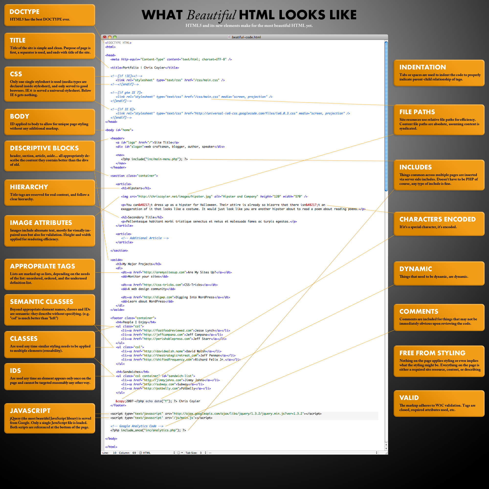
Original source: What Beautiful HTML Code Looks Like

Original source: Anatomy Of A Perfect Landing Page


Excellent article, so many people do not care about usability when they build websites. Really good congratulations.
Good Article !
that’s nice!
What Beautiful HTML Code Looks Like:
– why there is no lang atribute in html tag?
– why charset is not defined in html5 style?
And there is no aria roles and outdated ie conditional for IE6??