
In our new tutorial we will create animated flask with bubbles. Not so long ago I was tasked to create an animation in the form of bubbles emitting from the flask. It was the original step of an advertising agency. Very often when you want to create the animation, we think about using javascript, but sometimes you can do it using the capabilities of CSS3. We can draw basic elements like rectangles, circles and even triangles using pseudo-classes CSS3. Sounds interesting? Then let’s get started!
Live Demo
Examine the task
The flask consists of many diverse shapes, but CSS capabilities are limited and do not allow us to create complex elements. How do we proceed? We implement them using triangles and rectangles. To do this, we’ll use the following CSS properties:
- pseudo-elements :before and :after
- position, top, right, bottom, left and z-index
- border, width and height
Base of the flask
The base has a triangular shape, so we’ll do it using triangle. For this I will create the following markup:
<div class="flask">
  <div class="flask_bottom">
    <div class="big_triangle">
    </div>
  </div>
</div>
Main element with class flask is located in the base class flask_bottom. We have added a template for the future triangle.
Styles for the markup:
body {
  background-color: #292548;
}
.flask {
  height: 405px;
  width: 368px;
  position: absolute;
  bottom: 0;
}
.flask_bottom {
  bottom: 0;
  position: absolute;
}
.big_triangle {
  overflow: hidden;
  position: relative;
  width: 368px;
  height: 250px;
  background-color: #fff;
}
The base is fixed to the bottom of the flask, using position: absolute and bottom: 0. Set the width of 368 pixels and height of 250 pixels. As a result we have a rectangle
Now the fun begins! How do we make a triangle?! For this I will use pseudo-elements :before and :after. Using them, we will create right triangles and arrange them on top of the white rectangle from the left and the right edge respectively. Thus, hiding part of its area.
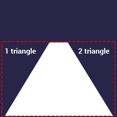
But first we need to make right-angled triangles. In order to make it, I will add the following CSS code:
.big_triangle:before, .big_triangle:after {
  content: "";
  display: block;
  width: 0;
  height: 0;
  border-top: 250px solid #292548;
  position: absolute;
  top: 0;
  z-index: 100;
}
.big_triangle:before {
  border-right: 152px solid transparent;
  left: 0;
}
.big_triangle:after {
  border-left: 152px solid transparent;
  right: 0;
}
The basic technique for creating CSS triangles – use the border property. But first you need to set the width and height of elements is equal to 0, for correct calculation of the size of the triangles. Next to them are set the property border-top equal to 250 pixels and color #292548 (background color). Next to the left triangle indicate a border-left with a value of the 152 pixels. The same thing will do for the right triangle, only instead of border-left we set border-right. Then have them on the edges of the rectangle using the left and right properties. And we make a triangle!
Elements of the base
Now we will start implementing the elements of the base. To do this, add the following markup:
<div class="flask">
  <div class="flask_bottom">
    <div class="big_triangle">
      <div class="flask_bottom_one"></div>
      <div class="flask_bottom_two"></div>
      <div class="flask_bottom_five"></div>
      <div class="flask_bottom_six"></div>
      <div class="flask_bottom_seven"></div>
      <div class="flask_bottom_eight"></div>
    </div>
  </div>
</div>
Then we use the following CSS styles:
.flask_bottom_one {
  width: 0;
  height: 0;
  border-bottom: 55px solid #3a2481;
  border-left: 32px solid transparent;
  border-right: 42px solid transparent;
  position: absolute;
  bottom: 0;
  z-index: 4;
}
.flask_bottom_two {
  border-bottom: 165px solid #4266c0;
  border-left: 93px solid transparent;
  border-right: 200px solid transparent;
  width: 0;
  height: 0;
  position: absolute;
  left: 0;
  bottom: 0;
  z-index: 2;
}
.flask_bottom_five {
  position: absolute;
  background-color: #4248c0;
  width: 100%;
  height: 75px;
  position: absolute;
  z-index: 3;
  left: 50px;
  bottom: 18px;
  -webkit-transform: rotate(24deg);
  transform: rotate(24deg);
  -webkit-transform-origin: left top;
  transform-origin: left top;
}
.flask_bottom_six {
  position: absolute;
  background-color: #37acdd;
  width: 100%;
  height: 170px;
  position: absolute;
  z-index: 1;
  right: 0;
  bottom: 0;
}
.flask_bottom_seven {
  position: absolute;
  background-color: #1493c8;
  width: 100%;
  height: 218px;
  position: absolute;
  z-index: 3;
  right: -95px;
  bottom: 24px;
  -webkit-transform: rotate(24deg);
  transform: rotate(24deg);
  -webkit-transform-origin: right top;
  transform-origin: right top;
}
.flask_bottom_eight {
  position: absolute;
  background-color: #5c30ae;
  width: 100%;
  height: 50px;
  position: absolute;
  z-index: 3;
  right: -95px;
  bottom: 218px;
  -webkit-transform: rotate(-12deg);
  transform: rotate(-12deg);
  -webkit-transform-origin: left top;
  transform-origin: left top;
}
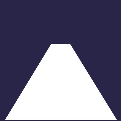
An important step in creating of elements is preserving the triangular form of the base. When positioning the internal elements, they will be outside the triangle. To avoid this, I added the overflow property with hidden value to the class big_triangle. When the browser reads this property, it will hide everything that goes outside of the element with class big_triangle.
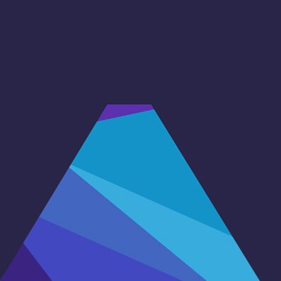
Next we need to create 6 additional elements and using the transform property (with value rotate) and transform-origin, positioning them as we need. In our case, the transformation is needed to rotate the elements, and transform-origin to specify the point around which will rotate the elements. Also,using absolute positioning, we have elements in their places. As a result, we get:
Top and its elements
To create the top (neck) we need to create a rectangle with a size of 62×152 pixels and place inside all 4 elements. Have a look at the following markup:
<div class="flask">
  <div class="flask_throat">
    <div class="flask_throat_one"></div>
    <div class="flask_throat_two"></div>
    <div class="flask_throat_three"></div>
    <div class="flask_throat_four"></div>
  </div>
  <div class="flask_bottom">
    <div class="big_triangle">
      <div class="flask_bottom_one"></div>
      <div class="flask_bottom_two"></div>
      <div class="flask_bottom_five"></div>
      <div class="flask_bottom_six"></div>
      <div class="flask_bottom_seven"></div>
      <div class="flask_bottom_eight"></div>
    </div>
  </div>
</div>
And styles for this markup:
.flask_throat {
  overflow: hidden;
  height: 155px;
  width: 64px;
  position: absolute;
  left: 152px;
  top: 0;
}
.flask_throat_one {
  position: absolute;
  -webkit-transform: rotate(24deg);
  transform: rotate(24deg);
  -webkit-transform-origin: right top;
  transform-origin: right top;
  background-color: #5c30ae;
  width: 150px;
  height: 50px;
  position: absolute;
  z-index: 3;
  right: -26px;
  top: 110px;
}
.flask_throat_two {
  position: absolute;
  -webkit-transform: rotate(20deg);
  transform: rotate(20deg);
  -webkit-transform-origin: right top;
  transform-origin: right top;
  background-color: #37acdd;
  width: 150px;
  height: 60px;
  position: absolute;
  z-index: 3;
  right: -35px;
  top: 35px;
}
.flask_throat_three {
  position: absolute;
  background-color: #5c30ae;
  width: 100%;
  height: 50px;
  position: absolute;
  z-index: 3;
  right: 0;
  bottom: 0;
}
.flask_throat_four {
  position: absolute;
  -webkit-transform: rotate(20deg);
  transform: rotate(20deg);
  -webkit-transform-origin: right top;
  transform-origin: right top;
  background-color: #6c49ac;
  width: 150px;
  height: 20px;
  position: absolute;
  z-index: 3;
  right: -45px;
  top: 100px;
}
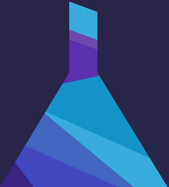
Arrangement of elements is exactly the same as the elements of base. In result we have finished the bulb!
Animation of the bubbles
We will load the flask and after some time the bubbles will appear. They will be of different sizes and colors. The timing of the appearance will be different.
For the realization of the bubbles, we will use modern CSS features, in particular the border-radius property. Using this property you can round the corners of an element. Now we will create 3 multi-colored bubbles of the same size, one is slightly larger, and another one with large size. Here is the markup:
<div class="flask">
  <div class="circle small_circle"></div>
  <div class="circle middle_circle"></div>
  <div class="circle little_circle little_circle_white"></div>
  <div class="circle little_circle little_circle_purpure"></div>
  <div class="circle little_circle little_circle_blue"></div>
  <div class="flask_throat">
    <div class="flask_throat_one"></div>
    <div class="flask_throat_two"></div>
    <div class="flask_throat_three"></div>
    <div class="flask_throat_four"></div>
  </div>
  <div class="flask_bottom">
    <div class="big_triangle">
      <div class="flask_bottom_one"></div>
      <div class="flask_bottom_two"></div>
      <div class="flask_bottom_five"></div>
      <div class="flask_bottom_six"></div>
      <div class="flask_bottom_seven"></div>
      <div class="flask_bottom_eight"></div>
    </div>
  </div>
</div>
Then we add CSS styles for the bubbles:
.circle {
  border-radius: 50%;
  border: 1px solid #fff;
  position: absolute;
  left: 45%;
  top: 30px;
  -webkit-animation-name: circle;
  animation-name: circle;
  -webkit-animation-duration: 5s;
  animation-duration: 5s;
  -webkit-animation-iteration-count: infinite;
  animation-iteration-count: infinite;
  -webkit-animation-delay: 0s;
  animation-delay: 0s;
}
.little_circle {
  width: 5px;
  height: 5px;
}
.little_circle_white {
  background-color: #fff;
  left: 48%;
  -webkit-animation-duration: 2000ms;
  animation-duration: 2000ms;
}
.little_circle_purpure {
  background-color: #6c49ac;
  border: 1px solid #6c49ac;
  left: 52%;
  -webkit-animation-duration: 2000ms;
  animation-duration: 2000ms;
  -webkit-animation-delay: 100ms;
  animation-delay: 100ms;
}
.little_circle_blue {
  background-color: #117fba;
  border: 1px solid #117fba;
  left: 45%;
  -webkit-animation-duration: 2000ms;
  animation-duration: 2000ms;
  -webkit-animation-delay: 200ms;
  animation-delay: 200ms;
}
.small_circle {
  width: 20px;
  height: 20px;
  -webkit-animation-duration: 4200ms;
  animation-duration: 4200ms;
  -webkit-animation-delay: 300ms;
  animation-delay: 300ms;
}
.middle_circle {
  width: 45px;
  height: 45px;
}
@-webkit-keyframes circle {
  0% {
    -webkit-transform: translateZ(0px) translateY(20px) scale(1);
    transform: translateZ(0px) translateY(20px) scale(1);
    opacity: 1;
  }
  85% {
    opacity: 0;
  }
  100% {
    -webkit-transform: translateZ(0px) translateY(-200px) scale(0);
    transform: translateZ(0px) translateY(-200px) scale(0);
    opacity: 0;
  }
}
@keyframes circle {
  0% {
    -webkit-transform: translateZ(0px) translateY(20px) scale(1);
    transform: translateZ(0px) translateY(20px) scale(1);
    opacity: 1;
  }
  85% {
    opacity: 0;
  }
  100% {
    -webkit-transform: translateZ(0px) translateY(-200px) scale(0);
    transform: translateZ(0px) translateY(-200px) scale(0);
    opacity: 0;
  }
}
Next step is to create animation using @keyframes. Here is the idea: when the page is loaded the bubbles are at the initial coordinates – 20 pixels on the y axis. Then the bubbles start moving along the axis Y from the start coordinate to 200px. Besides of this motion, the bubbles will move farther from us. For this we use the transform property. Also, the motion of the bubbles gradually disappear using the opacity property.
The script is created, now we need to specify it in the circle class. For this we use the property animation-name and specify the name of the script – circle. Next, for each bubble, we set the delay by using animation-delay, and thus they will appear in different period of time. The last step is to set the animation-iteration-count to infinite repetition of the scenario of the animation.
Animation of the flask
For the animation of the flask I created different scenario for each element:
@-webkit-keyframes animation_bg_element1 {
  0% {
    border-bottom-color: #3a2481;
  }
  25% {
    border-bottom-color: #242781;
  }
  50% {
    border-bottom-color: #244081;
  }
  75% {
    border-bottom-color: #242781;
  }
}
@keyframes animation_bg_element1 {
  0% {
    border-bottom-color: #3a2481;
  }
  25% {
    border-bottom-color: #242781;
  }
  50% {
    border-bottom-color: #244081;
  }
  75% {
    border-bottom-color: #242781;
  }
}
@-webkit-keyframes animation_bg_element2 {
  0% {
    border-bottom-color: #4266c0;
  }
  25% {
    border-bottom-color: #4287c0;
  }
  50% {
    border-bottom-color: #42a8c0;
  }
  75% {
    border-bottom-color: #4287c0;
  }
}
@keyframes animation_bg_element2 {
  0% {
    border-bottom-color: #4266c0;
  }
  25% {
    border-bottom-color: #4287c0;
  }
  50% {
    border-bottom-color: #42a8c0;
  }
  75% {
    border-bottom-color: #4287c0;
  }
}
@-webkit-keyframes animation_bg_element3 {
  0% {
    background-color: #4248c0;
  }
  25% {
    background-color: #4269c0;
  }
  50% {
    background-color: #428ac0;
  }
  75% {
    background-color: #4269c0;
  }
}
@keyframes animation_bg_element3 {
  0% {
    background-color: #4248c0;
  }
  25% {
    background-color: #4269c0;
  }
  50% {
    background-color: #428ac0;
  }
  75% {
    background-color: #4269c0;
  }
}
@-webkit-keyframes animation_bg_element4 {
  0% {
    background-color: #37acdd;
  }
  25% {
    background-color: #37d8dd;
  }
  50% {
    background-color: #37ddb5;
  }
  75% {
    background-color: #37d8dd;
  }
}
@keyframes animation_bg_element4 {
  0% {
    background-color: #37acdd;
  }
  25% {
    background-color: #37d8dd;
  }
  50% {
    background-color: #37ddb5;
  }
  75% {
    background-color: #37d8dd;
  }
}
@-webkit-keyframes animation_bg_element5 {
  0% {
    background-color: #1493c8;
  }
  25% {
    background-color: #14c2c8;
  }
  50% {
    background-color: #14c89d;
  }
  75% {
    background-color: #14c2c8;
  }
}
@keyframes animation_bg_element5 {
  0% {
    background-color: #1493c8;
  }
  25% {
    background-color: #14c2c8;
  }
  50% {
    background-color: #14c89d;
  }
  75% {
    background-color: #14c2c8;
  }
}
@-webkit-keyframes animation_bg_element6 {
  0% {
    background-color: #5c30ae;
  }
  25% {
    background-color: #3a30ae;
  }
  50% {
    background-color: #3048ae;
  }
  75% {
    background-color: #3a30ae;
  }
}
@keyframes animation_bg_element6 {
  0% {
    background-color: #5c30ae;
  }
  25% {
    background-color: #3a30ae;
  }
  50% {
    background-color: #3048ae;
  }
  75% {
    background-color: #3a30ae;
  }
}
@-webkit-keyframes animation_bg_element7 {
  0% {
    background-color: #6c49ac;
  }
  25% {
    background-color: #5249ac;
  }
  50% {
    background-color: #495aac;
  }
  75% {
    background-color: #5249ac;
  }
}
@keyframes animation_bg_element7 {
  0% {
    background-color: #6c49ac;
  }
  25% {
    background-color: #5249ac;
  }
  50% {
    background-color: #495aac;
  }
  75% {
    background-color: #5249ac;
  }
}
Now I’ll add a call to the animation in each class:
.flask_throat_one {
  position: absolute;
  -webkit-transform: rotate(24deg);
  transform: rotate(24deg);
  -webkit-transform-origin: right top;
  transform-origin: right top;
  background-color: #5c30ae;
  width: 150px;
  height: 50px;
  position: absolute;
  z-index: 3;
  right: -26px;
  top: 110px;
  -webkit-animation-name: animation_bg_element6;
  animation-name: animation_bg_element6;
  -webkit-animation-duration: 5s;
  animation-duration: 5s;
  -webkit-animation-iteration-count: infinite;
  animation-iteration-count: infinite;
  -webkit-animation-delay: 0s;
  animation-delay: 0s;
}
.flask_throat_two {
  position: absolute;
  -webkit-transform: rotate(20deg);
  transform: rotate(20deg);
  -webkit-transform-origin: right top;
  transform-origin: right top;
  background-color: #37acdd;
  width: 150px;
  height: 60px;
  position: absolute;
  z-index: 3;
  right: -35px;
  top: 35px;
  -webkit-animation-name: animation_bg_element5;
  animation-name: animation_bg_element5;
  -webkit-animation-duration: 5s;
  animation-duration: 5s;
  -webkit-animation-iteration-count: infinite;
  animation-iteration-count: infinite;
  -webkit-animation-delay: 0s;
  animation-delay: 0s;
}
.flask_throat_three {
  position: absolute;
  background-color: #5c30ae;
  width: 100%;
  height: 50px;
  position: absolute;
  z-index: 3;
  right: 0;
  bottom: 0;
  -webkit-animation-name: animation_bg_element6;
  animation-name: animation_bg_element6;
  -webkit-animation-duration: 5s;
  animation-duration: 5s;
  -webkit-animation-iteration-count: infinite;
  animation-iteration-count: infinite;
  -webkit-animation-delay: 0s;
  animation-delay: 0s;
}
.flask_throat_four {
  position: absolute;
  -webkit-transform: rotate(20deg);
  transform: rotate(20deg);
  -webkit-transform-origin: right top;
  transform-origin: right top;
  background-color: #6c49ac;
  width: 150px;
  height: 20px;
  position: absolute;
  z-index: 3;
  right: -45px;
  top: 100px;
  -webkit-animation-name: animation_bg_element7;
  animation-name: animation_bg_element7;
  -webkit-animation-duration: 5s;
  animation-duration: 5s;
  -webkit-animation-iteration-count: infinite;
  animation-iteration-count: infinite;
  -webkit-animation-delay: 0s;
  animation-delay: 0s;
}
.flask_bottom_one {
  width: 0;
  height: 0;
  border-bottom: 55px solid #3a2481;
  border-left: 32px solid transparent;
  border-right: 42px solid transparent;
  position: absolute;
  bottom: 0;
  z-index: 4;
  -webkit-animation-name: animation_bg_element1;
  animation-name: animation_bg_element1;
  -webkit-animation-duration: 5s;
  animation-duration: 5s;
  -webkit-animation-iteration-count: infinite;
  animation-iteration-count: infinite;
  -webkit-animation-delay: 0s;
  animation-delay: 0s;
}
.flask_bottom_two {
  border-bottom: 165px solid #4266c0;
  border-left: 93px solid transparent;
  border-right: 200px solid transparent;
  width: 0;
  height: 0;
  position: absolute;
  left: 0;
  bottom: 0;
  z-index: 2;
  -webkit-animation-name: animation_bg_element2;
  animation-name: animation_bg_element2;
  -webkit-animation-duration: 5s;
  animation-duration: 5s;
  -webkit-animation-iteration-count: infinite;
  animation-iteration-count: infinite;
  -webkit-animation-delay: 0s;
  animation-delay: 0s;
}
.flask_bottom_five {
  position: absolute;
  background-color: #4248c0;
  width: 100%;
  height: 75px;
  position: absolute;
  z-index: 3;
  left: 50px;
  bottom: 18px;
  -webkit-transform: rotate(24deg);
  transform: rotate(24deg);
  -webkit-transform-origin: left top;
  transform-origin: left top;
  -webkit-animation-name: animation_bg_element3;
  animation-name: animation_bg_element3;
  -webkit-animation-duration: 5s;
  animation-duration: 5s;
  -webkit-animation-iteration-count: infinite;
  animation-iteration-count: infinite;
  -webkit-animation-delay: 0s;
  animation-delay: 0s;
}
.flask_bottom_six {
  position: absolute;
  background-color: #37acdd;
  width: 100%;
  height: 170px;
  position: absolute;
  z-index: 1;
  right: 0;
  bottom: 0;
  -webkit-animation-name: animation_bg_element4;
  animation-name: animation_bg_element4;
  -webkit-animation-duration: 5s;
  animation-duration: 5s;
  -webkit-animation-iteration-count: infinite;
  animation-iteration-count: infinite;
  -webkit-animation-delay: 0s;
  animation-delay: 0s;
}
.flask_bottom_seven {
  position: absolute;
  background-color: #1493c8;
  width: 100%;
  height: 218px;
  position: absolute;
  z-index: 3;
  right: -95px;
  bottom: 24px;
  -webkit-transform: rotate(24deg);
  transform: rotate(24deg);
  -webkit-transform-origin: right top;
  transform-origin: right top;
  -webkit-animation-name: animation_bg_element5;
  animation-name: animation_bg_element5;
  -webkit-animation-duration: 5s;
  animation-duration: 5s;
  -webkit-animation-iteration-count: infinite;
  animation-iteration-count: infinite;
  -webkit-animation-delay: 0s;
  animation-delay: 0s;
}
.flask_bottom_eight {
  position: absolute;
  background-color: #5c30ae;
  width: 100%;
  height: 50px;
  position: absolute;
  z-index: 3;
  right: -95px;
  bottom: 218px;
  -webkit-transform: rotate(-12deg);
  transform: rotate(-12deg);
  -webkit-transform-origin: left top;
  transform-origin: left top;
  -webkit-animation-name: animation_bg_element6;
  animation-name: animation_bg_element6;
  -webkit-animation-duration: 5s;
  animation-duration: 5s;
  -webkit-animation-iteration-count: infinite;
  animation-iteration-count: infinite;
  -webkit-animation-delay: 0s;
  animation-delay: 0s;
}
Conclusion
In this article we demonstrated the possibilities of modern CSS3. I hope that this is interesting for you, and you will be able to create spectacular work.
Live Demo
[sociallocker]
download in package
[/sociallocker]


