
Bootstrap forms, do you know them? Our new article is for beginners and will show the process of creating pages using the bootstrap. Also we will tell you what is bootstrap, its purpose, installing, and the process of designing forms.
GETTING START WITH BOOTSTRAP FORMS
Content
- What is bootstrap
- Components of bootstrap
- Importance of bootstrap
- Downloading bootstrap
- Bootstrapping a form
- Download resources
INTRODUCTION
WHAT IS BOOTSTRAP
The BOOTSTRAP official website is being updated at interval and it includes a clear definition for now which states that “Bootstrap is the most popular HTML, CSS, and JS framework for developing responsive, mobile first projects on the web.” It is an html, css, javascript framework that you can use as basis for creating web sites or web applications.
COMPONENTS OF BOOTSTRAP
From the definition given to BOOTSTRAP above you and I have seen that bootstrap is no other thing than a web kit that assist web designers and developers in achieving an appealing aesthetic outlook in their day to day web projects
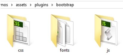
From the image above notice that officially bootstrap file structure or organisation contains below listed
- CSS – encompasses of .css file frameworks

- FONTS – glyph-icons (icon fonts)
- JS – comprises of jQuery and Javascript files
IMPORTANCE OF BOOTSTRAP
Easy to use
Even if you are not an expert web designer or developer bootstrap get you covered to achieving that beautiful Responsive web outlook you desire. Learn to how design an aesthetic website interface / outlook easy and simple in our next tutorials using bootstrap
Optimisation
They load fast because of their small file size and thorough compressed jQuery, CSS and Javascript files since it maintains consistency to design and code between projects and between developers
Supports
They’re supported in all browsers (even back to IE6). It Ensure cross-browser compatibility
DOWNLOADING BOOTSTRAP
Getting started: Go to bootstrap official website and the bootstrap zip file and unzip it in any directory of your choice and remember the file organisation it is importance for protocols.
BOOTSTRAPPING A FORM
GETTING STARTED WITH BOOTSTRAP FORM
Now let’s create a responsive form using bootstraps
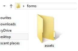
- Create a folder named ‘forms‘
- Create another folder named ‘assets‘
in the ‘forms‘
Open that folder and create two .css files respectively app.css and style.css
i. app.css
copy and paste the following below codes in the app.css file/* Script-Tutorials - Responsive Bootstrap Template * Author: Godwin Okeagu @script-tutorials * Website: https://www.script-tutorials.com */ /*Breaks ------------------------------------*/ hr { margin: 30px 0; } /*Headings ------------------------------------*/ h1 { font-size: 28px; line-height: 35px; } h2 { font-size: 24px; line-height: 33px; } h3 { font-size: 20px; line-height: 27px; } h4 { line-height: 25px; } h5 { line-height: 20px; } h6 { line-height: 18px; } .font-open-sans { font-family: "Open Sans", Arial, sans-serif; } h1, h2, h3, h4, h5, h6 { color: #555; margin-top: 5px; text-shadow: none; font-weight: normal; font-family: "Open Sans", Arial, sans-serif; } h1 i, h2 i, h3 i, h4 i, h5 i, h6 i { margin-right: 5px; } /*Devider ------------------------------------*/ .devider.devider-dotted { border-top: 2px dotted #eee; } .devider.devider-dashed { border-top: 2px dashed #eee; } .devider.devider-db { height: 5px; border-top: 1px solid #eee; border-bottom: 1px solid #eee; } .devider.devider-db-dashed { height: 5px; border-top: 1px dashed #ddd; border-bottom: 1px dashed #ddd; } .devider.devider-db-dotted { height: 5px; border-top: 1px dotted #ddd; border-bottom: 1px dotted #ddd; } /*Tables ------------------------------------*/ /*Basic Tables*/ .table thead > tr > th { border-bottom: none; } @media (max-width: 768px) { .table th.hidden-sm, .table td.hidden-sm { display: none !important; } } /*Forms ------------------------------------*/ .form-control { box-shadow: none; border-radius: 0; } .input-group-addon { border-radius: 0; } .form-control:focus { border-color: #bbb; box-shadow: 0 0 2px #c9c9c9; } /*Form Spacing*/ .form-spacing .form-control { margin-bottom: 15px; } /*Form Icons*/ .input-group-addon { color: #b3b3b3; font-size: 14px; background: #fff; } /*Button Styles ------------------------------------*/ .btn { box-shadow: none; border-radius: 0; } .btn-u { border: 0; color: #fff; font-size: 14px; cursor: pointer; font-weight: 400; padding: 6px 13px; position: relative; background: #00d2ff; white-space: nowrap; display: inline-block; text-decoration: none; } .btn-u:hover { color: #fff; text-decoration: none; transition: all 0.3s ease-in-out; } .btn-u.btn-block { text-align: center; } /*Button Groups*/ .btn-group .dropdown-menu > li > a { padding: 3px 13px; } .btn-group > .btn-u, .btn-group-vertical > .btn-u { float: left; position: relative; } .btn-group > .btn-u:first-child { margin-left: 0; } /*For FF Only*/ @-moz-document url-prefix() { .footer-subscribe .btn-u { padding-bottom: 4px; } } @media (max-width: 768px) { @-moz-document url-prefix() { .btn-u { padding-bottom: 6px; } } } /*Buttons Color*/ .btn-u:hover, .btn-u:focus, .btn-u:active, .btn-u.active, .open .dropdown-toggle.btn-u { background: #5fb611; } .btn-u-split.dropdown-toggle { border-left: solid 1px #5fb611; } .btn-u.btn-u-blue { background: #3498db; } .btn-u.btn-u-blue:hover, .btn-u.btn-u-blue:focus, .btn-u.btn-u-blue:active, .btn-u.btn-u-blue.active, .open .dropdown-toggle.btn-u.btn-u-blue { background: #2980b9; } .btn-u.btn-u-split-blue.dropdown-toggle { border-left: solid 1px #2980b9; } .btn-u.btn-u-green { background: #2ecc71; } .btn-u.btn-u-green:hover, .btn-u.btn-u-green:focus, .btn-u.btn-u-green:active, .btn-u.btn-u-green.active, .open .dropdown-toggle.btn-u.btn-u-green { background: #2ecc71; } .btn-u.btn-u-split-green.dropdown-toggle { border-left: solid 1px #2ecc71; } .btn-u.btn-u-default { background: #95a5a6; } .btn-u.btn-u-default:hover, .btn-u.btn-u-default:focus, .btn-u.btn-u-default:active, .btn-u.btn-u-default.active, .open .dropdown-toggle.btn-u.btn-u-default { background: #7f8c8d; } .btn-u.btn-u-split-default.dropdown-toggle { border-left: solid 1px #7f8c8d; } /*Bordered Buttons*/ .btn-u.btn-brd { color: #555; background: none; padding: 5px 13px; border: solid 1px transparent; } .btn-u.btn-brd-width-2 { padding: 7px 18px; border-width: 2px; } .btn-u.btn-brd:hover { background: none; } .btn-u.btn-brd:focus { background: none; } .btn-u.btn-brd.btn-brd-hover:hover { color: #fff !important; } .btn-u.btn-brd { border-color: #00d2ff; } .btn-u.btn-brd:hover { color: #5fb611; border-color: #5fb611; } .btn-u.btn-brd.btn-brd-hover:hover { background: #5fb611; } .btn-u.btn-brd.btn-u-default { border-color: #95a5a6; } .btn-u.btn-brd.btn-u-default:hover { color: #7f8c8d; border-color: #7f8c8d; } .btn-u.btn-brd.btn-u-default.btn-brd-hover:hover { background: #7f8c8d; } /*Labels*/ .label { border-radius: 0; } span.label { font-size: 11px; font-weight: 400; padding: 4px 7px; } /*Font Awesome Icon Styles*/ i.icon-custom { color: #555; width: 40px; height: 40px; font-size: 20px; line-height: 40px; margin-bottom: 5px; text-align: center; display: inline-block; border: solid 1px #555; } i.icon-2x { font-size: 30px; } i.icon-3x { font-size: 40px; } i.icon-4x { font-size: 50px; } /* Make Font Awesome icons fixed width */ .fa-fixed [class^="fa"], .fa-fixed [class*=" fa"] { width: 1.25em; text-align: center; display: inline-block; } /*Panels (Portlets) ------------------------------------*/ .panel, .panel-heading, .panel-group .panel { border-radius: 0; } .panel-heading { color: #fff; padding: 5px 15px; } /*Panel Table*/ .panel .table { margin-bottom: 0; } /*Panel Script-Tutorials*/ .panel-u { border-color: #00d2ff; } .panel-u > .panel-heading { background: #00d2ff; } /*Panel Blue*/ .panel-blue { border-color: #3498db; } .panel-blue > .panel-heading { background: #3498db; } /*Panel Red*/ .panel-red { border-color: #e74c3c; } .panel-red > .panel-heading { background: #e74c3c; } /*Panel Green*/ .panel-green { border-color: #2ecc71; } .panel-green > .panel-heading { background: #2ecc71; } /*Panel Sea*/ .panel-sea { border-color: #1abc9c; } .panel-sea > .panel-heading { background: #1abc9c; } /*Panel Orange*/ .panel-orange { border-color: #e67e22; } .panel-orange > .panel-heading { background: #e67e22; } /*Panel Grey*/ .panel-grey { border-color: #95a5a6; } .panel-grey > .panel-heading { background: #95a5a6; } /*Panel Brown*/ .panel-brown { border-color: #9c8061; } .panel-brown > .panel-heading { background: #9c8061; } /*Panel Dark Blue*/ .panel-dark-blue { border-color: #4765a0; } .panel-dark-blue > .panel-heading { background: #4765a0; } /*Panel Light Green*/ .panel-light-green { border-color: #79d5b3; } .panel-light-green > .panel-heading { background: #79d5b3; } /*Panel Default Dark*/ .panel-default-dark { border-color: #585f69; } .panel-default-dark > .panel-heading { background: #585f69; }ii. style.css
copy and paste the following code in style.css/* Script-Tutorials - Responsive Bootstrap Template * Description: Bootstrap form tutorials * Author: Okeagu Godwin@script-tutorials * Website: https://www.script-tutorials.com */ /*Import Global Compulsory CSS Files*/ @import url(app.css); * { border-radius: 0; } body { color: #333; font-size: 13px; line-height: 1.6; } p, li, li a, label { color: #555; } a { color: #00d2ff; text-decoration: none; } a, a:focus, a:hover, a:active, button, button:hover { outline: 0 !important; } a:focus { text-decoration: none; } a:hover { color: #00d2ff; text-decoration: underline; } /*Hiding arrows for select field in IE*/ select::-ms-expand { display: none; } - Copy the downloaded unzipped bootstrap file into the directly called ‘forms‘
 in the ‘forms‘
Now lets start the real bootstrapping
Firstly we ought to know that bootstrap have three standard form interface or layout namely
- Basic form interface
- Horizontal form interface
- Inline form interface
Create three different files in the folder ‘forms’ and name them accordingly in respect to the standard bootstrap form interface listed above
copy and paste the following basic html structure snippet of code in each
<!DOCTYPE html>
<html lang="en">
<head>
<title>Common Form Components | Script-Tutorials - Responsive Website Template</title>
<!-- Meta -->
<meta charset="utf-8">
<meta name="viewport" content="width=device-width, initial-scale=1.0">
<meta name="description" content="script-tutorials on bootstrap forms">
<meta name="author" content="Okeagu Godwin">
<!-- Favicon -->
<link rel="shortcut icon" href="favicon.ico">
<!-- Fonts for Web-->
<link rel="stylesheet" href="//fonts.googleapis.com/css?family=Open+Sans:600,400,300&subset=cyrillic,latin">
<!-- CSS BOOTSTRAP - Compulsory -->
<link rel="stylesheet" href="bootstrap/css/bootstrap.min.css">
<!-- custom necessary css file -->
<link rel="stylesheet" href="assets/style.css">
<!-- Implementing font icon css files-->
<link rel="stylesheet" href="assets/plugins/font-awesome/css/font-awesome.min.css">
</head>
<body>
<div class="wrapper">
<div class="col-md-9">
<!--form content begins--->
content goes here...
<!--- form content ends --->
</div>
</div><!--/End Wrapepr-->
<!-- JS BOOTSTRAP - Compulsory -->
<script type="text/javascript" src="bootstrap/js/bootstrap.min.js"></script>
</body>
</html>
Observations:
-
<!-- CSS BOOTSTRAP - Compulsory --> <link rel="stylesheet" href="bootstrap/css/bootstrap.min.css">
-
<!-- custom necessary css file --> <link rel="stylesheet" href="assets/style.css">
div class="wrapper"div class="col-md-9"
The bootstrap css file was linked to the html just like description in the preceding list above numbered 1.
While a custom stylesheet file was also link in order to add more aesthetics to the form.
The first div class was defined wrapper for consistency among web-designers it was to style in the bootstrap to fit any screen and house all other site content in the body tag <body> --- </body>
The second div class was defined col-md-9 to create / invoke already style responsive bootstrap column in the wrapper that will house the form content specifically.
Note
Copy and paste the codes of the standard bootstrap standard form interface in between the comment above in the basic html structure snippet of code give above
<!—form content  begins--->
Code goes here….
<!--- form content ends --->
Basic Bootstrap form interface
Notice the form class="margin-bottom-40" or the class might either remain undefined
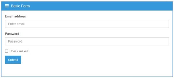
Basic Bootstrap form Html code
<!-- Basic Form -->
<div class="panel panel-blue margin-bottom-40">
  <div class="panel-heading">
    <h3 class="panel-title"><i class="fa fa-tasks"></i> Basic Form</h3>
  </div>
  <div class="panel-body">
    <form class="margin-bottom-40" role="form">
      <div class="form-group">
        <label for="exampleInputEmail1">Email address</label>
        <input class="form-control" id="exampleInputEmail1" placeholder="Enter email" type="email">
      </div>
      <div class="form-group">
        <label for="exampleInputPassword1">Password</label>
        <input class="form-control" id="exampleInputPassword1" placeholder="Password" type="password">
      </div>
      <div class="checkbox">
        <label>
          <input type="checkbox"> Check me out
        </label>
      </div>
      <button type="submit" class="btn-u btn-u-blue">Submit</button>
    </form>
  </div>
</div>
<!-- End Basic Form -->
Bootstrap Horizontal form interface
Notice: form class="form-horizontal" the form class name is defined horizontally so the form take a horizontal form interface
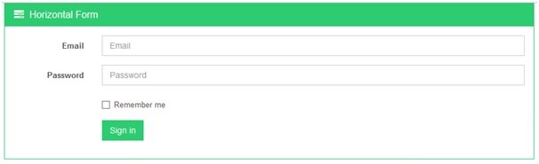
Html code Bootstrap Horizontal form
<!-- Horizontal Form -->
<div class="panel panel-green margin-bottom-40">
  <div class="panel-heading">
    <h3 class="panel-title"><i class="fa fa-tasks"></i> Horizontal Form</h3>
  </div>
  <div class="panel-body">
    <form class="form-horizontal" role="form">
      <div class="form-group">
        <label for="inputEmail1" class="col-lg-2 control-label">Email</label>
        <div class="col-lg-10">
          <input class="form-control" id="inputEmail1" placeholder="Email" type="email">
        </div>
      </div>
      <div class="form-group">
        <label for="inputPassword1" class="col-lg-2 control-label">Password</label>
        <div class="col-lg-10">
          <input class="form-control" id="inputPassword1" placeholder="Password" type="password">
        </div>
      </div>
      <div class="form-group">
        <div class="col-lg-offset-2 col-lg-10">
          <div class="checkbox">
            <label>
              <input type="checkbox"> Remember me
            </label>
          </div>
        </div>
      </div>
      <div class="form-group">
        <div class="col-lg-offset-2 col-lg-10">
          <button type="submit" class="btn-u btn-u-green">Sign in</button>
        </div>
      </div>
    </form>
  </div>
</div>
<!-- End Horizontal Form -->
Bootstrap inline form interface
Notice that the form class="form-inline" so the form take the inline interface layout
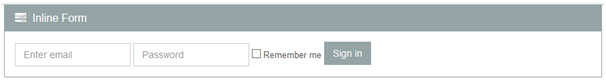
Html code for Bootstrap inline form
<!-- Inline Form -->
<div class="panel panel-grey margin-bottom-40">
  <div class="panel-heading">
    <h3 class="panel-title"><i class="fa fa-tasks"></i> Inline Form</h3>
  </div>
  <div class="panel-body">
    <form class="form-inline" role="form">
      <div class="form-group">
        <label class="sr-only" for="exampleInputEmail2">Email address</label>
        <input class="form-control" id="exampleInputEmail2" placeholder="Enter email" type="email">
      </div>
      <div class="form-group">
        <label class="sr-only" for="exampleInputPassword2">Password</label>
        <input class="form-control" id="exampleInputPassword2" placeholder="Password" type="password">
      </div>
      <div class="checkbox">
        <label>
          <input type="checkbox"> Remember me
        </label>
      </div>
      <button type="submit" class="btn-u btn-u-default">Sign in</button>
    </form>
  </div>
</div>
<!-- End Inline Form -->
[sociallocker]
download in package
[/sociallocker]


