
Creating CSS3 Dropdown Menu
During last several years, CSS-based menus are becoming more and more popular. Almost any website have own navigation menu, and quite often the menu plays a major role in mapping the site. Just because this is great solution to display lot of links and keep clean layout. Today I will show you how to create your own multilevel CSS3 dropdown menu (without extra JS files – pure CSS). Since this menu is made using CSS3 – it renders perfect on Firefox, Chrome and Safari browsers. This menu work also in IE8+, but the rounded corners and shadow will not be rendered.
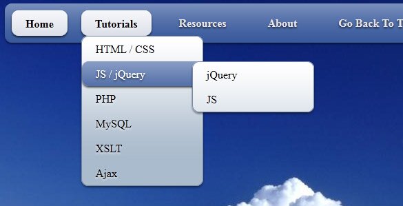
Here are final result (what we will creating):
Here are samples and downloadable package:
Live Demo
download in package
Ok, download the example files and lets start coding !
Step 1. HTML
As usual, we start with the HTML.
Here are html with our menu. As you can see – this is multi-level menu. I hope that you can easy to understand it.
index.html
<link rel="stylesheet" href="css/style.css" type="text/css" media="screen">

<div class="example">
    <ul id="nav">
        <li class="current"><a href="http://script-tutorials.com/">Home</a></li>
        <li><a href="http://script-tutorials.com/">Tutorials</a>
            <ul>
                <li><a href="http://script-tutorials.com/category/html-css/">HTML / CSS</a></li>
                <li><a href="http://script-tutorials.com/category/jquery/">JS / jQuery</a>
                    <ul>
                        <li><a href="http://script-tutorials.com/category/jquery/">jQuery</a></li>
                        <li><a href="http://script-tutorials.com/category/javascript/">JS</a></li>
                    </ul>
                </li>
                <li><a href="http://script-tutorials.com/category/php/">PHP</a></li>
                <li><a href="http://script-tutorials.com/category/mysql/">MySQL</a></li>
                <li><a href="http://script-tutorials.com/category/xslt/">XSLT</a></li>
                <li><a href="http://script-tutorials.com/category/ajax/">Ajax</a></li>
            </ul>
        </li>
        <li><a href="http://script-tutorials.com/category/resources/">Resources</a>
            <ul>
                <li><a href="http://script-tutorials.com/category/resources/">By category</a>
                    <ul>
                        <li><a href="http://script-tutorials.com/category/php/">PHP</a></li>
                        <li><a href="http://script-tutorials.com/category/mysql/">MySQL</a></li>
                        <li><a href="http://script-tutorials.com/category/xslt/">XSLT</a></li>
                        <li><a href="http://script-tutorials.com/category/ajax/">Ajax</a></li>
                    </ul>
                </li>
                <li><a href="http://script-tutorials.com/category/resources/">By tag name</a>
                    <ul>
                        <li><a href="http://script-tutorials.com/tag/captcha/">captcha</a></li>
                        <li><a href="http://script-tutorials.com/tag/gallery/">gallery</a></li>
                        <li><a href="http://script-tutorials.com/tag/animation/">animation</a></li>
                    </ul>
                </li>
            </ul>
        </li>
        <li><a href="http://script-tutorials.com/about/">About</a></li>
        <li><a href="http://script-tutorials.com/creating-css3-dropdown-menu/">Go Back To The Tutorial</a></li>
    </ul>
</div>
Step 2. CSS
Here are used CSS styles. First two selectors (you can skip it) belong to our demo page. All rest – belong to menu.
css/style.css
/* demo page styles */
body {
    background:#eee;
    margin:0;
    padding:0;
}
.example {
    background:#fff url(../images/clouds-in-blue-sky.jpg);
    width:770px;
    height:570px;
    border:1px #000 solid;
    margin:20px auto;
    padding:15px;
    border-radius:3px;
    -moz-border-radius:3px;
    -webkit-border-radius:3px;
}

/* main menu styles */
#nav {
    display:inline-block;
    width:100%;
    margin:0px auto;
    padding:0;
    background:#335599 url(../images/bg.png) repeat-x 0 -110px;

    border-radius:10px; /*some css3*/
    -moz-border-radius:10px;
    -webkit-border-radius:10px;
    box-shadow:0 2px 2px rgba(0,0,0, .5);
    -moz-box-shadow:0 2px 2px rgba(0,0,0, .5);
    -webkit-box-shadow:0 2px 2px rgba(0,0,0, .5);
}
#nav li {
    margin:10px;
    float:left;
    position:relative;
    list-style:none;
}
#nav a {
    font-weight:bold;
    color:#e7e5e5;
    text-decoration:none;
    display:block;
    padding:8px 20px;

    border-radius:10px; /*some css3*/
    -moz-border-radius:10px;
    -webkit-border-radius:10px;
    text-shadow:0 2px 2px rgba(0,0,0, .7);
}

/* selected menu element */
#nav .current a, #nav li:hover > a {
    background:#7788aa url(../images/bg.png) repeat-x 0 -20px;
    color:#000;
    border-top:1px solid #f8f8f8;

    box-shadow:0 2px 2px rgba(0,0,0, .7); /*some css3*/
    -moz-box-shadow:0 2px 2px rgba(0,0,0, .7);
    -webkit-box-shadow:0 2px 2px rgba(0,0,0, .7);
    text-shadow:0 2px 2px rgba(255,255,255, 0.7);
}

/* sublevels */
#nav ul li:hover a, #nav li:hover li a {
    background:none;
    border:none;
    color:#000;
}
#nav ul li a:hover {
    background:#335599 url(../images/bg.png) repeat-x 0 -100px;
    color:#fff;

    border-radius:10px; /*some css3*/
    -moz-border-radius:10px;
    -webkit-border-radius:10px;
    text-shadow:0 2px 2px rgba(0,0,0, 0.7);
}

#nav ul li:first-child > a {
    -moz-border-radius-topleft:10px; /*some css3*/
    -moz-border-radius-topright:10px;
    -webkit-border-top-left-radius:10px;
    -webkit-border-top-right-radius:10px;
}
#nav ul li:last-child > a {
    -moz-border-radius-bottomleft:10px; /*some css3*/
    -moz-border-radius-bottomright:10px;
    -webkit-border-bottom-left-radius:10px;
    -webkit-border-bottom-right-radius:10px;
}

/* drop down */
#nav li:hover > ul {
    opacity:1;
    visibility:visible;
}
#nav ul {
    opacity:0;
    visibility:hidden;
    padding:0;
    width:175px;
    position:absolute;
    background:#aabbcc url(../images/bg.png) repeat-x 0 0;
    border:1px solid #7788aa;

    border-radius:10px; /*some css3*/
    -moz-border-radius:10px;
    -webkit-border-radius:10px;
    box-shadow:0 2px 2px rgba(0,0,0, .5);
    -moz-box-shadow:0 2px 2px rgba(0,0,0, .5);
    -webkit-box-shadow:0 2px 2px rgba(0,0,0, .5);

    -moz-transition:opacity .25s linear, visibility .1s linear .1s;
    -webkit-transition:opacity .25s linear, visibility .1s linear .1s;
    -o-transition:opacity .25s linear, visibility .1s linear .1s;
    transition:opacity .25s linear, visibility .1s linear .1s;
}
#nav ul li {
    float:none;
    margin:0;
}
#nav ul a {
    font-weight:normal;
    text-shadow:0 2px 2px rgba(255,255,255, 0.7);
}
#nav ul ul {
    left:160px;
    top:0px;
}
Quite all css code is belong to css menu. I don`t including this into article. It always available in download package
Step 3. Images
Our menu using only single image to reach custom gradient effect. This will white-transparent image (PNG) which we will apply to different elements to make gradient. And, using background position we will able to adjust it (make more lighter or darker). Second image – just background (clouds) for our demo page.


Live Demo
download in package
Conclusion
Hope you enjoyed with this tutorial, don’t forget to tell thanks and leave a comment  Good luck!
Related Articles
Creating a CSS3 Dropdown Menu #2
Creating A CSS3 Dropdown Menu #4
Creating CSS3 Dropdown Menu #3


Looks great – but the demo does not seem to work on IE8 at all – I basically get the top-level menus, but those will not expand
I tested in IE8 just now – it expanding all levels, but immediately (not with delay – unsupported in IE)
and, in IE8 here are no rounded corners as I mentioned in article
If you have IE9 installed and you testing it in IE8 compatibility mode, make sure that you switched and browser mode and document mode to IE8, both
Thanks but it is not workung with ie9
Sure? I tested this in IE9, should working fine
just one not working in IE9 – timed transition effects like
transition:opacity .25s linear, visibility .1s linear .1s;
but all another should work, it should display menu elements momental
It works great in every browser I test (Firefox 5, Opera 11, Safari 4), except IE (as usual)! The menu only works at the top level in IE8; there are no drop-down menu’s. I tried to correct it with modernizr.full.js, but that doesn’t help, so IE hacks are still needed.
Awesome CSS dropdown menu I will try this on my blog thanks for sharing tutorial
Great tutorial, thanks for sharing. I have added down and right arrows to point out where the drop downs are unfortunately I seem to have 1 issue I wonder if you can help with. The right arrow for ‘By Tag Name’ shows through the layer when hovering over ‘By Category’. Any suggestions please.
Code used:-
html
▶
css
.rarrow {
position:absolute;
font-size:10pt;
top:12px;
right:1px;
color:#fff;
}
Can you please send me your updated version so our email? Right now it is not clean what element has ‘rarrow’ classname
Great tutorial, i’ll try this.. Thank you very much, sir…