
The modern web is changing so fast that it is becoming increasingly difficult to reach out to users. Outdated strategies are no longer work while new ones are just emerging. It is not always clear what works for and against you. Sometimes the ideas you find excellent may turn into a funny, confusing, and even useless.
A few years age, a well-designed interface could ensure a positive user experience, but with the wide distribution of mobile devices, things got changed radically. DesignContest has recently analyzed the situation in UX world and made some predictions for the future.
But before I pass to what we’ve got, let’s define the terms of UX and UI since a lot of users and even some novice designers believe that UX and UI are the same. However, the differences between these concepts are very important:
Let’s imagine a young man goes to a bar or nightclub and meets a beautiful girl. That is, she is perfect in terms of the interface (UI). Then he takes the risk and decides to acquaint with her. But, having exchanged a few words, he discovers the girl as an impenetrably stupid person with a too high-pitched voice. That is, he gets a negative user experience (UX).
No matter how stylish and beautiful the website is – if it is uncomfortable and does not interact with the user, it doesn’t cost a single penny. The first thing designers, marketers, and web developers should consider is the correct user experience.
So, let’s move to trends of UX design you have to apply in 2016 to get the desired result.
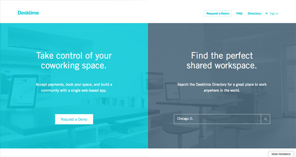
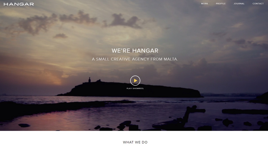
#1 Full-Screen Images
Recent studies have proven that a full-screen image makes the user stay a little bit longer on the website. That is, full-screen images attract attention and increase conversion.

In 2016, background images and pictures of happy people laughing are in trend. Another interesting effect is cinemagraph – an image with some elements periodically move.
#2 Monochrome Design with a Contrast CTA
One of the most exciting color trends in 2016 is the use of several shades of one color in the design of webpages with a contrast CTA as a prerequisite.

#3 Split Screen
If you unite multiple products or services for different categories of the target audience in the same advertising campaign, one of the best tricks you can do is to use a split screen to quickly and easily send a specific user to the desired proposal.
#4 The Simpler – the Better
Please remove all unnecessary and excessive from the website and leave only the elements you really need and those which can increase the number of potential customers, namely powerful and well-thought header, simple and revealing the essence of the proposal subtitle, and the capture form.
Additional options and features on the website have chances to increase the conversion rate only if all proposed actions are accessible and as simple as possible. Therefore, you need to take care of simple and easy navigation: the user must immediately find what he needs and get where he needs.

#5 Convenient Location of Buttons
The CTA button should always be at hand and in sight. Attach it to the footer or sidebar. Believe me, it’s paramount.
No matter how many blocks are on the website – the title, the subtitle, and the form of capture with a call to action should be within the same block.
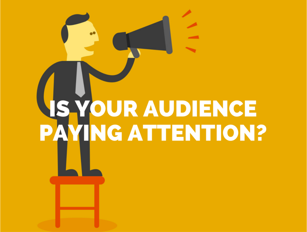
#6 Attention to the Audience
Personalize your users and pay attention to them. How to do it? Track their latest actions and, basing on the collected data, provide them with the right information at the right time. Personalization greatly increases the likelihood of a purchase.
#7 Card Design
Pinterest style has inspired designers and become an important trend in UX. Such a structure is useful, interesting, not obtrusive, and, most importantly, effective since it makes even the most suspicious users to stay longer on the website.
#8 Video
According to experts, videos will be one of the most effective UX tools in future since it increases the trust and credibility of the brand in users’ eyes. Just tell your audience what it wants to hear in the most interesting form.
The term “UX” was proposed by Donald Norman, who studied the cognitive aspects of user behavior and substantiated the need for user-centered design, which involves the easy and pleasant interaction of users with interfaces.
Although UX involves the use of technologies, it’s much more than just a technological matter. UX is how we live and how we use devices with interfaces. Moreover, UX is not limited by a computer or mobile screen since the device with no screen may have UX. That is, modern UX is any interaction with a product/system.


