The article tells about new responsive framework that is developed by one of web developers from Russia. The framework is based on twitter bootstrap with some additional features and enhancements. The original developer has prepared for us this preparatory article describing the capabilities of this framework, so let’s read what is said about it.
Hello everyone. I’m a front-end developer from Russia. I started to build my own framework for responsive web-design. It’s called ResponsiveFramework(RF). I used Twitter Bootstrap idea(speed and convenience), when i develop my own framework. But it has several differences from TB, let’s see closer.
First of all, I tried to help developers make compact and intuitive source. As a result, simple and obvious code-parts were made, which confirm W3C standard.
Second. Many animated elements are here. They are smooth and fast. I optimize and release them, all the time.
Third. It contains pure JS and jQuery components. Change everything to use pure JS is in my todo list.
Fourth. It uses 3 the most popular preprocessors: LESS, SASS/SCSS, Stylus. You may use whatever you used to use.
This are the main differences from Twitter Bootstrap. Let me show how you can use it. We’ll create responsive web page, using RF. It will contain menu, slider, content (about us and portfolio), feedback form and contacts. We’ll use only ResponsiveFramework. ResponsiveGrid is used to build skeleton for our page.
Live Demo
Step 1. Header.
Header will consist logo and menu.Logo is just a link to page. ResponsiveMenu will be used for creating menu. HTML code:
  <div class="wrapper_header" id="home">
    <header class="container header">
      <a href="#home" class="logo"><h1>Responsive UX <span class="logo_item">template</span></h1></a>
      <nav id="wrapper_menu" class="wrapper_menu">
        <span id="icon_menu" class="position_right" data-effect="slide_top" data-menu="drop_down_block"> </span>
        <ul class="menu">
          <li class="menu_item">
            <a href="#about" class="menu_link">About<span class="line_bottom"> </span></a>
          </li>
          <li class="menu_item">
            <a href="#works_portfolio" class="menu_link">Works<span class="line_bottom"> </span></a>
          </li>
          <li class="menu_item">
            <a href="#feedback" class="menu_link">Feedback<span class="line_bottom"> </span></a>
          </li>
          <li class="menu_item">
            <a href="#contacts" class="menu_link">Contacts<span class="line_bottom"> </span></a>
          </li>
          <li class="menu_item wrapper_drop_down_block">
            <a href="#" class="menu_link">Pages</a>
            <ul class="drop_down_block">
              <li class="drop_down_menu_item"><a class="drop_down_menu_link" href="shortcodes.html">Shortcodes</a></li>
              <li class="drop_down_menu_item"><a class="drop_down_menu_link" href="blog.html">Blog</a></li>
            </ul>
          </li>
          <li class="menu_item wrapper_drop_down_block">
            <a href="#" class="menu_link">Portfolio</a>
            <ul class="drop_down_block">
              <li class="drop_down_menu_item"><a class="drop_down_menu_link" href="portfolio3.html">3 Columns</a></li>
              <li class="drop_down_menu_item"><a class="drop_down_menu_link" href="portfolio4.html">4 Columns</a></li>
              <li class="drop_down_menu_item"><a class="drop_down_menu_link" href="dynamic_portfolio.html">Dynamic portfolio</a></li>
              <li class="drop_down_menu_item"><a class="drop_down_menu_link" href="project.html">Single Project</a></li>
              <li class="drop_down_menu_item"><a class="drop_down_menu_link" href="3dproject.html">3d Single Project</a></li>
            </ul>
          </li>
        </ul>
      </nav>
    </header>
  </div>
Tag `nav` includes selectors `#icon_menu` and `.menu`. Selector `icon_menu` will be used as menu on mobile devices. Main menu will be shown, when user click `icon_menu`.
Let’s dig deeper into menu. HTML code:
  <nav id="wrapper_menu" class="wrapper_menu">
    <span id="icon_menu" class="position_right" data-effect="slide_top" data-menu="drop_down_block"> </span>
    <ul class="menu">
      <li class="menu_item">
        <a href="#about" class="menu_link">About<span class="line_bottom"> </span></a>
      </li>
      <li class="menu_item">
        <a href="#works_portfolio" class="menu_link">Works<span class="line_bottom"> </span></a>
      </li>
      <li class="menu_item">
        <a href="#feedback" class="menu_link">Feedback<span class="line_bottom"> </span></a>
      </li>
      <li class="menu_item">
        <a href="#contacts" class="menu_link">Contacts<span class="line_bottom"> </span></a>
      </li>
      <li class="menu_item wrapper_drop_down_block">
        <a href="#" class="menu_link">Pages</a>
        <ul class="drop_down_block">
          <li class="drop_down_menu_item"><a class="drop_down_menu_link" href="shortcodes.html">Shortcodes</a></li>
          <li class="drop_down_menu_item"><a class="drop_down_menu_link" href="blog.html">Blog</a></li>
        </ul>
      </li>
      <li class="menu_item wrapper_drop_down_block">
        <a href="#" class="menu_link">Portfolio</a>
        <ul class="drop_down_block">
          <li class="drop_down_menu_item"><a class="drop_down_menu_link" href="portfolio3.html">3 Columns</a></li>
          <li class="drop_down_menu_item"><a class="drop_down_menu_link" href="portfolio4.html">4 Columns</a></li>
          <li class="drop_down_menu_item"><a class="drop_down_menu_link" href="dynamic_portfolio.html">Dynamic portfolio</a></li>
          <li class="drop_down_menu_item"><a class="drop_down_menu_link" href="project.html">Single Project</a></li>
          <li class="drop_down_menu_item"><a class="drop_down_menu_link" href="3dproject.html">3d Single Project</a></li>
        </ul>
      </li>
    </ul>
  </nav>
Tag `ul` is the top level of menu here, it’s very common. Let’s see on tag `span` with `line_bottom` class. This tag decorates out menu items. When user hovers menu item, item will be smoothly underscored.
Tag `ul` with `drop_down_block` class is a dropdown lists. Every list appears when appropriate item will be hovered by cursor. That’s it.
Step 2. Slider.
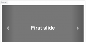
For building it we’ll use ResponsiveFullslider. HTML code:
  <div id="slideshow">
    <span class="arrow prev"  id="leftControl"></span>
    <div id="slidesContainer" >
      <div id="slideInner">
        <div id="slide1" class="slide active_slide">
          <div class="layer scale icon_slide"></div>
          <p class="layer slide_info slide_right">
            I've seen the <span class="decor"> future</span>
          </p>
          <p class="layer slide_info slide_left paragraph_two">
            It's in my <span class="decor"> Browser</span>
          </p>
        </div>
        <div id="slide2" class="slide">
          <div class="layer slide_top icon_slide"></div>
          <p class="layer slide_info flipY">
            delightful<span class="decor"> animations</span>
          </p>
          <p class="layer slide_info slide_bottom paragraph_two">
            In your<span class="decor"> devices</span>
          </p>
        </div>
        <div id="slide3" class="slide">
          <div class="layer slide_bottom icon_slide"></div>
          <p class="layer slide_info slide_left">
            Create interactive<span class="decor"> interfaces</span>
          </p>
          <p class="layer slide_info scale paragraph_two">
            Bring joy
          </p>
        </div>
      </div>
    </div>
    <span class="arrow next"  id="rightControl"></span>
  </div>
We’ll create 3 sliders to demonstrate how it works. For every slider we must add id attribute( slide1, slide2, slide3). We add some content to this sliders. To animate sliders we add `layer` class to slider, and choose an animation type. Here I use `slide_left`, `slide_bottom`, `flipY`, `scale`, `slide_right`.
Also we have to specify the necessary settings in `fullslider.js` file.
  speed = '0.5s', // time animation
  carusel = true, //endless scrolling
  autoplay = false, //automatic beggining
  time = 6000, // item changing time
  src = 'images/', // background path (we don't use it in demo)
  format = '.jpg', //background format (we don't use it in demo)
Step 3. Content.
We can divide this step to two separate parts:
1 – Building «about us»
2 – Building «portfolio»
Step 3.1. About us.
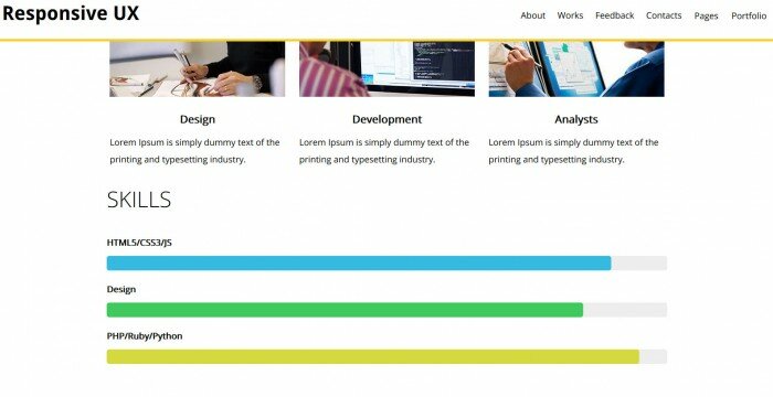
This block contains 3 columns. ResponsiveGrid is working again. HTML code :
  <section id="about" class="main_container columns3">
    <h3>About</h3>
    <p>
      Lorem Ipsum is simply dummy text of the printing and typesetting industry. Lorem Ipsum has been the industry's standard dummy text ever since the 1500s, when an unknown printer took a galley of type and scrambled it to make a type specimen book.
    </p>
    <div class="main_container_item">
      <a href="#" class="hover_circle">
        <img class="img_post" src="images/designer.jpg" alt="designer" />
        <div class="wrapper_circle">
          <div class="circle">
            <span class="circle_item">Development of UX interfaces</span>
          </div>
        </div>
      </a>
      <h3 class="title_post">Design</h3>
      <p>Lorem Ipsum is simply dummy text of the printing and typesetting industry.</p>
    </div>
    <div class="main_container_item">
      <a href="#" class="hover_circle">
        <img class="img_post" src="images/frontenddev.jpg" alt="frontenddev" />
        <div class="wrapper_circle">
          <div class="circle">
            <span class="circle_item">Development of the high-loaded systems</span>
          </div>
        </div>
      </a>
      <h3 class="title_post">Development</h3>
      <p>Lorem Ipsum is simply dummy text of the printing and typesetting industry.</p>
    </div>
    <div class="main_container_item">
      <a href="#" class="hover_circle" id="hover_left_circle">
        <img class="img_post" src="images/seo.jpg" alt="seo" />
        <div class="wrapper_circle">
          <div class="circle">
            <span class="circle_item">SEO-analysts</span>
          </div>
        </div>
      </a>
      <h3 class="title_post">Analysts</h3>
      <p>Lorem Ipsum is simply dummy text of the printing and typesetting industry.</p>
    </div>
    <article class="skills">
      <h3>Skills</h3>
      <div class="skills_item">
        <div class="skill">HTML5/CSS3/JS</div>
        <div class="value blue"></div>
      </div>
      <div class="skills_item">
        <div class="skill">Design</div>
        <div class="value green"></div>
      </div>
      <div class="skills_item">
        <div class="skill">PHP/Ruby/Python</div>
        <div class="value yellow"></div>
      </div>
    </article>
  </section>
To align text we use `selection` tag with `main_container` class. Also we add `column3` class, which tell RF to divide it into 3 columns. So simly we create a skeleton for our content. We’ll add animation(animated circle) as well. ResponsiveHover makes everything for us. Tag `img` is wrapped by `a` tag with `hover_circle` class. Add `div` tag with `wrapper_circle` class on the same level as `img` tag.
Step 3.2. Portfolio.
ResponsiveFilter is used for building portfolio section. HTML code:
  <section id="works_portfolio">
    <h2>Works</h2>
    <div id="type_products" class="type_products">
      <span id="category1" class="type_products_item">Web-design</span>
      <span id="category2" class="type_products_item">Back-end</span>
      <span id="category3" class="type_products_item">Front-end</span>
      <span id="all_category" class="type_products_item active_type">All</span>
    </div>
    <div id="all_production">
      <div class="production_item show_category wrapper_svg" data-id="category1">
        <svg width="300" height="225">
          <filter id="light">
            <feComponentTransfer>
              <feFuncR type="linear"  slope="2" />
              <feFuncG type="gamma" amplitude="2" exponent="1" />
              <feFuncB type="linear"  slope="1" />
              <feFuncA type="linear"  intercept ="1"/>
            </feComponentTransfer>
            <feColorMatrix  type="hueRotate" values="350" />
            </filter>
          <image x="0" y="0" width="300" height="225"  filter= "url(#light)" xlink:href="images/cat3.jpg" />
        </svg>
        <img  class="img_production"  src="images/cat3.jpg" alt="img" />
      </div>
    </div>
  </section>
Here we include JS and CSS files. After that, we set block sizes in CSS and style «close» button. We use ResponsiveHover to animate images.
Step 4. Feedback form.
RF has ResponsiveForm as well, and we may use it to create our feedback form. HTML code:
  <section id="feedback" class="wrapper_form">
    <h2>Feedback</h2>
    <form class="form" id="form_contact">
      <div class="left_column">
        <input type="text" id="full_name" name="full_name" class="input_text" placeholder="Name"  required />
        <input class="input_text" type="email" id="email"  name="email" placeholder="Email" required />
        <div id="rating" class="element_form">
          <div class="wrapper_stars">
            <span class="icon-star"></span>
            <span class="icon-star"></span>
            <span class="icon-star"></span>
            <span class="icon-star"></span>
            <span class="icon-star"></span>
          </div>
          <input type="hidden" id="total_rating" />
          <p>Your rating: <span id="total_value">0</span></p>
        </div>
      </div>
      <textarea class="input_text textarea" id="comment" name="comment" placeholder="Review" required></textarea>
      <button type="submit" id="button" class="button" disabled="disabled">send</button>
    </form>
  </section>
Here we include JS and CSS files for rating selection.
Step 5. Map and footer.
Map and footer were built without RF, since it’s not necessary here.


