
Dear readers, today we continue our Bootstrap 3 lessons, and for this lesson I prepared a new page layout that would suit different purposes. The huge advantage of using CSS frameworks is that the developer does not need to think about different issues of the layout, most of which were solved by creators of frameworks. For instance: cross-browser compatibility, support for different screen resolutions (responsiveness) and so on. The developer only needs to indicates what to display and when to display (depending on conditions), the rest the framework does itself. This approach can greatly accelerate the layout of the site. Another advantage of Bootstrap is its popularity. This means that another developer will be easier maintain your code.
The disadvantage of using frameworks is the fact that the page will have to “carry” the whole framework (all extra styles), even if it uses only a small part of them. The framework is an excellent tool for prototyping and creating pages for which the design is secondary, for example – administration pages. If you have a very specific design, then to impose it by means of the framework may be more difficult than by the native tools. Nevertheless, it is possible.
About using of Bootstrap
Currently, there are several ways to work with Bootstrap styles: without the use of LESS and with use of LESS
Without the use of LESS
For beginners, Bootstrap recommends the following approach: you have to download the compiled Bootstrap and put it in your project, nothing has changed. Then you need to create your empty CSS file and connect it after bootstrap.css.
<link href="css/bootstrap.min.css" rel="stylesheet">
<link href="css/styles.css" rel="stylesheet">
After that, in order to change the default bootstrap styles, you need to override them in your styles.css:
a { color: #00ff00 }
block { background-color: #dddddd }
The obvious disadvantage of this approach is that you have to manually look for the right styles that you want to change, and it will not always trivial, since some parameters are applied to many selectors in modified form, for example through formulas. Customize tool may help you a bit, it can compile correctly all your changes, and only once. Next time you want to change new parameters, you will need to to re-enter updated values for all fields in order to compile styles again.
Using LESS
This method assumes that all Bootstrap variables are stored in .less files. The developer works with these variables and compile them into css files (manually or automatically) as necessary. In HTML we just connect already compiled CSS files. Thus is the most flexible version.
There are many ways to compile LESS files, and Bootstrap leaves it to the discretion of developers. Bootstrap itself uses Grunt to compile less files, you may consider WinLess for Windows, SimpLESS for Mac or Koala for Linux. All of these programs do the same: they get the input folder with LESS files and listen to changes in them. As soon as you make changes to any file – it compiles to the corresponding CSS file. Thus you do not need to start the compiling manually after each your change. You change the LESS file, save it and immediately see the changes on the website in already compiled, compressed form.
Creating a project
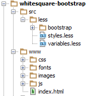
First of all, let’s create a simple file structure for our project
- Create a folder with the name of the project, for example ‘whitesquare-bootstrap’.
- Create two subfolders: ‘src’ – for source files and ‘www’ – for files of the final site (release stage).
- In ‘www’ folder we create an empty ‘images’ folder and an empty file: index.html.
- Then we download Bootstrap and copy the contents of the archive in the ‘www’ folder of our project.
- Since we decided to use LESS in our project, we need to download Bootstrap sources and copy the folder ‘less’ from the package, and put it in the ‘src’ folder of our project.
- Near the ‘less/bootstrap’ folder we create two empty files – styles.less and variables.less. We will override the standard bootstrap properties in these files. This approach would then quickly update the Bootstrap.
- Then we have to configure the compilation of LESS files to CSS.
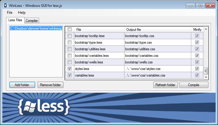
If you decided to use the WinLess, then firstly, select ‘Add folder’ and specify the path to the folder with our LESS files:
C:\whitesquare-bootstrap\src\less
You will see a list of all files in this folder. You can remove all the checkboxes, but pay attention to the last two files: ‘styles.less’ and ‘variables.less’. Right mouse click on them and select from the popup menu ‘Select output file’ and specify the path where the CSS files will be compiled:
..\..\www\css\styles.css
..\..\www\css\variables.css
After that, after any changes in these LESS files, you will get fresh recompiled CSS files.
Preview
After we created the file structure, let’s review the structure of our template. We need to consider the following things:
- how images are placed / cutted
- how components are used
- what are basic styles
- what page layout we get in result
After we answer to these questions, we can proceed to the layout.
Images
At this stage we need to prepare and save only the most common images that will be on all pages and do not apply to the content. In our case, these are: light gray background, header background, image of map, two logos and social networks icons.
Save the image of the map:
images/map.png
Save the logos:
images/logo.png
images/footer-logo.png
Repeating background images:
/images/bg.png
/images/h1-bg.png
For faster loading, icons of social networks are stored in one sprite file:
/images/social.png
/images/social-small.png
Components
The main difference between layout using Bootstrap and layout using native instruments is that Bootstrap introduces the concept of components. Components represent a commonly used ready-made HTML blocks with predefined styles. Sometimes components use JavaScript, but this is rare. We can use all ready bootstrap components as is, as well as we can override styles of the components. You just need to change variable values in the Bootstrap for this. If you need more flexible changes, the developer can always change the HTML and CSS on his own. Let’s back to our template, we can see that we need the following components:
- For layout columns – grid system (row, col)
- For search – inline form (form-inline), grouped controls (input-group), button (btn)
- For navigation – navigation bar (navbar) and navigation itself (nav)
- For the sub-menu – group list (list-group)
- For the card block – visual panel (panel)
- For the large central block – jumbotron
- For the frames pictures – thumbnail
Basic styles
By default, we already have a majority of styles in Bootstrap, we only need to override them if they are different from our design. We can do it in ‘src/less/variables.css’ file.
First of all, it is necessary to add variables that are not configured in Bootstrap options in order to be able to use them further. We have only a particular font:
@brand-font: 'Oswald',sans-serif;
Now let’s override bootstrap settings to our custom settings:
/* gray background of the page */
@body-bg: #f8f8f8;
/* blue background */
@ brand-primary: #29c5e6;
/* background of panels */
@panel-bg: #f3f3f3;
/* frame color of panels */
@panel-inner-border: #e7e7e7;
/* remove rounding in blocks */
@border-radius-base: 0;
/* primary buttons have blue background */
@btn-primary-bg: @brand-primary;
/* if the screen width is more then 992px, then the container width is 960px */
@container-md: 960px;
/* if the screen width is more 1200px, then the container width is 960px again */
@container-lg: @container-md;
/* main font is Tahoma */
@font-family-base: Tahoma, sans-serif;
/* base font size */
@font-size-base: 12px;
/* main color of text */
@text-color: #8f8f8f;
/* gray background of text fields */
@input-bg: @panel-bg;
/* gray frame of text fields */
@input-border: @panel-inner-border;
/* gray color of the text in the fields */
@input-color: #b2b2b2;
Once we finished with variables, let’s start to writing our styles in our ‘styles.less’ file. First, connect the Bootstrap and our variables file:
@import "bootstrap/bootstrap.less";
@import "variables.less";
Not all styles (that are set in the Bootstrap by default) can be changed by variables, we can change them manually:
p {
    margin: 20px 0;
}
.form-control {
    box-shadow: none;
}
.btn {
    font-family: @brand-font;
}
Here we have removed the shadow of form elements, and indicated the specific font for text in buttons. Then we describe the background of the page and the top strip:
body {
  border-top: 5px solid #7e7e7e;
  background-image: url(../images/bg.png);
}
Further in the tutorial, we will not mention files where we add styles. Just remember that all the variables we save in ‘variables.less’ file, and all custom CSS styles are in ‘styles.less’ file.
HTML skeleton
Layout of the site we traditionally begin with HTML skeleton. Here is it:
<!DOCTYPE html>
<html>
  <head>
    <title>Bootstrap 3 page layout</title>
    <meta name="viewport" content="width=device-width, initial-scale=1.0">
    <link href="css/styles.css" rel="stylesheet">
    <!--[if lt IE 9]>
      <script src="https://oss.maxcdn.com/libs/html5shiv/3.7.0/html5shiv.js"></script>
      <script src="https://oss.maxcdn.com/libs/respond.js/1.3.0/respond.min.js"></script>
    <![endif]-->
  </head>
  <body>
  </body>
</html>
In this section we create the HTML5 document structure. In the ‘title’ we indicate the name of our page – ‘Bootstrap 3 page layout’. Metatag ‘viewport’ indicates that the width of the page on a mobile device will be equal to the width of the screen and the initial scale is 100%. Then we connect the stylesheet. And for Internet Explorer (below v9) we connect scripts that allow properly display our layout.
Page layout
The layout consists of two parts: the main container for maim content, that is centered on the screen and trailing footer. The primary container consists of two columns: the main content and the sidebar. Above them is header, navigation (nav) and the title of the page (.heading).

Let’s add the following code in the body:
<body>
  <div class="wrapper container">
    <header></header>
    <nav></nav>
    <div class="heading"></div>
    <div class="row">
      <aside class="col-md-7"></aside>
      <section class="col-md-17"></section>
    </div>
  </div>
  <footer></footer>
Here we meet the first Bootstrap component – columns. Parent element of columns has the class row, and the classes of columns begin with the prefix col-, then – the screen size (xs, sm, md, lg), and end with a relative width of the column.
Column can be specified together with the values of the different classes of screens, such as class='col-xs-12 col-md-8'. These classes are just the column width as a percentage for a specific screen sizes. If the column is not given a certain class of the screen, then a class for a certain minimum screen will be applied, and if it is not specified as well – the width will not be applied, thus the block takes the maximum possible width.
We have classes col-md-7 and col-md-17 that indicate that the blocks represent a column width of 7 and 17 relative to the parent container. By default, the sum of the widths of columns in the Bootstrap is 12, but we have increased the number (double) to achieve the desired flexibility to us.
Now, let’s describe necessary paddings:
body {
  …
  .wrapper {
      padding: 0 0 50px 0;
  }
  header {
      padding: 20px 0;
  }
}
We put this construction into the body. LESS syntax allows nested rules, which are compiled in constructions like:
body .wrapper {…}
body header {…}
This approach allows you to see the structure of HTML inside of CSS and it gives a kind of ‘scope’ to the rules.
Logo

Add the logo into the header:
<header>
  <a href="/"><img src="" alt="Logo"></a>
</header>
Additional styles are not required.
Search

To create the search, we need the following bootstrap components: inline form, grouped controls and button. In the header tag we create the inline form aligned to the right. The fields of this form should have a class form-control and label.
In the form we place the grouped control component. Grouping controls makes it possible to remove the space between input text and the button, that looks like merging them into a single element. This is div with the class input-group and fields, and the button of the component is placed in the block with the class input-group-btn.
Since we do not need to show the label for the each field – we hide it with class sr-only. Then we add the class btn-primary for our button, that means that it is the primary button of this form.
<header>
…
<form name="search" action="#" method="get" class="form-inline form-search pull-right">
    <div class="input-group">
        <label class="sr-only" for="searchInput">Search</label>
        <input class="form-control" id="searchInput" type="text" name="search" placeholder="Search">
        <div class="input-group-btn">
            <button type="submit" class="btn btn-primary">GO</button>
        </div>
    </div>
</form>
</header>
All that remains is set in the styles width of the search box
body {
    …
    .wrapper {
        …
        header {
            …
            .form-search {
                width: 200px;
            }
        }
    }
}
Menu

To display the menu we take the ‘navigation bar’ component and place the component ‘navigation’ in it, which is a list with links. For the navigation, we add the class navbar-nav, which applies special styles within the navigation bar.
<nav class="navbar navbar-default">
  <ul class="nav navbar-nav">
    <li><a href="/home/">Home</a></li>
    <li class="active"><a href="/about/">About us</a></li>
    <li><a href="/services/">Services</a></li>
    <li><a href="/partners/">Partners</a></li>
    <li><a href="/customers/">Customers</a></li>
    <li><a href="/projects/">Projects</a></li>
    <li><a href="/careers/">Careers</a></li>
    <li><a href="/contact/">Contact</a></li>
  </ul>
</nav>
In order to bring this menu to our design, we set the following values for variables:
/* navigation menu height */
@navbar-height: 37px;
/* additional paddings */
@nav-link-padding: 10px 30px;
/* background for menu items */
@navbar-default-bg: @panel-bg;
/* text color in the menu items */
@navbar-default-link-color: #b2b2b2;
/* for the mouse hover - the same color */
@navbar-default-link-hover-color: @navbar-default-link-color;
/* background of the active menu item */
@navbar-default-link-active-bg: @brand-primary;
/* text color of the active menu item */
@navbar-default-link-active-color: #fff;
In addition to the adjustable parameters, we describe the text in uppercase and our specific font:
body {
    …
    .wrapper {
        …
        .navbar a {
            text-transform: uppercase;
            font: 14px @brand-font;
        }
    }
}
Page header

Page header is placed in a div with the class heading.
<div class="heading">
    <h1>About us</h1>
</div>
With the following styles:
body {
    …
    .wrapper {
        …
        .heading {
            height: 40px;
            background: transparent url(../images/h1-bg.png);
            margin: 30px 0;
            padding-left: 20px;
            h1 {
                display: inline-block;
                color: #7e7e7e;
                font: normal 40px/40px 'Oswald', sans-serif;
                background: url(../images/bg.png);
                margin: 0;
                padding: 0 10px;
                text-transform: uppercase;
            }
        }
    }
}
Here we draw a gray striped background on div, and put it the h1 into it with the necessary font and background color (of the page), to give the impression of transparent background for h1
Submenu
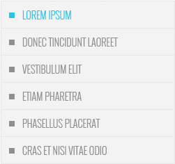
During creating the submenu, we will not use the ‘navigation’ component, as it has not very suitable styles, instead we will use ‘group list’ component. Each element of this component has a class list-group-item. Submenu should be placed in the tag aside. List of links we create like the main menu.
<aside class="col-md-7">
  <ul class="list-group submenu">
    <li class="list-group-item active">Lorem ipsum</li>
    <li class="list-group-item"><a href="/donec/">Donec tincidunt laoreet</a></li>
    <li class="list-group-item"><a href="/vestibulum/">Vestibulum elit</a></li>
    <li class="list-group-item"><a href="/etiam/">Etiam pharetra</a></li>
    <li class="list-group-item"><a href="/phasellus/">Phasellus placerat</a></li>
    <li class="list-group-item"><a href="/cras/">Cras et nisi vitae odio</a></li>
  </ul>
</aside>
In the setting of the component, we note that all grouped lists need to show with the background and with border of the ‘panel’ component:
@list-group-bg: @panel-bg;
@list-group-border: @panel-inner-border;
Then we apply the following styles to the sub-menu:
body {
    …
    .wrapper {
        …
        .submenu {
                margin-bottom: 30px;
                li {
                    display: list-item;
                    font: 300 14px @brand-font;
                    list-style-position: inside;
                    list-style-type: square;
                    padding: 10px;
                    text-transform: uppercase;
                    &.active {
                        color: @brand-primary;
                    }
                    a {
                        color: @text-color;
                        text-decoration: none;
                        &:hover {
                              color: @text-color;
                        }
                    }
                }
           }
    }
}
First we return standard styles to the elements of the list, because Bootstrap overrided them to default ones. Then we add the bottom margin. A thinner font and square markers are for the submenu. For links, we set the color, upper case and remove the underscore. Ampersand in code & .active for LESS syntax during compilation will be replaced by the parent selector: .submenu li.active.
To be continued


