
Our fifth jQuery Mobile tutorial. Today we continue talking about built-in set of icons, icon placement, creating custom buttons, using of swatches, making custom themes and so on. All examples are supported with code snippets.
ADDING ICONS TO BUTTONS
These images, or icons, allow us to know what the button is without having to read it. They also make some buttons appear less awkward if there is not enough space to spell out what they are supposed to do.
USING THE JQUERY BUILT-IN ICON SET
jQuery Mobile comes with a built-in set of icons that you can use on your buttons to help with styling for mobile devices. These icons are applied to your buttons by including a data-icon="" attribute in the element you are using as a button. The icon you want to display on the button is the value for the attribute. For example, if I wanted to display a search icon in my button I would use data-icon="search" as an attribute on the element that I am using as a button.
The included icons are
- Left Arrow – data-icon=”arrow-l”
- Right Arrow – data-icon=”arrow-r”
- Up Arrow – data-icon=”arrow-u”
- Down Arrow – data-icon=”arrow-d”
- Delete – data-icon=”delete”
- Plus – data-icon=”plus”
- Minus – data-icon=”minus”
- Check – data-icon=”check”
- Gear – data-icon=”gear”
- Refresh – data-icon=”refresh”
- Forward – data-icon=”forward”
- Back – data-icon=”back”
- Grid – data-icon=”grid”
- Star – data-icon=”star”
- Alert – data-icon=”alert”
- Info – data-icon=”info”
- Home – data-icon=”home”
- Search – data-icon=”search”
Example 38: Adding icons to button
Link-based buttons being created with the use of data-role="button".Each button has had a different icon applied to it by using data-icon="back", dataicon="home", and data-icon="forward" and this added default built in jQuery icons to the buttons as shown in the image below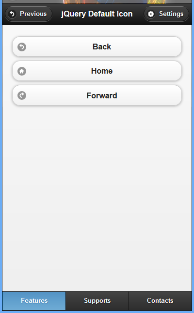
|
 <!DOCTYPE html>
<html>
<head>
  <title>Script-Tutorials: Default icons in jQuery Mobile</title>
  <meta name="viewport" content="width=device-width, initial-scale=1">
  <link rel="stylesheet" href="http://code.jquery.com/mobile/1.1.0/jquery.mobile-1.1.0.min.css" />
  <script src="http://code.jquery.com/jquery-1.7.1.min.js"></script>
  <script src="http://code.jquery.com/mobile/1.1.0/jquery.mobile-1.1.0.min.js"></script>
</head>
<body>
  <div data-role="page" data-fullscreen="false">
    <div data-role="header" data-position="fixed">
      <a href="#" data-icon="back">Previous</a>
      <h1>jQuery Default Icon </h1><a href="#" data-icon="gear">Settings</a>
    </div>
    <div data-role="content">
      <a href="#" data-role="button" data-icon="back">Back</a>
      <a href="#" data-role="button" data-icon="home">Home</a>
      <a href="#" data-role="button" data-icon="forward">Forward</a>
    </div>
    <div data-role="footer" data-position="fixed" data-id="rps">
      <div data-role="navbar">
        <ul>
          <li><a href="features.html" class="ui-btn-active ui-statepersist">Features</a>
          </li>
          <li><a href="supports.html">Supports</a>
          </li>
          <li><a href="contacts.html">Contacts</a>
          </li>
        </ul>
      </div>
    </div>
  </div>
</body>
</html>
|
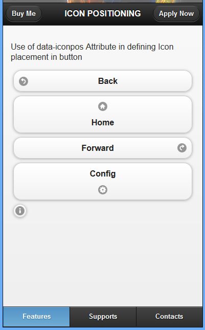
POSITIONING OF JQUERY MOBILE DEFAULT ICONS IN DIFFERENT PLACES IN THE BUTTON
This is the default behavior of icon placement on buttons. We can change the icon placement using the data-iconpos="" attribute and a value of top, right, or bottom. It should not come as a surprise that the placement of the icon will be exactly where the value says to place it. We can also use a value of notext to leave only the icon on the button and remove the text. This resizes the button to be to be barely larger than the icon itself and can come in handy when you need to place many buttons on a single line for a small screen.
Example 39: Use of data-iconpos Attribute in defining Icon placement in button
|
<!DOCTYPE html>
<html>
<head>
  <title>Script-Tutorials: Default icons in jQuery Mobile</title>
  <meta name="viewport" content="width=device-width, initial-scale=1">
  <link rel="stylesheet" href="http://code.jquery.com/mobile/1.1.0/jquery.mobile-1.1.0.min.css" />
  <script src="http://code.jquery.com/jquery-1.7.1.min.js"></script>
  <script src="http://code.jquery.com/mobile/1.1.0/jquery.mobile-1.1.0.min.js"></script>
</head>
<body>
  <div data-role="page" data-fullscreen="false">
    <div data-role="header" data-position="fixed">
      <a href="#">Buy Me</a>
      <h1>Full Screen </h1><a href="#">Apply Now</a>
    </div>
    <div data-role="content">
      <p>Use of data-iconpos Attribute in defining Icon placement in button</p>
      <a href="#" data-role="button" data-icon="back">Back</a>
      <a href="#" data-role="button" data-icon="home" data-iconpos="top">Home</a>
      <a href="#" data-role="button" data-icon="forward" data-iconpos="right">Forward</a>
      <a href="#" data-role="button" data-icon="gear" data-iconpos="bottom">Config</a>
      <a href="#" data-role="button" data-icon="info" data-iconpos="notext">information</a>
    </div>
    <div data-role="footer" data-position="fixed" data-id="rps">
      <div data-role="navbar">
        <ul>
          <li><a href="features.html" class="ui-btn-active ui-statepersist">Features</a>
          </li>
          <li><a href="supports.html">Supports</a>
          </li>
          <li><a href="contacts.html">Contacts</a>
          </li>
        </ul>
      </div>
    </div>
  </div>
</body>
</html>
|
CREATING CUSTOM ICON
The Icon Disc
You may have noticed that all the built-in icons are sitting on top of a round circle or disc. This is to help the icon stand out and work on any color of background. This disc must fit within the 18×18 pixel space. This means that when you are designing a custom button, you want to add a few pixels of space so that your custom icon does not appear broken or out of place when the disc is applied.
We create an icon disc and add an icon to it using the below CSS snippet of code
<style>
  .ui-icon-custom-cart-icon {
    background-image: url("godwins_customize_cart-icon.png");
  }
  @media only screen and (-webkit-min-device-pixel-ratio: 2) {
    .ui-icon-custom-cart-icon {
      background-image: url("customised_cart-icon.png");
      background-size: 18px 18px;
    }
  }
</style>
Then add it to our html markup as shown below
<div data-role="content">
  <a href="#" data-role="button" data-icon="custom-cart-icon">Customised Cart icon</a>
</div>
Example 40: Applying a custom button to button
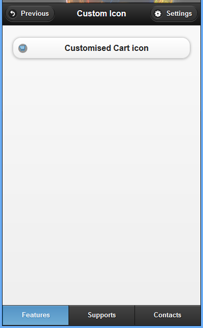 We used the data-icon attribute and pass in a custom value. The value custom-cart-icon is used to generate a class named ui-icon-custom-cart-icon
|
<!DOCTYPE html>
<html>
<head>
  <title>Script-Tutorials: Cutomized icons in jQuery Mobile</title>
  <meta name="viewport" content="width=device-width, initial-scale=1">
  <link rel="stylesheet" href="http://code.jquery.com/mobile/1.1.0/jquery.mobile-1.1.0.min.css" />
  <script src="http://code.jquery.com/jquery-1.7.1.min.js"></script>
  <script src="http://code.jquery.com/mobile/1.1.0/jquery.mobile-1.1.0.min.js"></script>
  <style>
    .ui-icon-custom-cart-icon {
      background-image: url("godwins_customize_cart-icon.png");
    }
    @media only screen and (-webkit-min-device-pixel-ratio: 2) {
      .ui-icon-custom-cart-icon {
        background-image: url("customised_cart-icon.png");
        background-size: 18px 18px;
      }
    }
  </style>
</head>
<body>
  <div data-role="page" data-fullscreen="false">
    <div data-role="header" data-position="fixed">
      <a href="#" data-icon="back">Previous</a>
      <h1>Custom Icon </h1><a href="#" data-icon="gear">Settings</a>
    </div>
    <div data-role="content">
      <a href="#" data-role="button" data-icon="custom-cart-icon">Customised Cart icon</a>
    </div>
    <div data-role="footer" data-position="fixed" data-id="rps">
      <div data-role="navbar">
        <ul>
          <li><a href="features.html" class="ui-btn-active ui-statepersist">Features</a>
          </li>
          <li><a href="supports.html">Supports</a>
          </li>
          <li><a href="contacts.html">Contacts</a>
          </li>
        </ul>
      </div>
    </div>
  </div>
</body>
</html>
|
The media query is used to check the mobile browser for support of high-resolution icons. If the browser supports them, then the CSS code inside the media-query will run. The background-image property again, only this time points to a high-resolution file.
The image to fit within a space of 18×18 pixels. Without this property being set, the larger image will try to scale up and will end up being mostly hidden, leaving only a small portion of your custom icon visible.
USING ICONS AND CLASSES
Even though CSS3 is in use and helps reduce file size, some static assets are still used. They have been put together into a minimum amount of files that are downloaded only when needed.
Currently the default theme uses five static image files:
ajax-loader.png—This is the animated loader or spinner.
icons-18-white.png—This sprite contains 22 white icons.
icons-18-black.png—This sprite contains 22 black icons.
icons-36-white.png—This sprite contains 22 high-res white icons.
icons-36-black.png—This sprite contains 22 high-res black icons.
The file ajax-loader.png is the spinner or loader image that appears when pages are being loaded through AJAX. The image dimension is 35×35 pixels and is downloaded by the browser on page load.
The files icons-18-white.png and icons-18-black.png are sprite files. They are horizontal sprites that measure 776×18 pixels each. They contain 22 icons or images that are 18×18 pixels separated by an 18-pixel space. Most of the icons found in this file do not take up the full 18×18 pixel space. This is because a circular disc is applied through CSS as a background to help the icons maintain visibility on whatever object they are placed. Each image has between 2 and 4 pixels of empty space around the edges to make room for the disc.
The files icons-36-white.png and icons-36-black.png are also sprite images, and they contain the same images as the other two sprite files. The difference here is that the icons contained in these sprites are 36×36 pixel images with a 36-pixel space between them that is used for high resolution displays, like those with Retina™ displays. These high-resolution icons are loaded only on devices that support them, so you do not need to worry about wasting mobile bandwidth on devices that cannot use them. This is done through the following snippet that checks for device compliance:
@media only screen and(-webkit - min - device - pixel - ratio: 1.5),
  only screen and(min--moz - device - pixel - ratio: 1.5),
  only screen and(min - resolution: 240 dpi) {}
If the device viewing the page does not meet the requirements of the media query, then any code inside it is skipped and not loaded.
ADDING JQUERY MOBILE THEMES AND SWATCHES TO YOUR MOBILE SITE
In jQuery Mobile, a ‘theme’ is a unified visual design applied across the interface. In practical terms, a theme specifies everything from fonts to drop shadows to colors.
In keeping with the idea of separating layout from color and texture, a jQuery Mobile theme can have multiple ‘swatches’. Swatches are a set of defined styles that can be applied when using a theme. By default five swatches are included with jQuery Mobile. You can change the default swatch used for an entire page by including an attribute of data-theme with the value set to the swatch you want loaded. When the page loads, every component except the header and footer will have that swatch color scheme applied to it.
A swatch is a unified color concept governing the colors of background, text, shadows, iconography, etc.
The default jQuery Mobile theme includes five swatches (called a, b, c, d, and e). Each swatch provides different visual emphasis, with swatch a being the most visually emphatic (typically white text on a black background), and swatch d being much softer.
Swatch e is an ‘error’ swatch. JQuery Mobile defaults to swatch c in most cases, but it is easy to specify a different swatch using the data-theme attribute. The data-theme attribute can be applied to any enhanced element and will cascade down through child elements.
However, an attribute of data-theme="b" has been added to standard markup for setting up a page; This attribute will change the applied swatch for the entire page.
It will not, however, change the swatch for the header and footer. To change those you must include the data-theme attribute separately.
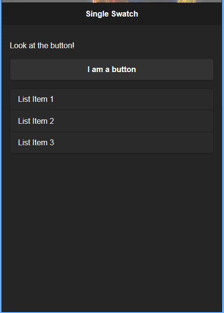
Example 41: Adding jQuery mobile themes and swatches to a standard markup for setting page
|
<!DOCTYPE html>
<html>
<head>
  <title>Script-Tutorials: Swatches</title>
  <meta name="viewport" content="width=device-width, initial-scale=1">
  <link rel="stylesheet" href="http://code.jquery.com/mobile/1.4.5/jquery.mobile-1.4.5.min.css">
  <script src="http://code.jquery.com/jquery-1.11.3.min.js"></script>
  <script src="http://code.jquery.com/mobile/1.4.5/jquery.mobile-1.4.5.min.js"></script>
</head>
<body>
  <div data-role="page" data-theme="b">
    <div data-role="header">
      <h1>Single Swatch</h1>
    </div>
    <div data-role="content">
      <p>Look at the button!</p>
      <a href="#" data-role="button">I am a button</a>
      <ul data-role="listview" data-inset="true">
        <li>List Item 1</li>
        <li>List Item 2</li>
        <li>List Item 3</li>
      </ul>
    </div>
  </div>
</body>
</html>
|
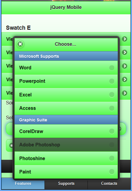
SWATCHES IN JQUERY MOBILE
Example 42: Adding common swatches in jQuery mobile
<!DOCTYPE html>
<html>
<head>
  <title>Script-Tutorials: Cutomized icons in jQuery Mobile</title>
  <meta name="viewport" content="width=device-width, initial-scale=1">
  <link rel="stylesheet" href="http://code.jquery.com/mobile/1.1.0/jquery.mobile-1.1.0.min.css" />
  <script src="http://code.jquery.com/jquery-1.7.1.min.js"></script>
  <script src="http://code.jquery.com/mobile/1.1.0/jquery.mobile-1.1.0.min.js"></script>
</head>
<body>
  <section id="swatch-default" data-role="page">
    <header data-role="header">
      <h1>jQuery Mobile</h1>
    </header>
    <div class="content" data-role="content">
      <h3>Default Swatch</h3>
      <ul data-role="listview">
        <li><a href="#swatch-a">View swatch a</a>
        </li>
        <li><a href="#swatch-b">View swatch b</a>
        </li>
        <li><a href="#swatch-c">View swatch c</a>
        </li>
        <li><a href="#swatch-d">View swatch d</a>
        </li>
        <li><a href="#swatch-e">View swatch e</a>
        </li>
      </ul>
      <p>Some sample form elements and buttons:</p>
      <form action="formprocessor.php" method="post">
        <div data-role="fieldcontain">
          <label for="select-courses">Select Your Courses:</label>
          <select id="select-courses" name="select-courses" data-native-menu="false" multiple="multiple">
            <option value="choose" data-placeholder="true">Choose...</option>
            <optgroup label="Microsoft Supports">
              <option value="Word">Word</option>
              <option value="Powerpoint">Powerpoint</option>
              <option value="Excel">Excel</option>
              <option value="Access">Access</option>
            </optgroup>
            <optgroup label="Graphic Suite">
              <option value="CorelDraw">CorelDraw</option>
              <option value="Adobe Photoshop" disabled="disabled">Adobe Photoshop</option>
              <option value="Photoshine">Photoshine</option>
              <option value="Paint">Paint</option>
            </optgroup>
          </select>
        </div>
      </form>
      <div data-role="controlgroup" data-type="horizontal">
        <a href="#" data-role="button" data-icon="star">Yes</a>
        <a href="#" data-role="button" data-icon="alert">No</a>
        <a href="#" data-role="button" data-icon="home">Cancel</a>
      </div>
    </div>
    <footer data-role="footer">
      <h1>Footer content</h1>
    </footer>
    <div data-role="footer" data-position="fixed" data-id="rps">
      <div data-role="navbar">
        <ul>
          <li><a href="#" class="ui-btn-active ui-statepersist">Features</a>
          </li>
          <li><a href="#">Supports</a>
          </li>
          <li><a href="#">Contacts</a>
          </li>
        </ul>
      </div>
    </div>
  </section>
  <section id="swatch-a" data-role="page" data-theme="a">
    <header data-role="header">
      <h1>jQuery Mobile</h1>
    </header>
    <div class="content" data-role="content">
      <h3>Swatch A</h3>
      <ul data-role="listview">
        <li><a href="#swatch-default">View default swatch</a>
        </li>
        <li><a href="#swatch-b">View swatch b</a>
        </li>
        <li><a href="#swatch-c">View swatch c</a>
        </li>
        <li><a href="#swatch-d">View swatch d</a>
        </li>
        <li><a href="#swatch-e">View swatch e</a>
        </li>
      </ul>
      <p>Some sample form elements and buttons:</p>
      <form action="formprocessor.php" method="post">
        <div data-role="fieldcontain">
          <label for="select-courses">Select Your Courses:</label>
          <select id="select-courses" name="select-courses" data-native-menu="false" multiple="multiple">
            <option value="choose" data-placeholder="true">Choose...</option>
            <optgroup label="Microsoft Supports">
              <option value="Word">Word</option>
              <option value="Powerpoint">Powerpoint</option>
              <option value="Excel">Excel</option>
              <option value="Access">Access</option>
            </optgroup>
            <optgroup label="Graphic Suite">
              <option value="CorelDraw">CorelDraw</option>
              <option value="Adobe Photoshop" disabled="disabled">Adobe Photoshop</option>
              <option value="Photoshine">Photoshine</option>
              <option value="Paint">Paint</option>
            </optgroup>
          </select>
        </div>
      </form>
      <div data-role="controlgroup" data-type="horizontal">
        <a href="#" data-role="button" data-icon="star">Yes</a>
        <a href="#" data-role="button" data-icon="alert">No</a>
        <a href="#" data-role="button" data-icon="home">Cancel</a>
      </div>
    </div>
    <footer data-role="footer">
      <h1>Footer content</h1>
    </footer>
    <div data-role="footer" data-position="fixed" data-id="rps">
      <div data-role="navbar">
        <ul>
          <li><a href="#" class="ui-btn-active ui-statepersist">Features</a>
          </li>
          <li><a href="#">Supports</a>
          </li>
          <li><a href="#">Contacts</a>
          </li>
        </ul>
      </div>
    </div>
  </section>
  <section id="swatch-b" data-role="page" data-theme="b">
    <header data-role="header">
      <h1>jQuery Mobile</h1>
    </header>
    <div class="content" data-role="content">
      <h3>Swatch B</h3>
      <ul data-role="listview">
        <li><a href="#swatch-default">View default swatch</a>
        </li>
        <li><a href="#swatch-a">View swatch a</a>
        </li>
        <li><a href="#swatch-c">View swatch c</a>
        </li>
        <li><a href="#swatch-d">View swatch d</a>
        </li>
        <li><a href="#swatch-e">View swatch e</a>
        </li>
      </ul>
      <p>Some sample form elements and buttons:</p>
      <form action="formprocessor.php" method="post">
        <div data-role="fieldcontain">
          <label for="select-courses">Select Your Courses:</label>
          <select id="select-courses" name="select-courses" data-native-menu="false" multiple="multiple">
            <option value="choose" data-placeholder="true">Choose...</option>
            <optgroup label="Microsoft Supports">
              <option value="Word">Word</option>
              <option value="Powerpoint">Powerpoint</option>
              <option value="Excel">Excel</option>
              <option value="Access">Access</option>
            </optgroup>
            <optgroup label="Graphic Suite">
              <option value="CorelDraw">CorelDraw</option>
              <option value="Adobe Photoshop" disabled="disabled">Adobe Photoshop</option>
              <option value="Photoshine">Photoshine</option>
              <option value="Paint">Paint</option>
            </optgroup>
          </select>
        </div>
      </form>
      <div data-role="controlgroup" data-type="horizontal">
        <a href="#" data-role="button" data-icon="star">Yes</a>
        <a href="#" data-role="button" data-icon="alert">No</a>
        <a href="#" data-role="button" data-icon="home">Cancel</a>
      </div>
    </div>
    <footer data-role="footer">
      <h1>Footer content</h1>
    </footer>
    <div data-role="footer" data-position="fixed" data-id="rps">
      <div data-role="navbar">
        <ul>
          <li><a href="#" class="ui-btn-active ui-statepersist">Features</a>
          </li>
          <li><a href="#">Supports</a>
          </li>
          <li><a href="#">Contacts</a>
          </li>
        </ul>
      </div>
    </div>
  </section>
  <section id="swatch-c" data-role="page" data-theme="c">
    <header data-role="header">
      <h1>jQuery Mobile</h1>
    </header>
    <div class="content" data-role="content">
      <h3>Swatch C</h3>
      <ul data-role="listview">
        <li><a href="#swatch-default">View default swatch</a>
        </li>
        <li><a href="#swatch-a">View swatch a</a>
        </li>
        <li><a href="#swatch-b">View swatch b</a>
        </li>
        <li><a href="#swatch-d">View swatch d</a>
        </li>
        <li><a href="#swatch-e">View swatch e</a>
        </li>
      </ul>
      <p>Some sample form elements and buttons:</p>
      <form action="formprocessor.php" method="post">
        <div data-role="fieldcontain">
          <label for="select-courses">Select Your Courses:</label>
          <select id="select-courses" name="select-courses" data-native-menu="false" multiple="multiple">
            <option value="choose" data-placeholder="true">Choose...</option>
            <optgroup label="Microsoft Supports">
              <option value="Word">Word</option>
              <option value="Powerpoint">Powerpoint</option>
              <option value="Excel">Excel</option>
              <option value="Access">Access</option>
            </optgroup>
            <optgroup label="Graphic Suite">
              <option value="CorelDraw">CorelDraw</option>
              <option value="Adobe Photoshop" disabled="disabled">Adobe Photoshop</option>
              <option value="Photoshine">Photoshine</option>
              <option value="Paint">Paint</option>
            </optgroup>
          </select>
        </div>
      </form>
      <div data-role="controlgroup" data-type="horizontal">
        <a href="#" data-role="button" data-icon="star">Yes</a>
        <a href="#" data-role="button" data-icon="alert">No</a>
        <a href="#" data-role="button" data-icon="home">Cancel</a>
      </div>
    </div>
    <footer data-role="footer">
      <h1>Footer content</h1>
    </footer>
    <div data-role="footer" data-position="fixed" data-id="rps">
      <div data-role="navbar">
        <ul>
          <li><a href="#" class="ui-btn-active ui-statepersist">Features</a>
          </li>
          <li><a href="#">Supports</a>
          </li>
          <li><a href="#">Contacts</a>
          </li>
        </ul>
      </div>
    </div>
  </section>
  <section id="swatch-d" data-role="page" data-theme="d">
    <header data-role="header">
      <h1>jQuery Mobile</h1>
    </header>
    <div class="content" data-role="content">
      <h3>Swatch D</h3>
      <ul data-role="listview">
        <li><a href="#swatch-default">View default swatch</a>
        </li>
        <li><a href="#swatch-a">View swatch a</a>
        </li>
        <li><a href="#swatch-b">View swatch b</a>
        </li>
        <li><a href="#swatch-c">View swatch c</a>
        </li>
        <li><a href="#swatch-e">View swatch e</a>
        </li>
      </ul>
      <p>Some sample form elements and buttons:</p>
      <form action="formprocessor.php" method="post">
        <div data-role="fieldcontain">
          <label for="select-courses">Select Your Courses:</label>
          <select id="select-courses" name="select-courses" data-native-menu="false" multiple="multiple">
            <option value="choose" data-placeholder="true">Choose...</option>
            <optgroup label="Microsoft Supports">
              <option value="Word">Word</option>
              <option value="Powerpoint">Powerpoint</option>
              <option value="Excel">Excel</option>
              <option value="Access">Access</option>
            </optgroup>
            <optgroup label="Graphic Suite">
              <option value="CorelDraw">CorelDraw</option>
              <option value="Adobe Photoshop" disabled="disabled">Adobe Photoshop</option>
              <option value="Photoshine">Photoshine</option>
              <option value="Paint">Paint</option>
            </optgroup>
          </select>
        </div>
      </form>
      <div data-role="controlgroup" data-type="horizontal">
        <a href="#" data-role="button" data-icon="star">Yes</a>
        <a href="#" data-role="button" data-icon="alert">No</a>
        <a href="#" data-role="button" data-icon="home">Cancel</a>
      </div>
    </div>
    <footer data-role="footer">
      <h1>Footer content</h1>
    </footer>
    <div data-role="footer" data-position="fixed" data-id="rps">
      <div data-role="navbar">
        <ul>
          <li><a href="#" class="ui-btn-active ui-statepersist">Features</a>
          </li>
          <li><a href="#">Supports</a>
          </li>
          <li><a href="#">Contacts</a>
          </li>
        </ul>
      </div>
    </div>
  </section>
  <section id="swatch-e" data-role="page" data-theme="e">
    <header data-role="header">
      <h1>jQuery Mobile</h1>
    </header>
    <div class="content" data-role="content">
      <h3>Swatch E</h3>
      <ul data-role="listview">
        <li><a href="#swatch-default">View default swatch</a>
        </li>
        <li><a href="#swatch-a">View swatch a</a>
        </li>
        <li><a href="#swatch-b">View swatch b</a>
        </li>
        <li><a href="#swatch-c">View swatch c</a>
        </li>
        <li><a href="#swatch-d">View swatch d</a>
        </li>
      </ul>
      <p>Some sample form elements and buttons:</p>
      <form action="formprocessor.php" method="post">
        <div data-role="fieldcontain">
          <label for="select-courses">Select Your Courses:</label>
          <select id="select-courses" name="select-courses" data-native-menu="false" multiple="multiple">
            <option value="choose" data-placeholder="true">Choose...</option>
            <optgroup label="Microsoft Supports">
              <option value="Word">Word</option>
              <option value="Powerpoint">Powerpoint</option>
              <option value="Excel">Excel</option>
              <option value="Access">Access</option>
            </optgroup>
            <optgroup label="Graphic Suite">
              <option value="CorelDraw">CorelDraw</option>
              <option value="Adobe Photoshop" disabled="disabled">Adobe Photoshop</option>
              <option value="Photoshine">Photoshine</option>
              <option value="Paint">Paint</option>
            </optgroup>
          </select>
        </div>
      </form>
      <div data-role="controlgroup" data-type="horizontal">
        <a href="#" data-role="button" data-icon="star">Yes</a>
        <a href="#" data-role="button" data-icon="alert">No</a>
        <a href="#" data-role="button" data-icon="home">Cancel</a>
      </div>
    </div>
    <footer data-role="footer">
      <h1>Footer content</h1>
    </footer>
    <div data-role="footer" data-position="fixed" data-id="rps">
      <div data-role="navbar">
        <ul>
          <li><a href="#" class="ui-btn-active ui-statepersist">Features</a>
          </li>
          <li><a href="#">Supports</a>
          </li>
          <li><a href="#">Contacts</a>
          </li>
        </ul>
      </div>
    </div>
  </section>
</body>
</html>
DEFAULT SWATCHES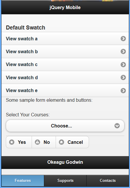
|
SWATCHE A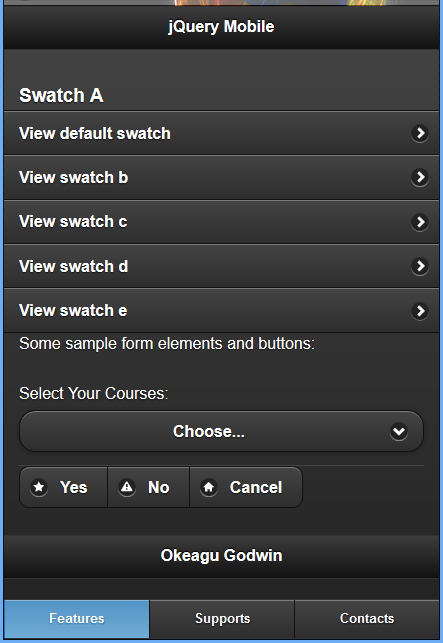
|
SWATCHE B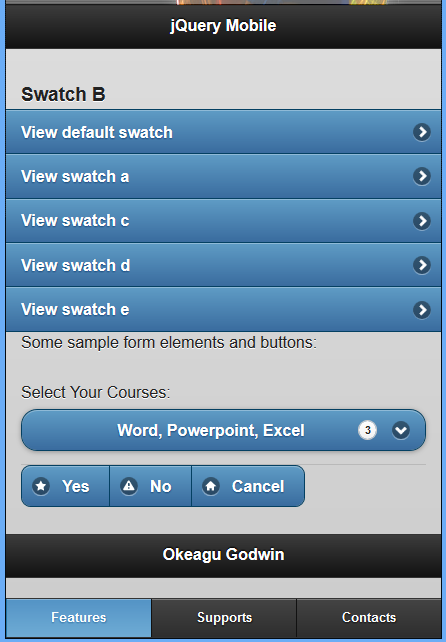
|
SWATCHE C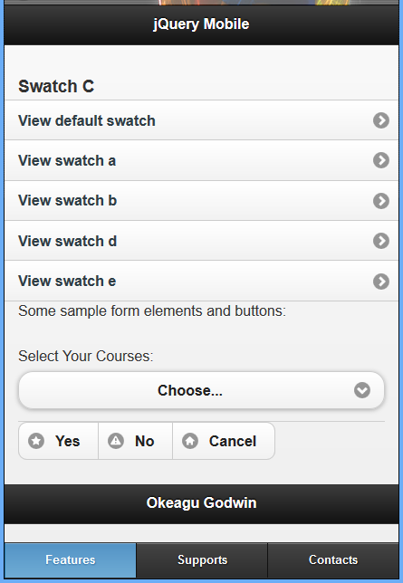
|
SWATCHE D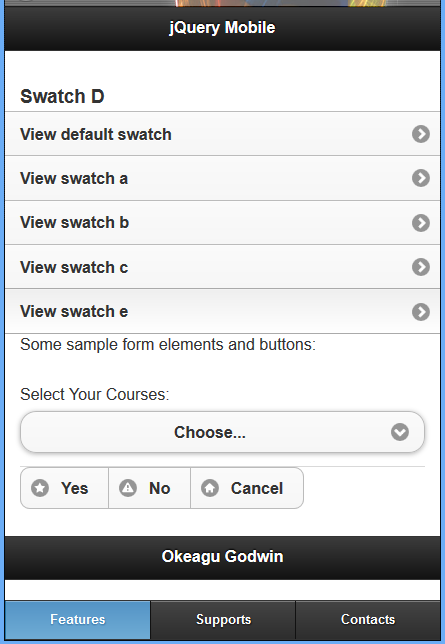
|
SWATCHE E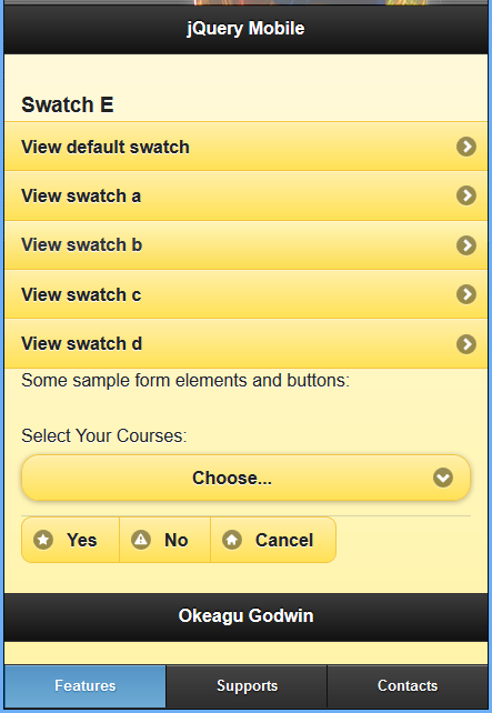
|
| Some few image of the ‘choose’ label of select form input when clicked | ||
|
|
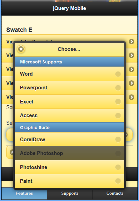
|
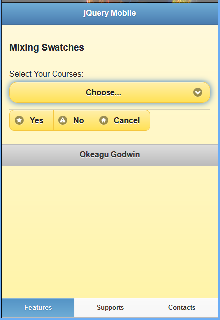
MIXING JQUERY MOBILE SWATCHES
You can even mix and match swatches within a given page, giving you fine control over the look and feel of your application.
Example 43: Mixing common default swatches in jQuery mobile
|
<!DOCTYPE html>
<html>
<head>
  <title>Script-Tutorials: Cutomized icons in jQuery Mobile</title>
  <meta name="viewport" content="width=device-width, initial-scale=1">
  <link rel="stylesheet" href="http://code.jquery.com/mobile/1.1.0/jquery.mobile-1.1.0.min.css" />
  <script src="http://code.jquery.com/jquery-1.7.1.min.js"></script>
  <script src="http://code.jquery.com/mobile/1.1.0/jquery.mobile-1.1.0.min.js"></script>
</head>
<body>
  <section id="swatch-mixed" data-role="page" data-theme="e">
    <header data-role="header" data-theme="b">
      <h1>jQuery Mobile</h1>
    </header>
    <div class="content" data-role="content">
      <h3>Mixing Swatches</h3>
      <form action="formprocessor.php" method="post">
        <div data-role="fieldcontain">
          <label for="select-courses">Select Your Courses:</label>
          <select id="select-courses" name="select-courses" data-native-menu="false" multiple="multiple">
            <option value="choose" data-placeholder="true">Choose...</option>
            <optgroup label="Microsoft Supports">
              <option value="Word">Word</option>
              <option value="Powerpoint">Powerpoint</option>
              <option value="Excel">Excel</option>
              <option value="Access">Access</option>
            </optgroup>
            <optgroup label="Graphic Suite">
              <option value="CorelDraw">CorelDraw</option>
              <option value="Adobe Photoshop" disabled="disabled">Adobe Photoshop</option>
              <option value="Photoshine">Photoshine</option>
              <option value="Paint">Paint</option>
            </optgroup>
          </select>
        </div>
      </form>
      <div data-role="controlgroup" data-type="horizontal">
        <a href="#" data-role="button" data-icon="star">Yes</a>
        <a href="#" data-role="button" data-icon="alert">No</a>
        <a href="#" data-role="button" data-icon="home">Cancel</a>
      </div>
    </div>
    </div>
    <footer data-role="footer" data-theme="d">
      <h1>Okeagu Godwin</h1>
    </footer>
    <div data-role="footer" data-position="fixed" data-id="rps" data-theme="d">
      <div data-role="navbar">
        <ul>
          <li><a href="#" class="ui-btn-active ui-statepersist">Features</a>
          </li>
          <li><a href="#">Supports</a>
          </li>
          <li><a href="#">Contacts</a>
          </li>
        </ul>
      </div>
    </div>
  </section>
</body>
</html>
|
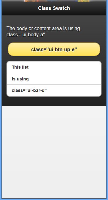
SPECIFYING THE SWATCH USED ON ELEMENTS BY CLASS ATTRIBUTE VALUE
Starting at the top you can see that both the page and the header sections do not have a datatheme attribute used, so theme defaults will be used on these sections.
Example 44: Mixing common default swatches in jQuery mobile by specifying the swatch used on elements by class attribute value
|
<!DOCTYPE html>
<html>
<head>
  <title>Script-Tutorials: Swatches</title>
  <meta name="viewport" content="width=device-width, initial-scale=1">
  <link rel="stylesheet" href="http://code.jquery.com/mobile/1.1.0-rc.1/jquery.mobile-1.1.0-rc.1.min.css" />
  <script src="http://code.jquery.com/jquery-1.7.1.min.js"></script>
  <script src="http://code.jquery.com/mobile/1.1.0-rc.1/jquery.mobile-1.1.0-rc.1.min.js">
  </script>
</head>
<body>
  <div data-role="page">
    <div data-role="header">
      <h1>Class Swatch</h1>
    </div>
    <div data-role="content" class="ui-body-a">
      <p>The body or content area is using class="ui-body-a"</p>
      <a href="#" data-role="button" class="ui-btn-up-e">class="ui-btn-up-e"</a>
      <ul data-role="listview" data-inset="true" class="ui-bar-d">
        <li>This list</li>
        <li>is using</li>
        <li>class="ui-bar-d"</li>
      </ul>
    </div>
  </div>
</body>
</html>
|
While only a few classes were used, you can customize just about every facet of the base jQuery
Mobile styles by overwriting classes like the following:
- ui-bar-(a-z)
- ui-body-(a-z)
- ui-btn-up-(a-z)
- ui-btn-down-(a-z)
- ui-btn-active
- ui-corner-all
- ui-br
- ui-icon
- ui-icon-alt
- ui-overlay
- ui-shadow
To see all the classes that you can use, open the noncompressed or minified CSS file that is part of the jQuery Mobile framework. This file has been commented and is really helpful when trying to create your own customized styles. Let’s take a look at how to create our own styles and include them.
CUSTOMIZING A SWATCH
The theme swatches in jQuery Mobile are all defined by CSS, so they are easy to modify to suit your individual needs. The swatches are broken out into sections in the jQuery Mobile style sheet, and are straightforward.
The best way to modify a theme is to create a style sheet that overrides the desired styles and then load that style sheet after you load the jQuery Mobile style sheet. This is especially useful if you are using the CDN to serve the jQuery Mobile style sheet.
APPLYING A CUSTOM THEME
Now that you know you are able to customize the styles of jQuery Mobile by using CSS classes, it is time to learn how to modify the default styles and even include your own. To do this you need to either edit the existing CSS file, or create your own and add it to the mobile page. Because I believe in using nondestructive methods when learning something new, we create a new CSS style sheet and add it to our page.
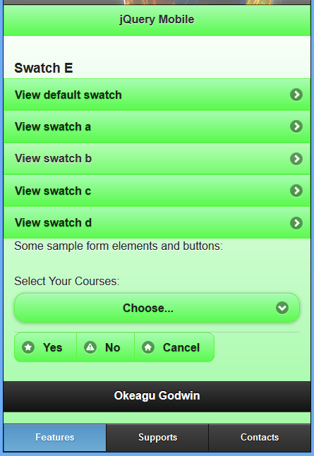
For example, let’s say we want to change the yellow colors of Swatch E to be green. It’s a simple matter of creating some override rules.
Note that I have included my custom Swatch E style sheet after the jQuery Mobile style sheet, thus guaranteeing that my styles will supersede the default styles.
Example 45: Applying a custom theme
<!DOCTYPE html>
<html>
<head>
  <title>Script-Tutorials: Cutomized icons in jQuery Mobile</title>
  <meta name="viewport" content="width=device-width, initial-scale=1">
  <link rel="stylesheet" href="http://code.jquery.com/mobile/1.1.0/jquery.mobile-1.1.0.min.css" />
  <script src="http://code.jquery.com/jquery-1.7.1.min.js"></script>
  <script src="http://code.jquery.com/mobile/1.1.0/jquery.mobile-1.1.0.min.js"></script>
  <style>
    /*
Change:
#fceda7 to #a7fcaf
#fadb4e to #5afa4e
#f7c942 to #5cf742
#33ff33 to #9efaa2
#fe3 to #33ff33
#fcf0b5 to #b5fcb5
#e79952 to #52e760
#fbe26f to #76fb6f
*/
    .ui-bar-e {
      border: 1px solid #5cf742;
      background: #5afa4e;
      background-image: -moz-linear-gradient(top, #a7fcaf, #5afa4e);
      background-image: -webkit-gradient(linear, left top, left bottom, color-stop(0, #a7fcaf), color-stop(1, #5afa4e));
      -ms-filter: "progid:DXImageTransform.Microsoft.gradient(startColorStr='#a7fcaf',EndColorStr='#5afa4e')";
    }
    .ui-body-e {
      border: 1px solid #5cf742;
      background: #9efaa2;
      background-image: -moz-linear-gradient(top, #fff, #9efaa2);
      background-image: -webkit-gradient(linear, left top, left bottom, color-stop(0, #fff), color-stop(1, #9efaa2));
      -ms-filter: "progid:DXImageTransform.Microsoft.gradient(startColorStr='#ffffff',EndColorStr='#9efaa2')";
    }
    .ui-btn-up-e {
      border: 1px solid #5cf742;
      background: #5afa4e;
      text-shadow: 0 1px 1px #33ff33;
      background-image: -moz-linear-gradient(top, #a7fcaf, #5afa4e);
      background-image: -webkit-gradient(linear, left top, left bottom, color-stop(0, #a7fcaf), color-stop(1, #5afa4e));
      -ms-filter: "progid:DXImageTransform.Microsoft.gradient(startColorStr='#a7fcaf',EndColorStr='#5afa4e')";
    }
    .ui-btn-hover-e {
      border: 1px solid #52e760;
      background: #76fb6f;
      background-image: -moz-linear-gradient(top, #b5fcb5, #76fb6f);
      background-image: -webkit-gradient(linear, left top, left bottom, color-stop(0, #b5fcb5), color-stop(1, #76fb6f));
      -ms-filter: "progid:DXImageTransform.Microsoft.gradient(startColorStr='#b5fcb5',EndColorStr='#76fb6f')";
    }
    .ui-btn-down-e {
      border: 1px solid #5cf742;
      background: #a7fcaf;
      background-image: -moz-linear-gradient(top, #5afa4e, #a7fcaf);
      background-image: -webkit-gradient(linear, left top, left bottom, color-stop(0, #5afa4e), color-stop(1, #a7fcaf));
      -ms-filter: "progid:DXImageTransform.Microsoft.gradient(startColorStr='#5afa4e',EndColorStr='#a7fcaf')";
    }
  </style>
</head>
<body>
  <section id="swatch-e" data-role="page" data-theme="e">
    <header data-role="header" data-theme="e">
      <h1>jQuery Mobile</h1>
    </header>
    <div class="content" data-role="content">
      <h3>Swatch E</h3>
      <ul data-role="listview">
        <li><a href="#swatch-default">View default swatch</a>
        </li>
        <li><a href="#swatch-a">View swatch a</a>
        </li>
        <li><a href="#swatch-b">View swatch b</a>
        </li>
        <li><a href="#swatch-c">View swatch c</a>
        </li>
        <li><a href="#swatch-d">View swatch d</a>
        </li>
      </ul>
      <p>Some sample form elements and buttons:</p>
      <form action="formprocessor.php" method="post">
        <div data-role="fieldcontain">
          <label for="select-courses">Select Your Courses:</label>
          <select id="select-courses" name="select-courses" data-native-menu="false" multiple="multiple">
            <option value="choose" data-placeholder="true">Choose...</option>
            <optgroup label="Microsoft Supports">
              <option value="Word">Word</option>
              <option value="Powerpoint">Powerpoint</option>
              <option value="Excel">Excel</option>
              <option value="Access">Access</option>
            </optgroup>
            <optgroup label="Graphic Suite">
              <option value="CorelDraw">CorelDraw</option>
              <option value="Adobe Photoshop" disabled="disabled">Adobe Photoshop</option>
              <option value="Photoshine">Photoshine</option>
              <option value="Paint">Paint</option>
            </optgroup>
          </select>
        </div>
      </form>
      <div data-role="controlgroup" data-type="horizontal">
        <a href="#" data-role="button" data-icon="star">Yes</a>
        <a href="#" data-role="button" data-icon="alert">No</a>
        <a href="#" data-role="button" data-icon="home">Cancel</a>
      </div>
    </div>
    <footer data-role="footer">
      <h1>Footer</h1>
    </footer>
    <div data-role="footer" data-position="fixed" data-id="rps">
      <div data-role="navbar">
        <ul>
          <li><a href="#" class="ui-btn-active ui-statepersist">Features</a>
          </li>
          <li><a href="#">Supports</a>
          </li>
          <li><a href="#">Contacts</a>
          </li>
        </ul>
      </div>
    </div>
  </section>
</body>
</html>
|
|
CREATING A SWATCH
You have a few different options when it comes to creating a swatch. You can either modify an existing swatch or code one from scratch, or copy one and change the swatch letter and change the settings to something you’d prefer. One other option is also available ‘Rolling Your Own Theme with ThemeRoller’.
To create our own swatch, we are going to copy one of the existing swatches and then modify the styles to be what we want.
Below is an entire swatch that was copied and then changed to be a custom swatch.
Example 46: Entire swatch – a copied and changed/modified to swatch f
<style>
  .ui-bar-f {
    border: 1px solid #4a4a4a;
    background: #333333;
    color: #ffffff;
    font-weight: bold;
    text-shadow: 0 -1px 1px #000000;
    background-image: -webkit-gradient(linear, left top, left bottom, from( #014D88), to( #111));
    /* Saf4+, Chrome */
    background-image: -webkit-linear-gradient(#014D88, #111);
    /* Chrome 10+, Saf5.1+ */
    background-image: -moz-linear-gradient(#014D88, #111);
    /* FF3.6 */
    background-image: -ms-linear-gradient(#014D88, #111);
    /* IE10 */
    background-image: -o-linear-gradient(#014D88, #111);
    /* Opera 11.10+ */
    background-image: linear-gradient(#014D88, #111);
  }
  .ui-bar-f,
  .ui-bar-f input,
  .ui-bar-f select,
  .ui-bar-f textarea,
  .ui-bar-f button {
    font-family: Helvetica, Arial, sans-serif;
  }
  .ui-bar-f .ui-link-inherit {
    color: #fff;
  }
  .ui-bar-f .ui-link {
    color: #F7E065;
    font-weight: bold;
  }
  .ui-bar-f .ui-link:hover {
    color: #FFFF7F;
  }
  .ui-bar-f .ui-link:active {
    color: #FFFF7F;
  }
  .ui-bar-f .ui-link:visited {
    color: #FFFF7F;
  }
  .ui-body-f,
  .ui-dialog.ui-overlay-f {
    border: 1px solid #3f3f3f;
    background: #444444;
    color: #fff;
    text-shadow: 0 1px 0 #000;
    font-weight: normal;
    background-image: -webkit-gradient(linear, left top, left bottom, from( #0C8DD2), to( #014D88));
    /* Saf4+, Chrome */
    background-image: -webkit-linear-gradient(#0C8DD2, #014D88);
    /* Chrome 10+, Saf5.1+ */
    background-image: -moz-linear-gradient(#0C8DD2, #014D88);
    /* FF3.6 */
    background-image: -ms-linear-gradient(#0C8DD2, #014D88/);
    /* IE10 */
    background-image: -o-linear-gradient(#0C8DD2, #014D88);
    /* Opera 11.10+ */
    background-image: linear-gradient(#0C8DD2, #014D88);
  }
  .ui-body-f,
  .ui-body-f input,
  .ui-body-f select,
  .ui-body-f textarea,
  .ui-body-f button {
    font-family: Helvetica, Arial, sans-serif;
  }
  .ui-body-f .ui-link-inherit {
    color: #fff;
  }
  .ui-body-f .ui-link {
    color: #FFFF7F;
    font-weight: bold;
  }
  .ui-body-f .ui-link:hover {
    color: #FFFF7F;
  }
  .ui-body-f .ui-link:active {
    color: #FFFF7F;
  }
  .ui-body-f .ui-link:visited {
    color: #FFFF7F;
  }
  .ui-btn-up-f {
    border: 1px solid #222;
    background: #065BDB;
    font-weight: bold;
    color: #fff;
    text-shadow: 0 -1px 1px #000;
    background-image: -webkit-gradient(linear, left top, left bottom, from( #1065E4), to( #065BDB));
    /* Saf4+, Chrome */
    background-image: -webkit-linear-gradient(#1065E4, #065BDB);
    /* Chrome 10+, Saf5.1+ */
    background-image: -moz-linear-gradient(#1065E4, #065BDB);
    /* FF3.6 */
    background-image: -ms-linear-gradient(#1065E4, #065BDB);
    /* IE10 */
    background-image: -o-linear-gradient(#1065E4, #065BDB);
    /* Opera 11.10+ */
    background-image: linear-gradient(#1065E4, #065BDB);
  }
  .ui-btn-up-f a.ui-link-inherit {
    color: #fff/;
  }
  .ui-btn-hover-f {
    border: 1px solid 000;
    background: #444444;
    font-weight: bold;
    color: #fff;
    text-shadow: 0 -1px 1px #000;
    background-image: -webkit-gradient(linear, left top, left bottom, from( #1A6FEF), to( #1065E4));
    /* Saf4+, Chrome */
    background-image: -webkit-linear-gradient(#1A6FEF, #1065E4);
    /* Chrome 10+, Saf5.1+ */
    background-image: -moz-linear-gradient(#1A6FEF, #1065E4);
    /* FF3.6 */
    background-image: -ms-linear-gradient(#1A6FEF, #1065E4);
    /* IE10 */
    background-image: -o-linear-gradient(#1A6FEF, #1065E4);
    /* Opera 11.10+ */
    background-image: linear-gradient(#1A6FEF, #1065E4);
  }
  .ui-btn-hover-f a.ui-link-inherit {
    color: #fff;
  }
  .ui-btn-down-f {
    border: 1px solid #014D88;
    background: #012E50;
    font-weight: bold;
    color: #fff;
    text-shadow: 0 -1px 1px #000;
    background-image: -webkit-gradient(linear, left top, left bottom, from( #013B66), to( #0261A9));
    /* Saf4+, Chrome */
    background-image: -webkit-linear-gradient(#013B66, #0261A9/);
    /* Chrome 10+, Saf5.1+ */
    background-image: -moz-linear-gradient(#013B66, #0261A9);
    /* FF3.6 */
    background-image: -ms-linear-gradient(#013B66, #0261A9);
    /* IE10 */
    background-image: -o-linear-gradient(#013B66, #0261A);
    /* Opera 11.10+ */
    background-image: linear-gradient(#013B66, #0261A9);
  }
  .ui-btn-down-f a.ui-link-inherit {
    color: #fff;
  }
  .ui-btn-up-f,
  .ui-btn-hover-f,
  .ui-btn-down-f {
    font-family: Helvetica, Arial, sans-serif;
    text-decoration: none;
  }
</style>
To create this new f swatch, the a swatch was copied and then modified. The fastest way to start the modification is to do a search-and-replace of the entire file for ‘-a’ and replace it with a dash and the letter of the swatch you are creating. When performing a search and replace, make sure you do not replace -o, -m, -w, -g, -s, or -i, or you will either break your styles altogether or break the fallback support for other browsers.
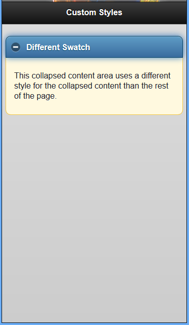
The f theme in an html markup in preview in a mobile browser
Example 47: Modified new created theme f in standard html markup setting
<!DOCTYPE html>
<html>
<head>
<title>Script-Tutorials: Cutomized icons in jQuery Mobile</title>
<meta name="viewport" content="width=device-width, initial-scale=1">
<link rel="stylesheet" href="http://code.jquery.com/mobile/1.1.0/jquery.mobile-1.1.0.min.css" />
<script src="http://code.jquery.com/jquery-1.7.1.min.js"></script>
<script src="http://code.jquery.com/mobile/1.1.0/jquery.mobile-1.1.0.min.js"></script>
<style>
.ui-bar-f {
border: 1px solid #4a4a4a;
background: #333333;
color: #ffffff;
font-weight: bold;
text-shadow: 0 -1px 1px #000000;
background-image: -webkit-gradient(linear, left top, left bottom, from( #014D88), to( #111));
/* Saf4+, Chrome */
background-image: -webkit-linear-gradient(#014D88, #111);
/* Chrome 10+, Saf5.1+ */
background-image: -moz-linear-gradient(#014D88, #111);
/* FF3.6 */
background-image: -ms-linear-gradient(#014D88, #111);
/* IE10 */
background-image: -o-linear-gradient(#014D88, #111);
/* Opera 11.10+ */
background-image: linear-gradient(#014D88, #111);
}
.ui-bar-f,
.ui-bar-f input,
.ui-bar-f select,
.ui-bar-f textarea,
.ui-bar-f button {
font-family: Helvetica, Arial, sans-serif;
}
.ui-bar-f .ui-link-inherit {
color: #fff;
}
.ui-bar-f .ui-link {
color: #F7E065;
font-weight: bold;
}
.ui-bar-f .ui-link:hover {
color: #FFFF7F;
}
.ui-bar-f .ui-link:active {
color: #FFFF7F;
}
.ui-bar-f .ui-link:visited {
color: #FFFF7F;
}
.ui-body-f,
.ui-dialog.ui-overlay-f {
border: 1px solid #3f3f3f;
background: #444444;
color: #fff;
text-shadow: 0 1px 0 #000;
font-weight: normal;
background-image: -webkit-gradient(linear, left top, left bottom, from( #0C8DD2), to( #014D88));
/* Saf4+, Chrome */
background-image: -webkit-linear-gradient(#0C8DD2, #014D88);
/* Chrome 10+, Saf5.1+ */
background-image: -moz-linear-gradient(#0C8DD2, #014D88);
/* FF3.6 */
background-image: -ms-linear-gradient(#0C8DD2, #014D88/);
/* IE10 */
background-image: -o-linear-gradient(#0C8DD2, #014D88);
/* Opera 11.10+ */
background-image: linear-gradient(#0C8DD2, #014D88);
}
.ui-body-f,
.ui-body-f input,
.ui-body-f select,
.ui-body-f textarea,
.ui-body-f button {
font-family: Helvetica, Arial, sans-serif;
}
.ui-body-f .ui-link-inherit {
color: #fff;
}
.ui-body-f .ui-link {
color: #FFFF7F;
font-weight: bold;
}
.ui-body-f .ui-link:hover {
color: #FFFF7F;
}
.ui-body-f .ui-link:active {
color: #FFFF7F;
}
.ui-body-f .ui-link:visited {
color: #FFFF7F;
}
.ui-btn-up-f {
border: 1px solid #222;
background: #065BDB;
font-weight: bold;
color: #fff;
text-shadow: 0 -1px 1px #000;
background-image: -webkit-gradient(linear, left top, left bottom, from( #1065E4), to( #065BDB));
/* Saf4+, Chrome */
background-image: -webkit-linear-gradient(#1065E4, #065BDB);
/* Chrome 10+, Saf5.1+ */
background-image: -moz-linear-gradient(#1065E4, #065BDB);
/* FF3.6 */
background-image: -ms-linear-gradient(#1065E4, #065BDB);
/* IE10 */
background-image: -o-linear-gradient(#1065E4, #065BDB);
/* Opera 11.10+ */
background-image: linear-gradient(#1065E4, #065BDB);
}
.ui-btn-up-f a.ui-link-inherit {
color: #fff/;
}
.ui-btn-hover-f {
border: 1px solid 000;
background: #444444;
font-weight: bold;
color: #fff;
text-shadow: 0 -1px 1px #000;
background-image: -webkit-gradient(linear, left top, left bottom, from( #1A6FEF), to( #1065E4));
/* Saf4+, Chrome */
background-image: -webkit-linear-gradient(#1A6FEF, #1065E4);
/* Chrome 10+, Saf5.1+ */
background-image: -moz-linear-gradient(#1A6FEF, #1065E4);
/* FF3.6 */
background-image: -ms-linear-gradient(#1A6FEF, #1065E4);
/* IE10 */
background-image: -o-linear-gradient(#1A6FEF, #1065E4);
/* Opera 11.10+ */
background-image: linear-gradient(#1A6FEF, #1065E4);
}
.ui-btn-hover-f a.ui-link-inherit {
color: #fff;
}
.ui-btn-down-f {
border: 1px solid #014D88;
background: #012E50;
font-weight: bold;
color: #fff;
text-shadow: 0 -1px 1px #000;
background-image: -webkit-gradient(linear, left top, left bottom, from( #013B66), to( #0261A9));
/* Saf4+, Chrome */
background-image: -webkit-linear-gradient(#013B66, #0261A9/);
/* Chrome 10+, Saf5.1+ */
background-image: -moz-linear-gradient(#013B66, #0261A9);
/* FF3.6 */
background-image: -ms-linear-gradient(#013B66, #0261A9);
/* IE10 */
background-image: -o-linear-gradient(#013B66, #0261A);
/* Opera 11.10+ */
background-image: linear-gradient(#013B66, #0261A9);
}
.ui-btn-down-f a.ui-link-inherit {
color: #fff;
}
.ui-btn-up-f,
.ui-btn-hover-f,
.ui-btn-down-f {
font-family: Helvetica, Arial, sans-serif;
text-decoration: none;
}
</style>
</head>
<body>
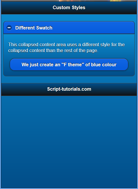
<div data-role="page" data-theme="f">
<div data-role="header" data-theme="f">
<h1>Custom Styles</h1>
</div>
<div data-role="content">
<div data-role="collapsible" data-collapsed="false" data-content-theme="f">
<h3>Different Swatch</h3>
<p>
This collapsed content area uses a different style for the collapsed content than the rest of the page.
</p>
<a href="#" data-role="button" data-theme="f"> We just create an "F theme" of blue colour </a>
</div>
</div>
<div data-role="footer" data-theme="f">
<h1>www.Script-Tutorials.com</h1>
</div>
</div>
</body>
</html>
THEMING SITE COMPONENTS
You just learned that you can use classes to change various aspects of the theme of your site, but there are a few extra options that you can use when theming individual components. Some components also have a default setting that you should be aware of.
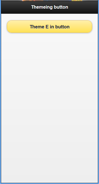
BUTTONS
Buttons automatically use the swatch that is assigned to the parent container. If you place a button in a content block that uses swatch b, then the button will use swatch b.
You can change this by using the data-theme attribute on the button directly to change what swatch it uses. The following one-line snippet shows the markup for changing a button theme using this method:
<a href="#" data-role="button" data-theme="e"></a>
Example 48: Using jQuery theme in site button components
|
<!DOCTYPE html>
<html>
<head>
  <title>Script-Tutorials: Themeing Components</title>
  <meta name="viewport" content="width=device-width, initial-scale=1">
  <link rel="stylesheet" href="http://code.jquery.com/mobile/1.1.0-rc.1/jquery.mobile-1.1.0-rc.1.min.css" />
  <script src="http://code.jquery.com/jquery-1.7.1.min.js"></script>
  <script src="http://code.jquery.com/mobile/1.1.0-rc.1/jquery.mobile-1.1.0-rc.1.min.js">
  </script>
</head>
<body>
  <div data-role="page">
    <div data-role="header">
      <h1>Themeing button </h1>
    </div>
    <div data-role="content">
      <a href="#" data-role="button" data-theme="e">Theme E in button</a>
    </div>
  </div>
</body>
</html>
|
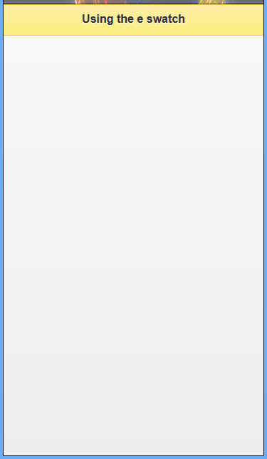
BARS
Component bars include the header and footer sections of your page. By default they use the a swatch, but they can be changed to use any swatch you prefer by adding the data-theme attribute.
The following one-line snippet shows a div element being used to create a header section that uses the data-theme attribute to change the swatch applied to it.
<div data-role="header" data-theme="e"><h1>Using the e swatch</h1></div>
Example 49: Using jQuery theme in site bars components
|
<!DOCTYPE html>
<html>
<head>
  <title>Script-Tutorials: Themeing Components</title>
  <meta name="viewport" content="width=device-width, initial-scale=1">
  <link rel="stylesheet" href="http://code.jquery.com/mobile/1.1.0-rc.1/jquery.mobile-1.1.0-rc.1.min.css" />
  <script src="http://code.jquery.com/jquery-1.7.1.min.js"></script>
  <script src="http://code.jquery.com/mobile/1.1.0-rc.1/jquery.mobile-1.1.0-rc.1.min.js">
  </script>
</head>
<body>
  <div data-role="page">
    <div data-role="header" data-theme="e">
      <h1>Using the e swatch</h1>
    </div>
  </div>
</body>
</html>
|
CONTENT BLOCKS
Content block theming can be a little tricky. The jQuery Mobile team suggests that you do not apply a data-theme attribute directly to the content section of your page. This is because of the potential that the content section will not take up the entire viewable space of the page. When this happens the background applied cuts off abruptly leaving you with a page that appears broken. Instead you should apply the swatch you want used by using a data attribute on the element that contains the data-role=”page” attribute.
Content blocks can also accept a second theme attribute, data-content-theme. This second theme attribute applies to content that is inside collapsible containers. It can also be applied to the element with the data-role="page" attribute and will be inherited by child elements.
Example 50: Using jQuery theme in site content blocks component
|
<!DOCTYPE html>
<html>
<head>
  <title>Script-Tutorials: Themeing Components</title>
  <meta name="viewport" content="width=device-width, initial-scale=1">
  <link rel="stylesheet" href="http://code.jquery.com/mobile/1.1.0-rc.1/jquery.mobile-1.1.0-rc.1.min.css" />
  <script src="http://code.jquery.com/jquery-1.7.1.min.js"></script>
  <script src="http://code.jquery.com/mobile/1.1.0-rc.1/jquery.mobile-1.1.0-rc.1.min.js">
  </script>
</head>
<body>
  <div data-role="page" data-theme="b">
    <div data-role="header">
      <h1>Custom Styles</h1>
    </div>
    <div data-role="content">
      <div data-role="collapsible" data-collapsed="false" data-content-theme="e">
        <h3>Different Swatch</h3>
        <p>
          This collapsed content area uses a different style for the collapsed content than the rest of the page.
        </p>
      </div>
    </div>
  </div>
</body>
</html>
|
When using both data-theme and data-content-theme attributes on an element, the swatch used in the data-content-theme attribute generally overwrites the swatch used in the datatheme attribute. This explains why when you are trying to use both attributes on the page container you will only see the swatch specified in the data-content-theme.


