How to design the site?
In this article we will look at such aspects of website designing as: choosing an editor for preparing the site layout, defining sizes of the site, how to save sources, how to work with text and more. This article is mainly targeted for beginning web designers.
Which editor is better to do website design?
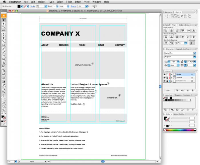
You can design your future Internet website in any graphical editor in which you are accustomed to working. Personally for me, for example, it is more convenient to use the Adobe Illustrator, although most designers tend to use Photoshop for these purposes. This is partially due to the fact, that browsers do not display vector images. As a result, in the process of preparing the site layout, all graphic elements are translated in a raster. Most often it is jpg. However if you need a transparent or semi-transparent background – we can use use png or gif (rarely). But most designers use Photoshop, not only because it is one of the best editors for raster graphics, which html understands, and also because this program is sufficiently well known, and therefore, most wanting to become designers usually begin studying computer graphics from Adobe Photoshop. Here are two main reasons why Photoshop is considered the most convenient program to make website design. And, if you do not typeset your own website, it is necessary to use it because html web designers are used to get the source in psd. Although, again, you can make the design in any convenient graphical editor.
What size to use to make a website?
First, if you are ordered to design the site, you need to forget about such a concept as dpi or metric system. Blocks sizes and inserted images on the site are specified in pixels or percentage (of the width / height) of the browser window (or a parent element).
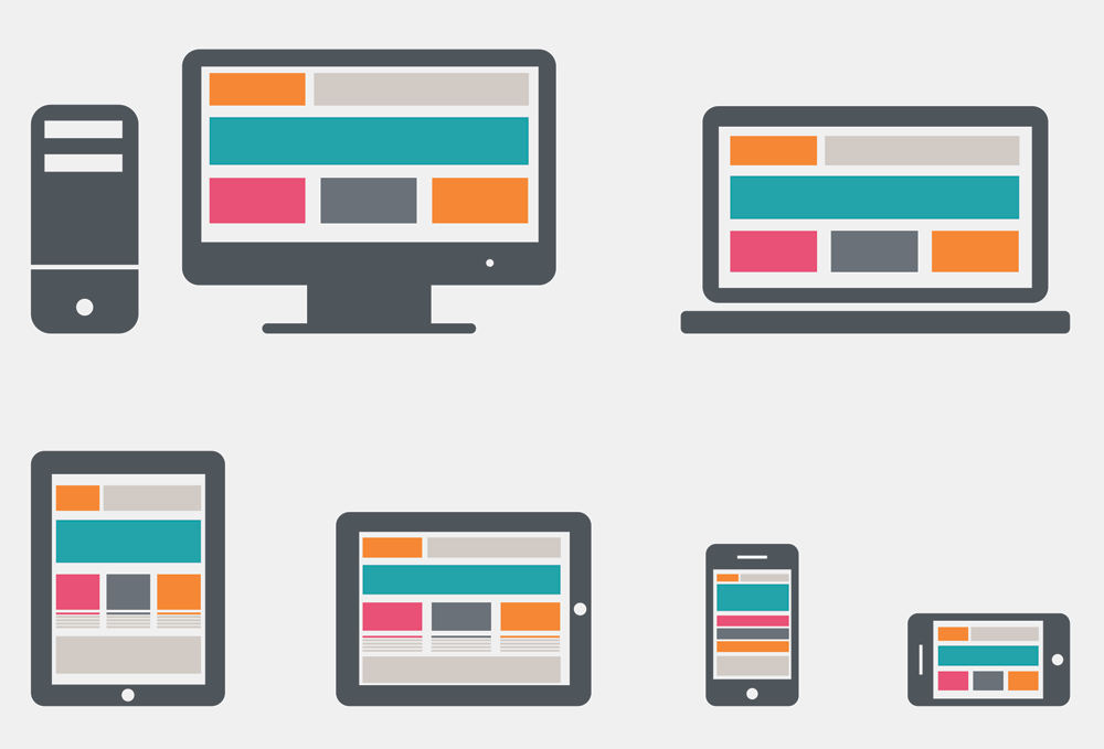
If the sizes in our website are defined in percentage, this site is called adaptive (or fluid / responsive). Adaptive and responsive sites are rather convenient. But, if you do not fully understand what you are doing, you better use fixed sizes. If your customer insists on the adaptive or responsive design of the site, then before doing the design, please think very well, which blocks will be stretched by increasing the window, and what will not be stretched. You can design it in the following way – make a few files with several standard sizes (eg: 1280×1024, 1920×1280 and 1024×768), that will clearly show how the website will look depending on the screen resolution. Write in the annex to the template – maximum and minimum block sizes.
So what’s a fixed value should be a website?
When we do a mockup of a business card and leaflet, we know the final size of the card. But it is a bit more complicated in case of the design of the site. Because all monitors have different screen resolution, ie the number of pixels in width and height. And this must be considered in the design. Most monitors have a resolution of 1280 or 1920 pixels wide. As a rule, we always rely to this majority. But do not do text blocks wider 800 pixels. When we have the resolution of 800×600 pixels, and we lose in the appearance of the site – it is not so terrible. But when a string does not fit on our monitor, reading becomes extremely uncomfortable.
It is best to make the site 1024 pixels in width and add to our layout some ‘free space’ to the size of 1280. Website in the layout can be aligned to the left, right, or center. With or without margins. Moreover, this ‘free space’ is not necessarily a white field. It may be any other color or consist of repeating graphic elements. As an option – seamless texture. You can also use a non-repeating background image to scale it to 100% width and disable scrolling, but firstly, sometimes it is not very convenient, and secondly – a site with such a background image will be very weighty and long time to load.
How do I save the source?
It is better to save sources in psd (photoshop), where each graphic element is on its own layer. Moreover, it is desirable to name the layers so that they could be easily understood. For example: ‘general site background’, ‘text block background’ and so on. Layers can be grouped by meaning. For example, the text and the background on which the text is, can be grouped and nameed into a group ‘main text block’. Or you can group a block with links with background into a group called ‘links group XX.’ Briefly, try to make this psd as easy as possible, so your html-coder would not call you every five minutes with various questions.
So how to make a beautiful website design?
The phrase ‘beautiful site’ can easily scare a competent webmaster. Site, first of all should be functional, secondly – the site should load quickly and be user-friendly. But ‘beauty’ is usually less important. Besides, everyone is different in taste and color. Thus hardly anyone will be able to teach you how to do a ‘beauty’. Creating a new design, it would be nice to think, first of all, about the functionality of the website. And have elements so that a visitor could easily find the information he needed. As it is necessary to take care that the user came to the site does not run away from it immediately, frightened or guided retching. To do this, you should not use many animated objects in the design. Such sites resemble pornography sites from which is about to climb the terrible viruses to your computer. In addition, they distract attention from the main part of the site – the text. Just do not use in the design of various ‘features’ like a nice little doggies or kitties. The Internet has a lot of this junk. Try to come up with something interesting.
Exceptions can be made only for those who create such a resource with information ‘My name is Nick, this is my dog. “Such people should immediately cut off his hands :-)
Working with text
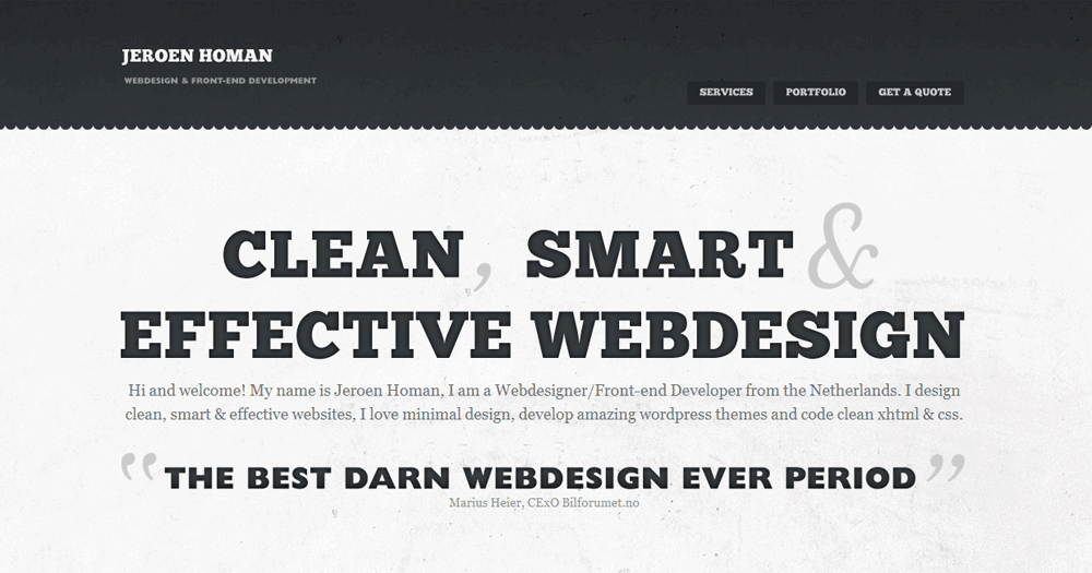
First, never forget about typography. Text and background colors should be contrast and bright, main text should be readable and navigation noticeable. Do not forget that if a user does not set a specific font, it will be replaced (by the browser) to the ‘default’ browser font. This creates the risk that your site will lose a lot in appearance. So use common fonts in design.
But if your customer is stubborned and insists on the corporate font, this problem can be solved in several ways:
- ‘Kill’ the customer. But it does not make money, this also is a violation of a criminal code and has little to do with design.
- Rasterize the font and paste the text as image. However, it is not better than the first variant. First of all: the letters will get serifs and it will be difficult to read; secondly, this text will not be indexed by search engines and achieve high positions in issuance of search engines; third: pictures are greater in size and this site will be long enough to load. Especially, if a user connects to the Internet via a modem.
- Load the font on the user’s computer using CSS. But it can be almost impossible, because the user will hardly give consent to install unknown fonts to him, losing this traffic and time
- Choose more common fonts that are similar for the necessary corporate font and prescribe them descending from the more similar to the more popular. That is to make the job a typesetter (coder), in which he will prescribe these fonts. It will act as if the computer does not have the desired font, the browser looks at what it can be replaced, and selects the first from the list, which is installed on the computer. Although there is a problem if the customer’s computer does not have the desired font.
- You may consider to use Cufon service by jQuery. This will allow to load custom fonts to your website with minimal casualties. It only works with True Type fonts (in ttf format)
- Remake the brand book of the customer and change the font on corporate Arial.


