How to create simple and effective design template
Today we are going to use jQuery mobile library again. Today I’m going to show you how to create simple, but very effective webdesign template for your website. Our template consists of header (with small logo), navigation menu, main content area (2-column grid layout with custom design boxes) and footer. More, we can say that this is a fluid layout, which means that it looks great with any resolution of your monitor. Welcome to try it.
Now please download the source files and let’s start coding !
Live Demo
[sociallocker]
download in package
[/sociallocker]
Step 1. HTML
For our demonstration I prepared 3-pages layout (multi-page), look at it’s anatomy:
<!-- Define page 1 -->
<div data-role="page" id="page1" data-title="First page">
    <!-- Define header block (with logo) -->
    <div data-role="header">
        ..........
    </div>
    <!-- Define navigation menu -->
    <div data-role="navbar">
        ..........
    </div>
    <!-- Define main content block -->
    <div data-role="content">
        ..........
    </div><!-- /content -->
    <!-- Define footer block -->
    <div data-role="footer" class="ui-bar" data-position="fixed">
        ..........
    </div>
</div>
<!-- Define page 2 -->
<div data-role="page" id="page2"  data-title="Info page">
    ..........
</div>
<!-- Define page 3 -->
<div data-role="page" id="page3"  data-title="About page">
    ..........
</div>
I hope that everything is clean. Please pay attention, that on multi-page documents in order to define a title to each page, we can use ‘data-title’ attribute. Now, I put header and navigation menu (buttons) at each page:
<!-- Define header block (with logo) -->
<div data-role="header">
    <img border="0" src="logo.png" alt="logo" style="float:left;display:inline"/>
    <h1>My website</h1>
</div>
<!-- Define navigation menu -->
<div data-role="navbar">
    <ul>
        <li><a href="#page1" class="ui-btn-active ui-state-persist">Main</a></li>
        <li><a href="#page2" data-transition="fade">Info</a></li>
        <li><a href="#page3" data-transition="fade">About</a></li>
    </ul>
</div>
In order to make header element – I set data-role="header" for our header’s DIV element. Next is – navigation menu. If you need to set active status – you can apply custom class="ui-btn-active ui-state-persist". Now – is it a very interesting moment. As you can see – by default – all the pages except first one – invisible by default. jQuery mobile let us switch between pages very easy, we even can use different transition effects, this is very easy, look at <a href="#page2" data-transition="fade"> – this link switch to page2 using ‘fade’ CSS3 transition effect. But you always can use different effects: fade, pop, flip, turn, flow, slidefade, slide, slideup, slidedown and none.
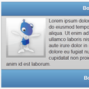
Finally – custom design boxes. I prepared an own custom design box layout:
<!-- Define Design box element with own header, content, footer -->
<div class="design_box">
    <div data-role="header" data-theme="b">
        <h1>Box header</h1>
        <a href="#" data-icon="gear" class="ui-btn-right">Options</a>
    </div>
    <div class="ui-body ui-body-b">
        <div><img src="article.png" style="float: left; margin: 0px 10px 10px 0px;">Lorem ipsum dolor sit amet, consectetur adipisicing elit, sed do eiusmod tempor incididunt ut labore et dolore magna aliqua. Ut enim ad minim veniam, quis nostrud exercitation ullamco laboris nisi ut aliquip ex ea commodo consequat. Duis aute irure dolor in reprehenderit in voluptate velit esse cillum dolore eu fugiat nulla pariatur. Excepteur sint occaecat cupidatat non proident, sunt in culpa qui officia deserunt mollit anim id est laborum.</div>
    </div>
    <div data-role="footer" class="ui-bar" data-theme="b">
        <h3>Box footer</h3>
    </div>
</div>
You can see here own header, body, and even footer.
Live Demo
Conclusion
Today we have created really great and simple web page layout using jQuery mobile. I think that this is very interesting addition to usual jQuery, and, it seems that it is much more better than usual jQuery UI? :-) Anyway – good luck in your work!


