
CSS3 Bottom navigation menu tutorial. Today I prepared nice CSS3 bottom navigation menu for you. This is will sliding drop down menu with fixed position in bottom of screen. Also, I going to use jQuery for sliding effects.
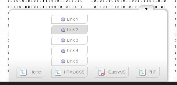
Here are final result (what we will creating):
Here are samples and downloadable package:
Live Demo
[sociallocker]
download in package
[/sociallocker]
Ok, download the example files and lets start coding !
Step 1. HTML
Here are html source code of our page with menu. Whole menu built on UL-LI elements.
index.html
<!DOCTYPE html>
<html lang="en" >
    <head>
        <meta charset="utf-8" />
        <title>CSS3 Bottom navigation menu | Script Tutorials</title>
        <link rel="stylesheet" href="css/layout.css" type="text/css" media="screen">
        <link rel="stylesheet" href="css/menu.css" type="text/css" media="screen">
        <!--[if lt IE 9]>
          <script src="http://html5shiv.googlecode.com/svn/trunk/html5.js"></script>
        <![endif]-->
        <script type="text/javascript" src="js/jquery-1.5.2.min.js"></script>
        <script type="text/javascript" src="js/script.js"></script>
    </head>
    <body>
        <div class="menuContent">
            <a class="slider"><img alt="" id="bot" src="images/arrow_bottom.png"></a>
            <ul id="nav">
                <li><a href="#"><img src="images/t1.png" /> Home</a></li>
                <li>
                    <ul id="1">
                        <li><a href="#"><img src="images/empty.gif" />Link 1</a></li>
                        <li><a href="#"><img src="images/empty.gif" />Link 2</a></li>
                        <li><a href="#"><img src="images/empty.gif" />Link 3</a></li>
                        <li><a href="#"><img src="images/empty.gif" />Link 4</a></li>
                        <li><a href="#"><img src="images/empty.gif" />Link 5</a></li>
                    </ul>
                    <a href="#" class="sub" tabindex="1"><img src="images/t2.png" />HTML/CSS</a>
                </li>
                <li>
                    <ul id="2">
                        <li><a href="#"><img src="images/empty.gif" />Link 6</a></li>
                        <li><a href="#"><img src="images/empty.gif" />Link 7</a></li>
                        <li><a href="#"><img src="images/empty.gif" />Link 8</a></li>
                        <li><a href="#"><img src="images/empty.gif" />Link 9</a></li>
                        <li><a href="#"><img src="images/empty.gif" />Link 10</a></li>
                    </ul>
                    <a href="#" class="sub" tabindex="1"><img src="images/t3.png" />jQuery/JS</a>
                </li>
                <li><a href="#"><img src="images/t2.png" />PHP</a></li>
            </ul>
        </div>
        <footer>
            <h2>CSS3 Bottom navigation menu</h2>
            <a href="https://www.script-tutorials.com/css3-bottom-navigation-menu/" class="stuts">Back to original tutorial on <span>Script Tutorials</span></a>
        </footer>
    </body>
</html>
Step 2. CSS
Here are the CSS styles of our menu. Maybe you’ve noticed – that in our html – I have two CSS files: layout.css and menu.css. The first file (layout.css) contain the styles of our test page. We will not publish these styles in this article, but if you wish – you can find these styles in the package.
css/menu.css
.menuContent {
    background-color:#FFF;
    background-image: -moz-linear-gradient(center top, #FFF, #FFF, #FFF, #ddd);
    background-image: -webkit-gradient(linear, center top, center bottom, from(#FFF), color-stop(0.5, #FFF), to(#ddd));
    border:1px solid #C7C7C7;
    bottom: 70px;
    left: 300px;
    padding: 0 15px 5px;
    position: fixed;
    width:520px;
    -moz-border-radius-topright: 10px;
    -moz-border-radius-topleft: 10px;
    border-top-right-radius: 10px;
    border-top-left-radius: 10px;
    -moz-box-shadow: 3px -3px 5px #B8B8B8;
    -webkit-box-shadow: 3px -3px 5px #B8B8B8;
    box-shadow: 3px -3px 5px #B8B8B8;
}
.menuContent a.slider {
    background-color:#fff;
    background-image: -moz-linear-gradient(center top , #ddd, #FFF);
    background-image: -webkit-gradient(linear, center top, center bottom, from(#ddd), to(#FFF));
    border: 1px solid #C7C7C7;
    border-bottom:none;
    cursor: pointer;
    float:right;
    height: 8px;
    margin:-15px 30px 0 0;
    padding:3px 20px;
    width: 8px;
    z-index: 2001;
    -moz-border-radius-topright: 7px;
    -moz-border-radius-topleft: 7px;
    border-top-right-radius: 7px;
    border-top-left-radius: 7px;
    -moz-box-shadow: 3px -2px 3px #B8B8B8;
    -webkit-box-shadow: 3px -2px 3px #B8B8B8;
    box-shadow: 3px -2px 3px #B8B8B8;
}
.menuContent a.slider img {
    padding-bottom: 3px;
}
#nav {
    list-style: none;
}
#nav li {
    display: inline-block;
    margin: 10px;
}
#nav li a {
    border: 1px solid #ccc;
    color:#858585;
    display: block;
    padding: 5px 10px;
    text-align:center;
    text-decoration:none;
    width: auto;
    -moz-border-radius-bottomright: 10px;
    -moz-border-radius-topleft: 10px;
    border-bottom-right-radius: 10px;
    border-top-left-radius: 10px;
}
#nav li a:hover, #nav li a.active {
    background-color:#ddd;
}
#nav li ul {
    display:none;
}
#nav li ul li {
    margin: 5px 0;
    display: block;
}
#nav li a img {
    border-width: 0px;
    margin-right: 8px;
    vertical-align: middle;
}
#nav ul li a img {
    background: url("../images/bulb.png") no-repeat;
    border-width:0px;
    height:16px;
    line-height:22px;
    margin-right:5px;
    vertical-align:middle;
    width:16px;
}
Step 3. jQuery
Finally, here are a little of JS code for our menu (for different slide effects).
js/script.js
$(function(){
    $('.slider').click(function () {
        $('#nav').slideToggle(300);
        var img = $(this).find('img');
        if ($(img).attr('id') == 'bot') {
            $(img).attr('src', 'images/arrow_top.png');
            $(img).attr('id', 'top');
        } else {
            $(img).attr('src', 'images/arrow_bottom.png');
            $(img).attr('id', 'bot');
        }
    });
    $('.sub').click(function () {
        var cur = $(this).prev();
        $('#nav li ul').each(function() {
            if ($(this)[0] != $(cur)[0])
                $(this).slideUp(300);
        });
        $(cur).slideToggle(300);
    });
});
Step 4. Images
Last step – used images:


Live Demo
Conclusion
Hope you enjoyed with our new css3 bottom sliding menu, don’t forget to tell thanks and leave a comment :) Good luck!


thanks Andrew, I am learning a little about how all this CSS and JS and HTML fits together–like a puzzle or the gears of your logo. A beginner, I am customizing a landing page. I appreciate your generosity!
For some reason I cannot get the accordian to close on my page. The js file listed in the header and the path is correct, but… some little thing will Not allow me to close it! thanks again!
Hello cece,
I suggest you to activate firebug, and try to investigate what is wrong with your layout. Possible you will be able to solve your situation.
This is immpressive really. I have a question.
Is it possible to make the home button does not appear when you are on the home page, but instead it appears someone else and so on each side.
Hi Marko,
Yes, of course, this is possible. But in this case you should generate this menu with PHP. You just don’t need to generate some menu parts at certain pages, that’s all
Hello! thanks for this tutorial.
I have adapted the menu to my site :)
But may I ask you how to show first the slide in position “bot”?
Hello Nathalie,
Did you mean ‘bot’ or ‘top’ ? Because, default position is visible (bot).
Hi
This is a god sent I have been looking for code like this for some time. However I have one question. Is it possible to have the navigation bar hidden when the page is open up instead of visible.
Hello Aaron,
Yes, it is possible, change
<ul id="nav">
to
<ul id="nav" style="display:none">
Hi…It’s really nice and cool bottom nav. But I want to make it responsive I can I do this…..say if I increase the height of UL to 580 pixel. On window-resize how can I reduce adjust the height of UL. here is my modification to the menu css file.
#nav ul{
border-width:0px;
height:580px;
}
#nav a img {
background: url(“../images/bulb.png”) no-repeat;
border-width:0px;
height:16px;
line-height:22px;
margin-right:5px;
vertical-align:middle;
width:16px;
}