
CSS3 slideout menu tutorial. This is our fifth CSS3 menu. This will nice slideout menu with fading images (animated with transition effects). Make attention, that all these new effects (transitions) will work only in most fresh browsers like FF, Chrome, Safary browsers (possible in Opera too). But not in IE (transitions still not available here). I just added few hacks for IE – so menu will work here too (but not so smooth). Anyway – lets test our new menu.
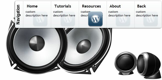
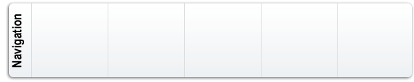
Here are final result (what we will creating):
Here are samples and downloadable package:
Live Demo
[sociallocker]
download in package
[/sociallocker]
Ok, download our example files (package) and lets start making this menu!
Step 1. HTML
Here are html source of our menu. As you can see – here we can assign URL, title, and description to each link.
index.html
<!DOCTYPE html PUBLIC "-//W3C//DTD XHTML 1.0 Strict//EN" "http://www.w3.org/TR/xhtml1/DTD/xhtml1-strict.dtd">
<html xmlns="http://www.w3.org/1999/xhtml" xml:lang="en">
<head>
    <link rel="stylesheet" href="css/style.css" type="text/css" media="all">
    <title>CSS3 slideout menu #5</title>
</head>
<body>
<div class="example">
    <ul class="nav">
        <li>
        <!--[if lte IE 6]><a class="ie6" href="#url"><table><tr><td><![endif]-->
            <ul class="sub">
                <li><a href="https://www.script-tutorials.com/"><b>Home</b><p>custom description here</p><i></i></a></li>
                <li><a href="https://www.script-tutorials.com/category/html-css/"><b>Tutorials</b><p>custom description here</p><i></i></a></li>
                <li><a href="https://www.script-tutorials.com/category/resources/"><b>Resources</b><p>custom description here</p><i></i></a></li>
                <li><a href="https://www.script-tutorials.com/about/"><b>About</b><p>custom description here</p><i></i></a></li>
                <li><a href="https://www.script-tutorials.com/creating-css3-slideout-menu-5/"><b>Back</b><p>custom description here</p><i></i></a></li>
            </ul>
        <!--[if lte IE 6]></td></tr></table></a><![endif]-->
        </li>
    </ul>
    <div style="clear:both"></div>
</div>
</body>
</html>
Step 2. CSS
Here are used CSS styles. First two selectors (you can skip it) belong to our demo page. All rest – menu #5 styles.
css/style.css
/* demo page styles */
body {
    background:#eee;
    margin:0;
    padding:0;
    font-family: "Trebuchet MS",Arial,Helvetica,sans-serif;
}
.example {
    position:relative;
    background:#fff url(../images/background.jpg);
    width:650px;
    height:382px;
    border:1px #000 solid;
    margin:20px auto;
    border-radius:3px;
    -moz-border-radius:3px;
    -webkit-border-radius:3px;
}
/* main menu styles */
ul.nav {
    list-style:none;
    height:120px;
    margin:0;
    padding:0;
}
ul.nav table {
    border-collapse:collapse;
    width:0;
    height:0;
    margin:-1px 0 -5px -1px;
}
ul.nav > li {
    float:right;
    height:120px;
    width:40px;
    position:relative;
    overflow:hidden;
    -webkit-transition-duration:.5s;
    -moz-transition-duration:.5s;
    -o-transition-duration:.5s;
}
* html ul.nav > li {
    width:auto;
}
ul.nav > li a.ie6 {
    float:left;
    height:120px;
    width:39px;
    position:relative;
    overflow:hidden;
}
ul.sub {
    list-style:none;
    height:120px;
    width:600px;
    background:url(../images/panel.png) no-repeat right top;
    position:absolute;
    left:0;
    top:0;
    margin:0;
    padding:0;
}
ul.sub li {
    float:left;
}
ul.sub li:first-child {
    margin-left:45px;
}
ul.sub li a {
    display:block;
    width:110px;
    height:120px;
    float:left;
    overflow:hidden;
    position:relative;
    text-decoration:none;
    color:#000;
}
ul.sub li a b {
    font-weight:700;
    display:block;
    padding:15px 15px 5px;
}
ul.sub li a p {
    font-size:12px;
    display:block;
    margin:0;
    padding:0 10px;
}
ul.sub li a i {
    display:block;
    width:64px;
    height:64px;
    position:absolute;
    right:10px;
    bottom:10px;
    background:url(../images/post.png);
    opacity:0.1;
    filter:alpha(opacity = 10);
    -webkit-transition-duration:.5s;
    -moz-transition-duration:.5s;
    -o-transition-duration:.5s;
}
ul.nav > li:hover {
    width:600px;
}
ul.nav > li a.ie6:hover {
    direction:ltr;
    width:600px;
}
ul.sub li a:hover i {
    opacity:1.0;
}
Step 3. Images
Here are three images for our menu:


Live Demo
Conclusion
Today we made new nice menu (fifth), your comments and thanks are very welcomed. Good luck!


Doesn’t work on a mobile touchscreen
Thank you for the script. Its cool. I like it. Do you know if it can be modifiable iPhone website?
Hi Shabina,
Yes, you will need to make it responsive.
Hi Andrew!
Thanks so much for this script! I’ve been trying to reverse it so that it scrolls from the left side of the screen, but I have’nt suceeded yet! Any clue or tip on how to do it?
Hi Paola,
This is pretty easy:
ul.nav > li { float: right;
to
ul.nav > li { float: left;