
Today we continue Bootstrap 3 lessons and review Bootstrap 3 Navbar. In our new lesson we will try to disassemble the navbar component in Boostrap 3. During making a new bootstrap template, we usually use the navbar. As well as all other Bootstrap blocks, the navbar component has a useful property – minimize. Now we have a look how this element looks on different devices.
Navbar on PC
Here is the navbar on desktop computers – all the elements are present

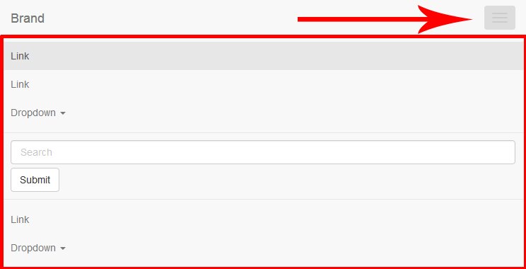
Navbar on mobile devices
Here is the navbar on mobile devices. All the elements are hidden and appear when we push this button

Navbar can be:
- Fixed above – when scrolling, navbar will always be on top
- Fixed below – when scrolling, navbar will always be on bottom
We have just learned the theory, now we can look at the example code. Navbar in Bootstrap is in the nav tag. The following code is separated into pieces and I try to explain every part of the code
Live Demo
<nav class="navbar navbar-default" role="navigation">
  <div class="container-fluid">
    <!-- Brand and toggle get grouped for better mobile display -->
    <div class="navbar-header">
      <button type="button" class="navbar-toggle" data-toggle="collapse" data-target="#bs-example-navbar-collapse-1">
        <span class="sr-only">Toggle navigation</span>
        <span class="icon-bar"></span>
        <span class="icon-bar"></span>
        <span class="icon-bar"></span>
      </button>
      <a class="navbar-brand" href="#">Brand</a>
    </div>
    <!-- Group the nav links, forms, drop-down menus and other elements for toggling -->
    <div class="collapse navbar-collapse" id="bs-example-navbar-collapse-1">
      <ul class="nav navbar-nav">
        <li class="active"><a href="#">Link</a></li>
        <li><a href="#">Link</a></li>
        <li class="dropdown">
          <a href="#" class="dropdown-toggle" data-toggle="dropdown">Dropdown <b class="caret"></b></a>
          <ul class="dropdown-menu">
            <li><a href="#">Action</a></li>
            <li><a href="#">Another action</a></li>
            <li><a href="#">Something else here</a></li>
            <li class="divider"></li>
            <li><a href="#">Separated link</a></li>
            <li class="divider"></li>
            <li><a href="#">One more separated link</a></li>
          </ul>
        </li>
      </ul>
      <form class="navbar-form navbar-left" role="search">
        <div class="form-group">
          <input type="text" class="form-control" placeholder="Search">
        </div>
        <button type="submit" class="btn btn-default">Submit</button>
      </form>
      <ul class="nav navbar-nav navbar-right">
        <li><a href="#">Link</a></li>
        <li class="dropdown">
          <a href="#" class="dropdown-toggle" data-toggle="dropdown">Dropdown <b class="caret"></b></a>
          <ul class="dropdown-menu">
            <li><a href="#">Action</a></li>
            <li><a href="#">Another action</a></li>
            <li><a href="#">Something else here</a></li>
            <li class="divider"></li>
            <li><a href="#">Separated link</a></li>
          </ul>
        </li>
      </ul>
    </div><!-- /.navbar-collapse -->
  </div><!-- /.container-fluid -->
</nav>
If you want to make it fluid, you simply change the class value:
<div class="container-fluid">
Instead of ‘container-fluid’ you can put just ‘container’, then the navbar will not be stretched the full width of the screen and take the width of the container by default. The maximum width of the container is 1170px. The next part of the code is responsible for the name of the company and the button that appears on mobile devices
<div class="navbar-header">
  <button type="button" class="navbar-toggle" data-toggle="collapse" data-target="#bs-example-navbar-collapse-1">
    <span class="sr-only">Toggle navigation</span>
    <span class="icon-bar"></span><!--Strips on the button-->
    <span class="icon-bar"></span>
    <span class="icon-bar"></span>
  </button>
  <a class="navbar-brand" href="#">Brand</a><!--The name of the organization (company)-->
</div>
The following code keeps the navbar elements.
<!-- Group the links, forms, pull-down menus and other elements -->
<div class="collapse navbar-collapse" id="bs-example-navbar-collapse-1">
  <ul class="nav navbar-nav">
    <li class="active"><a href="#">Link</a></li>
    <li><a href="#">Link</a></li>
    <li class="dropdown">
      <a href="#" class="dropdown-toggle" data-toggle="dropdown">Dropdown <b class="caret"></b></a>
      <ul class="dropdown-menu">
        <li><a href="#">Action</a></li>
        <li><a href="#">Another action</a></li>
        <li><a href="#">Something else here</a></li>
        <li class="divider"></li>
        <li><a href="#">Separated link</a></li>
        <li class="divider"></li>
        <li><a href="#">One more separated link</a></li>
      </ul>
    </li>
  </ul>
  <form class="navbar-form navbar-left" role="search">
    <div class="form-group">
      <input type="text" class="form-control" placeholder="Search">
    </div>
    <button type="submit" class="btn btn-default">Submit</button>
  </form>
  <ul class="nav navbar-nav navbar-right">
    <li><a href="#">Link</a></li>
    <li class="dropdown">
      <a href="#" class="dropdown-toggle" data-toggle="dropdown">Dropdown <b class="caret"></b></a>
      <ul class="dropdown-menu">
        <li><a href="#">Action</a></li>
        <li><a href="#">Another action</a></li>
        <li><a href="#">Something else here</a></li>
        <li class="divider"></li>
        <li><a href="#">Separated link</a></li>
      </ul>
    </li>
  </ul>
</div><!-- /.navbar-collapse -->
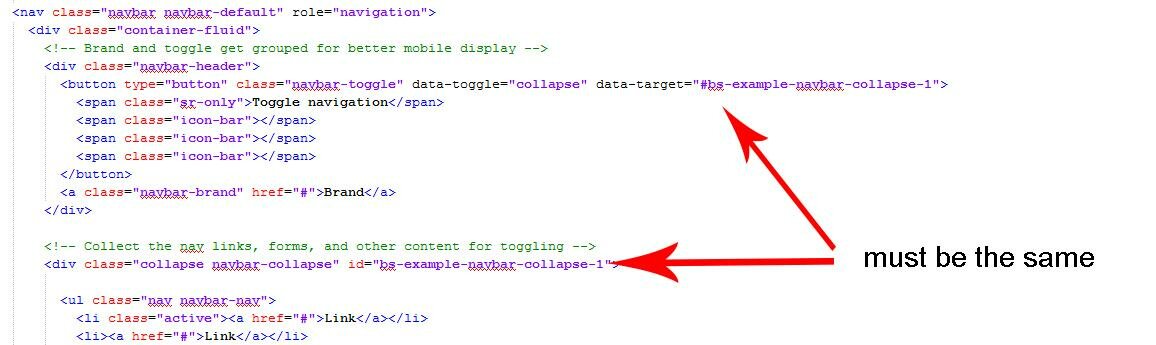
On mobile devices, all of these elements we will see by clicking on the button
To display elements (onclick) properly (in mobile version), it is important that the following IDs are matched
In our main example, here are different elements: simple elements (e.g. links) and complex elements (e.g. form or drop-down list). To create a menu based on the navbar we use ul list:
<ul class="nav navbar-nav">
    <li class="active"><a href="#">Link</a></li>
    <li><a href="#">Link</a></li>
    <li class="dropdown">
      <a href="#" class="dropdown-toggle" data-toggle="dropdown">Dropdown <b class="caret"></b></a>
      <ul class="dropdown-menu">
        <li><a href="#">Action</a></li>
        <li><a href="#">Another action</a></li>
        <li><a href="#">Something else here</a></li>
        <li class="divider"></li>
        <li><a href="#">Separated link</a></li>
        <li class="divider"></li>
        <li><a href="#">One more separated link</a></li>
      </ul>
    </li>
</ul>
Classes nav navbar-nav need to arrange list items in ul horizontally. To create a simple link in the menu you can use the following code
<li><a href="#">Link</a></li>
To highlight the active menu item you can use the class active. In order to display a drop-down menu, you need to add a dropdown class to the parent li and place a caret inside the element, by clicking on wich the drop down menu will show. In a nested list ul we need to add a dropdown-menu class.
<li class="dropdown">
  <a href="#" class="dropdown-toggle" data-toggle="dropdown">Dropdown <b class="caret"></b></a><!--caret-->
  <ul class="dropdown-menu"><!--Nested list that will drop-->
    <li><a href="#">Action</a></li>
    <li><a href="#">Another action</a></li>
    <li><a href="#">Something else here</a></li>
    <li class="divider"></li><!--The dividing line-->
    <li><a href="#">Separated link</a></li>
    <li class="divider"></li>
    <li><a href="#">One more separated link</a></li>
  </ul>
</li>
Fixing navbar on top
In order to fix the navbar on the top you need to add navbar-fixed-top class
<nav class="navbar navbar-default navbar-fixed-top" role="navigation">
Fixing navbar on bottom
In order to fix navbar on the bottom you need to add a class navbar-fixed-bottom
<nav class="navbar navbar-default navbar-fixed-bottom" role="navigation">
Live Demo
[sociallocker]
download in package
[/sociallocker]


Hi
Could you do a tutor to design a page template, specifically with the type of sticky menu that is on this main page.
ie. where it slides to the top as you scroll ?
Regards
Larry
Hi Larry, to make the navbar sticky, change the navbar class from ‘navbar navbar-default’ to ‘navbar navbar-default navbar-fixed-top’, and it will be fixed