As a web designer, working with grids is indeed one of the best things that you can do for delivering a top-quality website or web application. Believed to be one of the most vital components of a web design, a grid is capable of structuring your web pages and create a unique rhythm that can keep everything mess-free. Thanks to the innovative implementation of CSS grid layout modules and flexbox, it has become possible for us to create stunning layouts for our next website/web app. Still, there can be a lot of hassles associated with coding up a particular layout simply because you’ll be expected to remember tons of intuitive properties. Fortunately, there’s a solution to this problem as well. We can leverage the potential of several tools that can enable us to design grids for websites using popular CSS frameworks like Foundation and Bootstrap. Stay on this post to find everything about using Sass and Susy – two popular frameworks for achieving an excellent Grid System.
What’s so special about Sass and Susy?
Unlike the traditional frameworks like Bootstrap or Foundation, Sass and Susy are relatively easy to learn. Also, if you’re abreast with Sass, then learning Susy would become a breeze. Not loaded with tons of default styling options, Susy is itself a grid layout system that allows you to concentrate on your design more effectively. Talking about Susy, well you’re free to pick and choose what works best for you.
Getting Started with Susy for creation of a perfect grid
Specially designed to work with Compass (an open source CSS authoring framework) Susy is quite easy-to-install and setup. Compatible with just about any Sass work flow, Susy allows you to create a perfect grid. For installing Susy onto your system, just run the following command in your terminal:
$ gem install susy
Next, you need to set up the new project. If you’re using the Compass framework, then go to your config.rb file and add require 'susy' to it. Additionally, you’ll also be required to add @import "susy"; into the main SCSS file for importing Susy into your web project. Finally, create an index.html file within the project folder. This file would be used for storing the markup and linking the same to the style sheet.
Now, the steps that need to be followed for building a grid using Susy
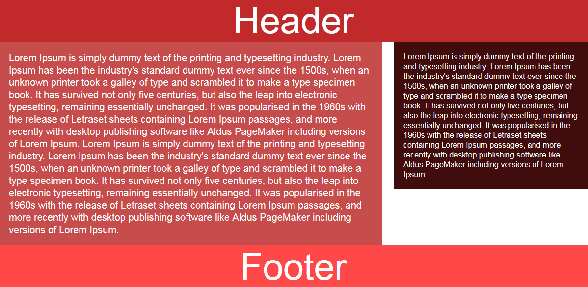
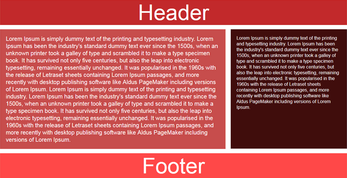
Have a look at what we’re looking forward to achieve in this tutorial:

After having performed the steps for running Susy in your project, it’s time to create your very first layout. Have a look at how the basic webpage layout would look like:

Here are the steps for the same:
Step 1- Define parameters for grid
Have a look at the below syntax that is used for defining parameters for the grid in the Sass map available towards the beginning of the main SCSS file:
$susy: (
  columns: 12,
  container: 1200px,
  gutters: 1/4,
  debug: (image: show)
  global-box-sizing: border-box,
);
Here’s a list of a few vital things that need to be defined within the Sass map for creating a grid:
- Count of columns that would be used in the formation of a grid
- Maximum width of the container. Ignoring to define a value here will set the container’s width to be 100% of the viewport’s width
- Box-sizing – Default value for this is set to ‘content-box’. However, you can replace it by ‘border-box’.
- Gutters – By default, Susy has gutters as the right-hand margins on the columns and at one quarter of the column width. However, you may choose to change the gutter ratio or opt for using gutter-position for deciding the behavior of gutters.
- Debug image – Setting the value for this field to ‘show’ will display a specific background image showcasing the column grids.
Step 2- Create a basic layout for the grid
Here is the HTML structure which includes a header, the main content area with an article, a sidebar and a footer:
<body>
  <div class="wrapper">
    <header>
      Header
    </header>
    <div class="article">
      Right Side Content Here
    </div>
    <aside class="sidebar">
      Sidebar Content Here
    </aside>
    <footer>
      Footer
    </footer>
  </div>
</body>
As is visible in the above markup, Susy purely depends on CSS and Sass for customization of the grid. Span mixin is the critical feature that allows you to create a grid using Susy. As it can be seen in the above image of a basic web page layout, we are inclined on having our header and footer take up 100% of the container’s width. Plus, we also want the <div class="article"> and <aside class="sidebar"> elements to consume eight columns and four columns respectively in the twelve-column grid. For achieving this, you simply need to use span mixin as displayed below:
/* SCSS */
.article {
  @include span(8 of 12);
  /* Style Define here */
}

.sidebar{
  @include span(4 of 12 last);
  /* Style Define here */
}
Two noteworthy points related to above span mixin include:
- Susy is dependent on context. That means, we can write @include span(8) for the <div class=”article”> element and it would produce same result simply because we’ve already defined the layout as four columns in the Sass map.
- We’ve added the word ‘last’ to mixin so as to have <aside class=”sidebar”> as the last item in the row. Doing this will inform Susy about the removal of right-hand margin available on the respective element.
Additionally, on observing the CSS file, you can see that the above mentioned Sass will compile to the following:
.article {
  width: 65%;
  float: left;
  margin-right: 2%;
  margin-bottom:15px;
}

.sidebar {
  width: 33%;
  float:right;
}
In the above code snippet, you can find that Susy has automatically calculated the column widths along with gutters on the basis of settings that have been specified in the Sass map. Here, do remember to include some dummy content, padding and a background color on your elements because Susy doesn’t come with any default styling.
Step 3- Clear the footer
While floating the elements, don’t forget to clear the footer. Code snippet associated with this is displayed below:
header {
  padding: 20px;
  background-color: #c12a2a;
  margin-bottom:15px;
}

.article {
  @include span(8);
  padding: 20px;
  background: #c64c4c;
}

.sidebar{
  @include span(4 last);
  padding: 20px;
  background: #400d0d;
}

footer {
  clear: both;
  padding: 20px;
  background: #ff4848;
}
Step 4- Include ‘container’ mixin into the ‘wrapper’ element
This step is performed for rendering the content a maximum width, followed by positioning it towards the center of the webpage by simply setting the right and left margins to ‘auto’ as shown in the below code:
div.wrapper {
  @include container;
}
With that we’re done with creating a grid (the image is displayed in the beginning of this post) using Sass and Susy.
Conclusion
Here’s hoping the above post would have helped you gather useful information about creating a grid using Susy and Sass. So, the next time you think about creating simple or complex layouts in a code-free way, following this post would turn to be a good time-saver.


