CSS3 clock. Today – another one great article – we are going to create pure CSS3 Analog Clock without any javascript (we are going to use power of CSS3 with animations to build it). Our clocks have three arrows on the face – hour, minute and second. Each of them – a narrow rectangle rotated to the desired angle. How it works in result? – Easy, I am using necessary delays for all these arrows. How exactly – read on.
For our clock – I have prepared -webkit and -moz styles. So please keep in mind – that clock will work only in Firefox, and Webkit-based browsers (Chrome and Safari). If you like – you always can expand necessary styles (for arrows) for IE and Opera browsers (by adding same stylesheets with -ms and -o prefixes).
Here are samples and downloadable package:
Live Demo
download in package
Ok, download the example files and lets start coding !
Step 1. HTML markup
The mark-up for our clock is not very simple – it contain lot of DIV elements. Each of them – our arrows. Here it is.
index.html
<!DOCTYPE html>
<html lang="en">
    <head>
        <meta charset="utf-8" />
        <title>Analog Clock with Pure CSS3 (without javascript) | Script Tutorials</title>
        <link href="css/layout.css" type="text/css" rel="stylesheet">
        <link href="css/clocks.css" type="text/css" rel="stylesheet">
    </head>
    <body>
        <header>
            <h2>Analog Clock with Pure CSS3 (without javascript)</h2>
            <a href="https://www.script-tutorials.com/analog-clock-with-pure-css3/" class="stuts">Back to original tutorial on <span>Script Tutorials</span></a>
        </header>
        <div class="container">
            <div id="clock">
                <div class="secs">
                    <div id="s1"></div><div id="s2"></div><div id="s3"></div>
                    <div id="s4"></div><div id="s5"></div><div id="s6"></div>
                    <div id="s7"></div><div id="s8"></div><div id="s9"></div>
                    <div id="s10"></div><div id="s11"></div><div id="s12"></div>
                    <div id="s13"></div><div id="s14"></div><div id="s15"></div>
                    <div id="s16"></div><div id="s17"></div><div id="s18"></div>
                    <div id="s19"></div><div id="s20"></div><div id="s21"></div>
                    <div id="s22"></div><div id="s23"></div><div id="s24"></div>
                    <div id="s25"></div><div id="s26"></div><div id="s27"></div>
                    <div id="s28"></div><div id="s29"></div><div id="s30"></div>
                    <div id="s31"></div><div id="s32"></div><div id="s33"></div>
                    <div id="s34"></div><div id="s35"></div><div id="s36"></div>
                    <div id="s37"></div><div id="s38"></div><div id="s39"></div>
                    <div id="s40"></div><div id="s41"></div><div id="s42"></div>
                    <div id="s43"></div><div id="s44"></div><div id="s45"></div>
                    <div id="s46"></div><div id="s47"></div><div id="s48"></div>
                    <div id="s49"></div><div id="s50"></div><div id="s51"></div>
                    <div id="s52"></div><div id="s53"></div><div id="s54"></div>
                    <div id="s55"></div><div id="s56"></div><div id="s57"></div>
                    <div id="s58"></div><div id="s59"></div><div id="s60"></div>
                </div>
                <div class="mins">
                    <div id="m1"></div><div id="m2"></div><div id="m3"></div>
                    <div id="m4"></div><div id="m5"></div><div id="m6"></div>
                    <div id="m7"></div><div id="m8"></div><div id="m9"></div>
                    <div id="m10"></div><div id="m11"></div><div id="m12"></div>
                    <div id="m13"></div><div id="m14"></div><div id="m15"></div>
                    <div id="m16"></div><div id="m17"></div><div id="m18"></div>
                    <div id="m19"></div><div id="m20"></div><div id="m21"></div>
                    <div id="m22"></div><div id="m23"></div><div id="m24"></div>
                    <div id="m25"></div><div id="m26"></div><div id="m27"></div>
                    <div id="m28"></div><div id="m29"></div><div id="m30"></div>
                    <div id="m31"></div><div id="m32"></div><div id="m33"></div>
                    <div id="m34"></div><div id="m35"></div><div id="m36"></div>
                    <div id="m37"></div><div id="m38"></div><div id="m39"></div>
                    <div id="m40"></div><div id="m41"></div><div id="m42"></div>
                    <div id="m43"></div><div id="m44"></div><div id="m45"></div>
                    <div id="m46"></div><div id="m47"></div><div id="m48"></div>
                    <div id="m49"></div><div id="m50"></div><div id="m51"></div>
                    <div id="m52"></div><div id="m53"></div><div id="m54"></div>
                    <div id="m55"></div><div id="m56"></div><div id="m57"></div>
                    <div id="m58"></div><div id="m59"></div><div id="m60"></div>
                </div>
                <div class="hours">
                    <div id="h1"></div><div id="h2"></div><div id="h3"></div>
                    <div id="h4"></div><div id="h5"></div><div id="h6"></div>
                    <div id="h7"></div><div id="h8"></div><div id="h9"></div>
                    <div id="h10"></div><div id="h11"></div><div id="h12"></div>
                </div>
            </div>
        </div>
    </body>
</html>
Step 2. CSS
Now – CSS styles. As usual, we won’t publish main page layout styles (layout.css). But, there are stylesheets for our clock:
css/clocks.css
#clock {
    background: #fff url(cface.png) 0 0 no-repeat;
    height: 500px;
    margin: 0 auto;
    overflow: hidden;
    position: relative;
    width: 500px;
    -webkit-border-radius: 250px;
    -moz-border-radius: 250px;
    -ms-border-radius: 250px;
    -o-border-radius: 250px;
    border-radius: 250px;
}
/* seconds */
@-webkit-keyframes secs_effect {
    0% {opacity: 1;}
    1.66% {opacity: 1;}
    1.67% {opacity: 0;}
    100% {opacity: 0;}
}
@-moz-keyframes secs_effect {
    0% {opacity: 1;}
    1.66% {opacity: 1;}
    1.67% {opacity: 0;}
    100% {opacity: 0;}
}
#clock  .secs {
    height: 400px;
    left: 155px;
    position: absolute;
    top: 249px;
    width: 400px;
}
#clock  .secs div {
    background-color: #860000;
    height: 2px;
    opacity: 0;
    position: absolute;
    width: 190px;
    -moz-animation-name: secs_effect;
    -moz-animation-duration: 60s;
    -moz-animation-timing-function: linear;
    -moz-animation-iteration-count: infinite;
    -moz-animation-direction: normal;
    -moz-animation-delay: 0;
    -moz-animation-play-state: running;
    -moz-animation-fill-mode: forwards;
    -webkit-animation-name: secs_effect;
    -webkit-animation-duration: 60s;
    -webkit-animation-timing-function: linear;
    -webkit-animation-iteration-count: infinite;
    -webkit-animation-direction: normal;
    -webkit-animation-delay: 0;
    -webkit-animation-play-state: running;
    -webkit-animation-fill-mode: forwards;
}
#clock #s1 {
-moz-transform: rotate(-90deg) translatex(130px);
-moz-animation-delay: 0s;
-webkit-transform: rotate(-90deg) translatex(130px);
-webkit-animation-delay: 0s;
}
#clock #s2 {
-moz-transform: rotate(-84deg) translatex(130px);
-moz-animation-delay: 1s;
-webkit-transform: rotate(-84deg) translatex(130px);
-webkit-animation-delay: 1s;
}
#clock #s3 {
-moz-transform: rotate(-78deg) translatex(130px);
-moz-animation-delay: 2s;
-webkit-transform: rotate(-78deg) translatex(130px);
-webkit-animation-delay: 2s;
}
...........
#clock #s60 {
-moz-transform: rotate(264deg) translatex(130px);
-moz-animation-delay: 59s;
-webkit-transform: rotate(264deg) translatex(130px);
-webkit-animation-delay: 59s;
}
/* minutes */
@-webkit-keyframes mins_effect {
    0% {opacity: 1;}
    1.66% {opacity: 1;}
    1.67% {opacity: 0;}
    100% {opacity: 0;}
}
@-moz-keyframes mins_effect {
    0% {opacity: 1;}
    1.66% {opacity: 1;}
    1.67% {opacity: 0;}
    100% {opacity: 0;}
}
#clock  .mins {
    height: 300px;
    left: 175px;
    position: absolute;
    top: 249px;
    width: 300px;
}
#clock  .mins div {
    background-color: #000086;
    height: 3px;
    opacity: 0;
    position: absolute;
    width: 150px;
    -moz-animation-name: mins_effect;
    -moz-animation-duration: 3600s;
    -moz-animation-timing-function: linear;
    -moz-animation-iteration-count: infinite;
    -moz-animation-direction: normal;
    -moz-animation-delay: 0;
    -moz-animation-play-state: running;
    -moz-animation-fill-mode: forwards;
    -webkit-animation-name: mins_effect;
    -webkit-animation-duration: 3600s;
    -webkit-animation-timing-function: linear;
    -webkit-animation-iteration-count: infinite;
    -webkit-animation-direction: normal;
    -webkit-animation-delay: 0;
    -webkit-animation-play-state: running;
    -webkit-animation-fill-mode: forwards;
}
#clock #m1 {
-moz-transform: rotate(-90deg) translatex(110px);
-moz-animation-delay: 0s;
-webkit-transform: rotate(-90deg) translatex(110px);
-webkit-animation-delay: 0s;
}
#clock #m2 {
-moz-transform: rotate(-84deg) translatex(110px);
-moz-animation-delay: 60s;
-webkit-transform: rotate(-84deg) translatex(110px);
-webkit-animation-delay: 60s;
}
#clock #m3 {
-moz-transform: rotate(-78deg) translatex(110px);
-moz-animation-delay: 120s;
-webkit-transform: rotate(-78deg) translatex(110px);
-webkit-animation-delay: 120s;
}
...........
#clock #m60 {
-moz-transform: rotate(264deg) translatex(110px);
-moz-animation-delay: 3540s;
-webkit-transform: rotate(264deg) translatex(110px);
-webkit-animation-delay: 3540s;
}
/* hours */
@-webkit-keyframes hours_effect {
    0% {opacity: 1;}
    8.33% {opacity: 1;}
    8.34% {opacity: 0;}
    100% {opacity: 0;}
}
@-moz-keyframes hours_effect {
    0% {opacity: 1;}
    8.33% {opacity: 1;}
    8.34% {opacity: 0;}
    100% {opacity: 0;}
}
#clock  .hours {
    height: 300px;
    left: 175px;
    position: absolute;
    top: 249px;
    width: 300px;
}
#clock  .hours div {
    background-color: #860086;
    height: 3px;
    opacity: 0;
    position: absolute;
    width: 150px;
    -moz-animation-name: hours_effect;
    -moz-animation-duration: 43200s;
    -moz-animation-timing-function: linear;
    -moz-animation-iteration-count: infinite;
    -moz-animation-direction: normal;
    -moz-animation-delay: 0;
    -moz-animation-play-state: running;
    -moz-animation-fill-mode: forwards;
    -webkit-animation-name: hours_effect;
    -webkit-animation-duration: 43200s;
    -webkit-animation-timing-function: linear;
    -webkit-animation-iteration-count: infinite;
    -webkit-animation-direction: normal;
    -webkit-animation-delay: 0;
    -webkit-animation-play-state: running;
    -webkit-animation-fill-mode: forwards;
}
#clock #h1 {
-moz-transform: rotate(-180deg) translatex(110px);
-moz-animation-delay: 0s;
-webkit-transform: rotate(-180deg) translatex(110px);
-webkit-animation-delay: 0s;
}
#clock #h2 {
-moz-transform: rotate(-150deg) translatex(110px);
-moz-animation-delay: 3600s;
-webkit-transform: rotate(-150deg) translatex(110px);
-webkit-animation-delay: 3600s;
}
#clock #h3 {
-moz-transform: rotate(-120deg) translatex(110px);
-moz-animation-delay: 7200s;
-webkit-transform: rotate(-120deg) translatex(110px);
-webkit-animation-delay: 7200s;
}
...........
#clock #h12 {
-moz-transform: rotate(150deg) translatex(110px);
-moz-animation-delay: 39600s;
-webkit-transform: rotate(150deg) translatex(110px);
-webkit-animation-delay: 39600s;
}
Now – you can understand the main idea. I won’t publish all ‘recurring’ styles for each arrow. Full code you can find in our package.
Step 4. Images
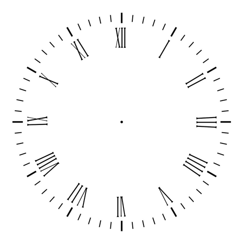
For our clock I have used single image (as face of our clock):
Live Demo
download in package
Conclusion
Finally we have built our clock! This was difficult, but we did it. I hope that this will interesting addition to your website. Don’t forget to tell thanks and leave a comment. Good luck!


Great stuff for my website….
Awesome one!Haven’t went through code yet,but it’s looks great!Nice work!
Nice, would be useful too if it would be always loaded at 9:00.
You can set it to 9:00 through changes in CSS :-)
Is it possible to set the time to different time zones using this CSS script?
Hi Doh,
Unfortunately no, mainly because CSS doesn’t know about your environment
Thank you!
very nice watch, I want to convert it to Vietnam time zone then how? look forward to receiving your instructions.
Hi Tuan,
If you need to set a certain time every time you open this page, you will need to re-adjust all CSS properties (all rotate angles) according your current time.
Actually i want use this in an assessment website .
so how can i use the current time and i want to display the clock in red in last minute of assessment